7 Common Copywriting Mistakes on Pricing Pages
Learn from these copywriting mistakes to take your pricing page to the next level

Jul 15, 2024
After analysing hundreds of pricing pages, I stumbled upon a lot of copywriting mistakes. These copywriting mistakes lead to low converting pricing pages resulting in lost revenue for your company.
Copywriting mistakes are not hard to avoid if you have examples of common mistakes that BtoB companies make. In the following article, I summarized 8 common copywriting mistakes that you can easily avoid:
Copywriting mistake #1: No info about the value proposition in the headline
One of the most frequent mistakes I've seen on pricing pages is neglecting the headline. Your pricing page headline should not only highlight key aspects of your pricing but also clearly communicate your value proposition.
Your pricing page is the second most visited page on your website. This means it's crucial to include details about your product and value proposition, not just the pricing. Make sure this page highlights both the benefits and the cost of your offering to engage and inform potential customers effectively.
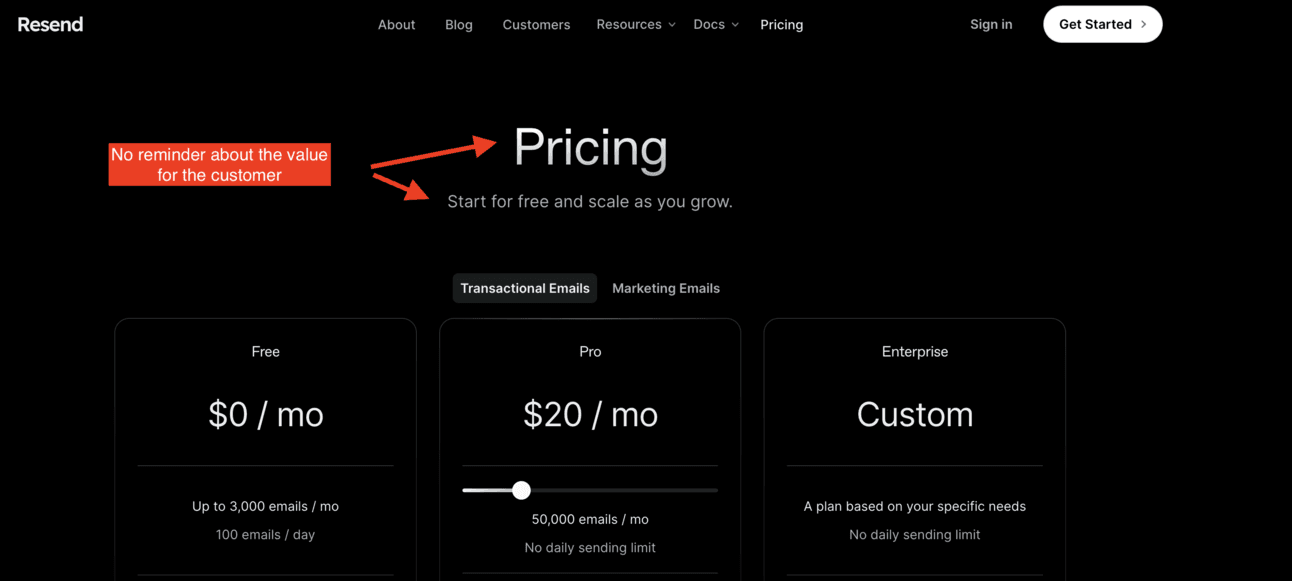
Resend’s pricing page shows an example of copywriting mistake #1. As a prospect, I should be able to understand at least part of Resend’s value proposition while looking at the headline/subheadline of the page
Copywriting mistake #2: No info about pricing model in the headline
While less common, I've noticed some pricing pages make the mistake of omitting information about the pricing. It's essential that the headline and sub-headline are value-oriented and concise, but it should not come at the expense of having to remove pricing hints.
Ensure your headline and sub-headline mention key pricing aspects, like the availability of a free trial or freemium plan, to reassure and attract prospects.
Tango’s pricing page shows an example of copywriting mistake #2. The copywriting of the value proposition is good, but the mistake here is not to mention one important element of the pricing model. In their specific case, I would suggest mention the Free trial in the headline or subheadline

Tango’s pricing page shows an example of copywriting mistake #2. The copywriting of the value proposition is good, but the mistake here is not to mention one important element of the pricing model. In their specific case, I would suggest mention the Free trial in the headline or subheadline
Copywriting mistake #3: No copy for the headline
It does not cost much to add a sub-headline on your pricing page. This will make you less likely to make Copywriting mistakes #1 and #2.
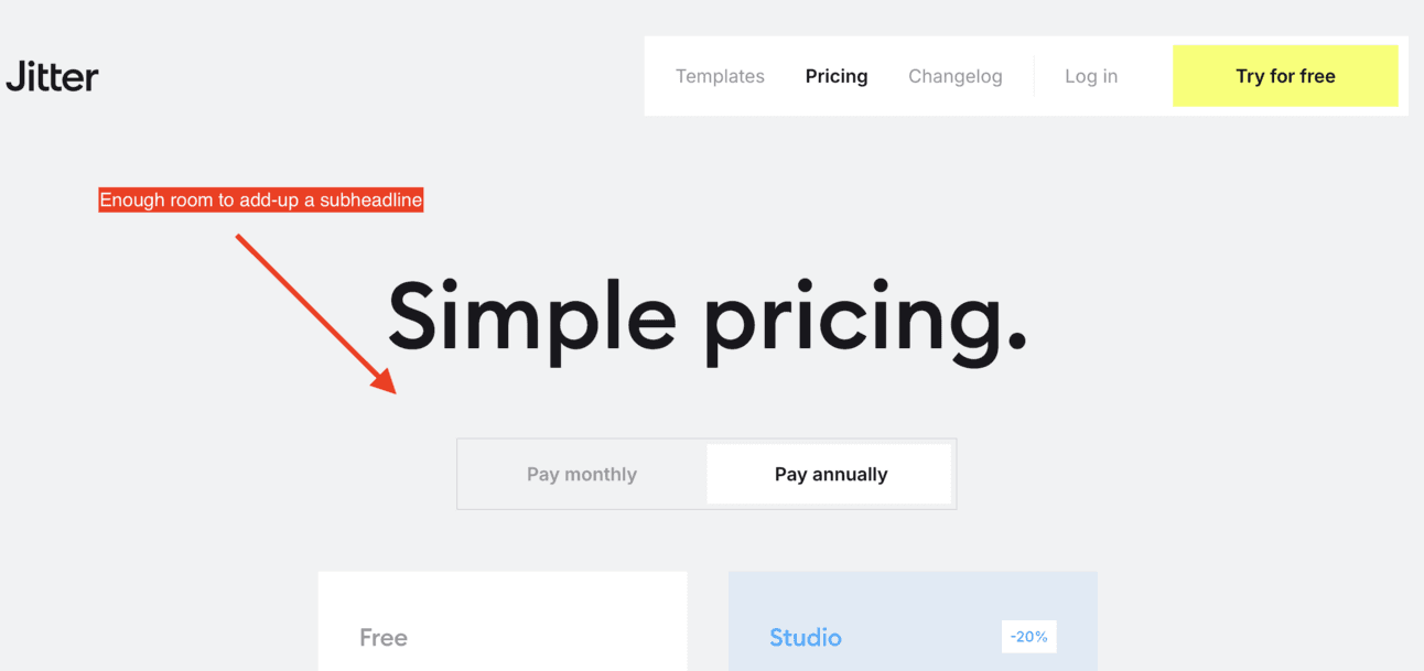
Here Jitter could make a good use of adding a sub-headline to add a mention about their value prop
Copywriting mistake #4: Copy is not concise enough
The copy on your pricing page should be short and compelling. It makes you sound more professional and sharper.
Conversely, an overly detailed sub-headline can backfire, making you seem unsure about your pricing model's key value or most important aspect of your pricing model.

To avoid copywriting mistake #3, make sure your sub-headline does not have more than 100 characters. Here Reflect’s sub-headline is too long
Copywriting mistake #5: Copy of the plan description does not create an anchor for the prospect
Plan descriptions are a very good practise to help the prospect associate themselves with a plan depending on their company category or size in the blink of an eye.
This is really important to enable prospects within your ICP to stick on your pricing page. And on the contrary, to avoid losing time with companies outside your ICP.
Example of a copywriting mistake #4: On Rayon’s pricing page, the Pro plan’s description does not refer to a specific use case, a specific persona or a company size contrary to the Team plan’s
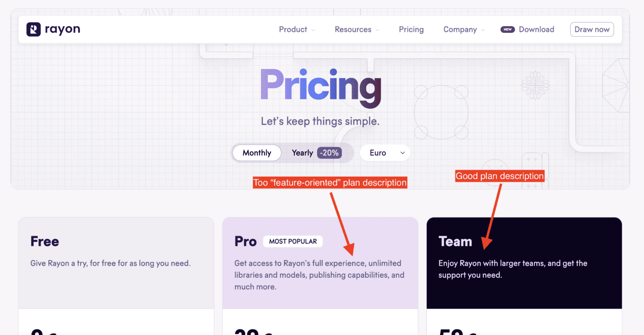
Example of a copywriting mistake #4: On Rayon’s pricing page, the Pro plan’s description does not refer to a specific use case, a specific persona or a company size contrary to the Team plan’s
Copywriting mistake #6: Copy of the pricing page is not comforting enough
Your pricing page isn't doing enough to ease worries about your offer.
Maybe you’re not highlighting your free trial or freemium option enough, or you don't have a dedicated FAQ for pricing questions.
A good FAQ should have 6 to 8 questions. If you have fewer, you might leave some doubts unaddressed.
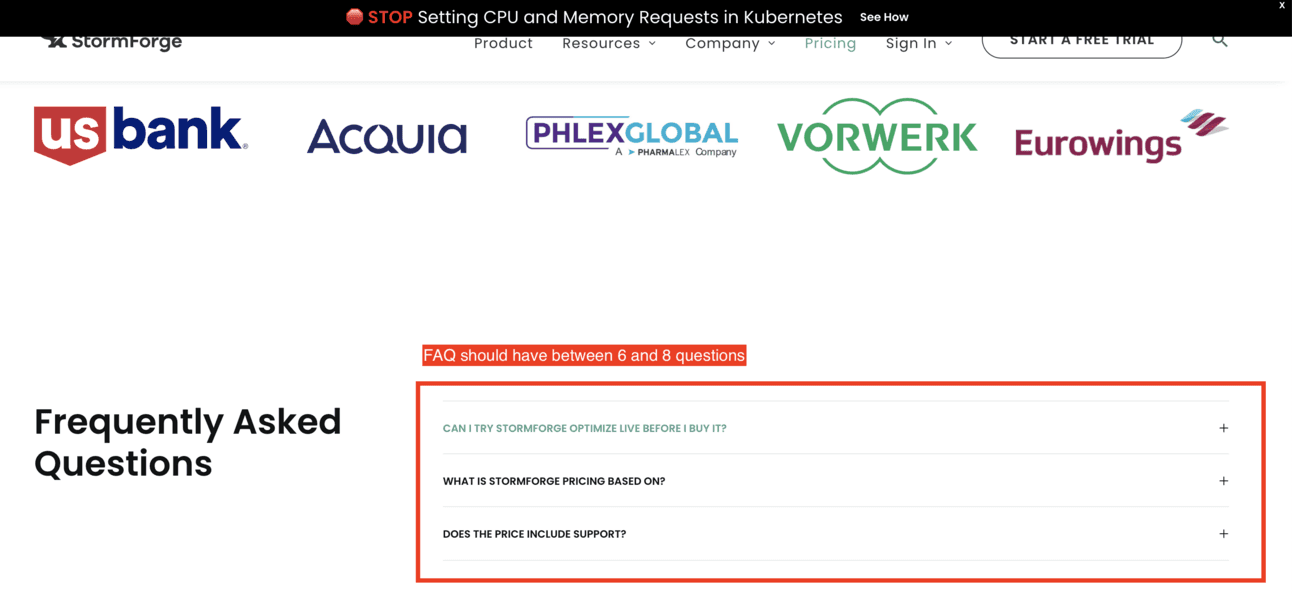
There aren't enough pricing-related questions to reassure potential customers on StomForge’s pricing page
Copywriting mistake #7: Mixing BtoB copy for product and pricing inside the FAQ
As mentioned above, the FAQ should have 6 to 8 questions to remain readable and concise. This number is sufficient to cover important pricing questions. Avoid including product-related questions here; instead, address those in your documentation or on a dedicated "Product" or "Feature" page.
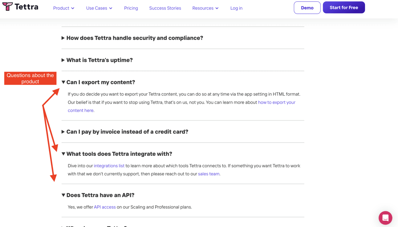
Tettra combines here Copywriting mistake #7 and #8. Too many questions in their FAQ, which make it less likely to be read. And too many questions about the product and not the pricing itself.
To recap: Common copywriting mistakes about pricing pages
Copywriting of the headline and sub-headline lacks a subtle connection between the value proposition and the pricing (Combination of copywriting mistakes #1, copywriting mistakes#2 and copywriting mistakes#3)
Copywriting of the plan descriptions does not enable to create an anchor for the prospect (Combination of copywriting mistakes #4 and Copywriting mistakes #5)
Copy of the FAQ is either too “bloated” or too “light”, thus failing in its job to reassure the customer (Combination of copywriting mistakes #6 and Copywriting mistakes #7)
