20 B2B Copywriting Examples to Make Your Pricing Page Stand Out from Competitors
I assessed 20 copywriting examples so that you take those as inspiration, and create great BtoB copywriting for your pricing page.

Jul 17, 2024
Effective B2B copywriting can have a significant impact but is often undervalued in favour of “sheer” design elements. To create compelling copy on your pricing page, you need to apply certain principles effectively.
And hiring a copywriter can be costly. Gathering BtoB copywriting inspirations from other pricing pages can also be time consuming.
In the following article, I assessed 20 copywriting examples of pricing pages, For some, I provided alternative copywriting suggestions that address their current weaknesses
But before diving into specific examples, let's quickly recap what B2B copywriting is all about and how to apply it effectively to pricing pages.
What is BtoB Copywriting?
B2B copywriting is the art of crafting persuasive and informative text specifically designed for B2B businesses.
The goal is to highlight the value, benefits, and solutions that a product or service can provide to another business. Effective B2B copywriting speaks directly to the needs and pain points of a business audience, using a tone and language that resonates with their professional context.
On pricing pages, BtoB copywriting involves leveraging specific practices at various points on the page.
Where will your BtoB copywriting be impactful on your pricing page?
Writing good copy for your headline/sub-headline, plan descriptions, feature explanations and FAQ are part of the 10 best practises to apply to your SaaS pricing page.
Headline/Sub-headline: David Ogilvy, a famous advertiser famously said “When you have written your headline, you have spent 80 cents of your advertising dollar“. The headline and sub-headline form your first impression. They should convey your value proposition and highlight at least one key aspect of your pricing model. A strong headline grabs attention by showcasing a value metric directly impacted by your product. The sub-headline provides clarity and reassurance by emphasizing one or two key aspects of the pricing model.
Plan Descriptions: These sections should create an anchor for prospects, making it easy for them to choose the right plan. Use concise, benefit-driven language that clearly distinguishes between different tiers and highlights the value each plan offers.
Feature Explanations: Describe features in terms of benefits to the user. Instead of listing technical specs, focus on how each feature solves a problem or improves the user’s business. This approach makes the value proposition more relatable and compelling.
FAQ: Address common questions and concerns to put lingering fears to rest. Use straightforward, reassuring language to build trust and provide clear, concise answers that resolve any doubts or hesitations potential customers might have.
By focusing your B2B copy on these key areas, you can create a pricing page that stands out and effectively converts prospects into customers.
Let’s assess 20 examples of pricing page copy to illustrate those practises 🚦
B2B Copywriting Example #1: Cello
Green light 🟢
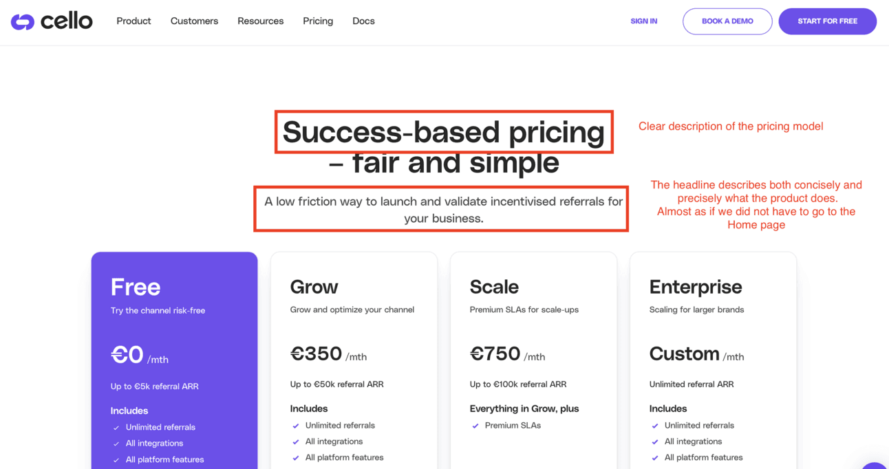
Cello is effectively utilizing copywriting practices on their pricing page.
The copy of the headline and subheadline each serve distinct purposes:
Cello uses the headline’s copy to highlight their unique pricing model, which is smart since success-based models are not that widespread in the SaaS industry.
The subheadline clearly explains the product's benefits with a “comforting” tone. Using terms like "low friction" and "validate" builds trust with customers.
B2B Copywriting Example #2: Softr
Green light 🟢
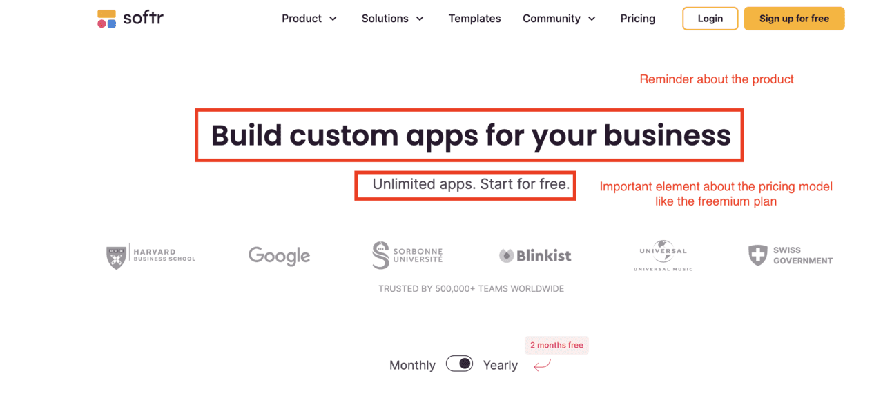
From a design perspective, Softr could reduce the space between the headline and subheadline. However, from a copywriting standpoint, it is very well executed.
On Softr’s pricing page, the copy of the headline and subheadline each have distinct objectives:
The headline explains what the product does. It’s almost as if you don’t need to visit the Home page to understand Softr's function. A key copywriting practice is to make the product clear from the pricing page. To improve, the copy could be more marketing-oriented, like “Create tailor-made apps for your business success” or “Your go-to app builder to elevate your business.”
The subheadline highlights two key aspects of the pricing model: the ability to create unlimited apps and the availability of a freemium plan. This is a good B2B copywriting practice to build trust with prospects.
B2B Copywriting Example #3: Jitter
Red light 🔴
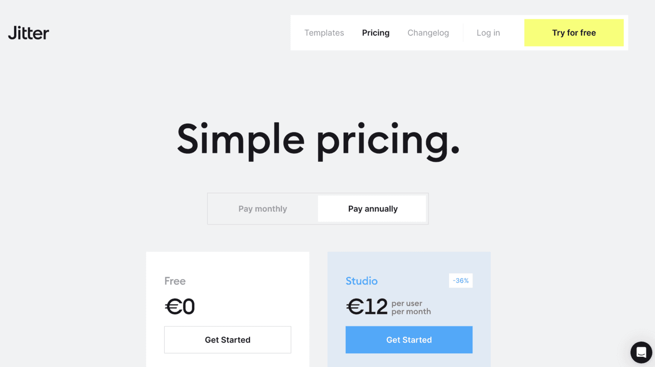
Jitter is a game-changer in the field of motion design. However, I really think they could improve their website conversion rate by improving the copy of their headline and subheadline
To make the copywriting of their pricing page to their advantage, I would suggest they insist on two elements:
their value proposition: they enable to create amazing animations and effects with a simple UI that is Figma-like
their licence-based pricing: they have a flexible pricing that adapts to the size of the brand design team
Here’s for instance one proposition to improve their copywriting (this requires to reduce a bit the font size of the headline):
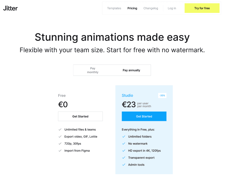
Proposition of an enhanced version of the current Jitter’s pricing page
B2B Copywriting Example #4: Tinybird
Orange light 🟠
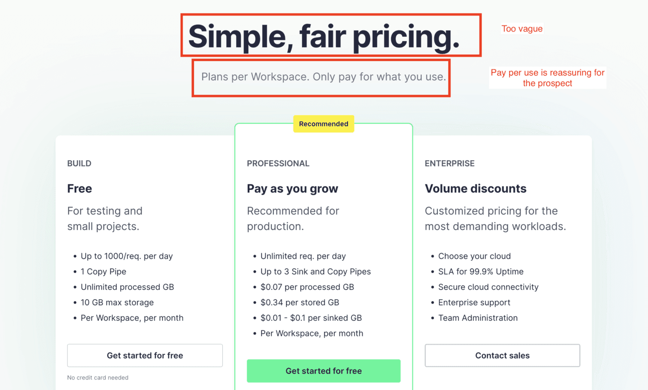
Tinybird’s copywriting does provide interesting information about the pricing model inside the subheadline. Using the “Only pay for what you use” is an important element of their pricing model that they are right to insist on. However, the copywriting of their headline is too vague, and does not provide any information. I would leverage the headline to convey information about the product or the value proposition
Here’s a proposition to make on the copy of their headline more compelling, and insisting a bit more on the free plan:
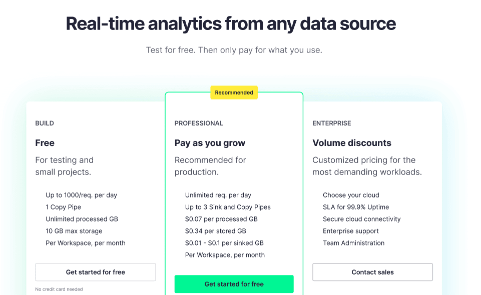
Proposition of an enhanced version of the current Tinybird’s pricing page
B2B Copywriting Example #5: SvelteLaunch
Green light 🟢
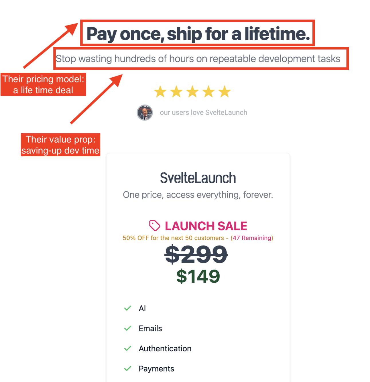
Svelte Launch’s pricing page copy is simple, yet very efficient. They have a life-time deal offer that is clearly stated in the headline. This makes sense as these types of pricing models are not common in the industry
They manage to convey in a very concise what their product brings to customers.
B2B Copywriting Example #6: Attest
Orange light 🟠
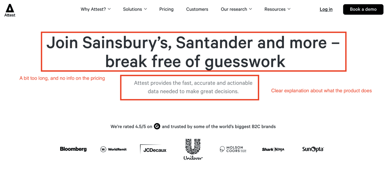
Attest’s overall design is very neat. It’s quite original, yet they look riguorous and trustworphy.
However, their copywriting could use improvement. Currently, the headline is used for social proof, a function better suited for the logo carousel and a dedicated customer testimonial section.
The headline and subheadline fail to provide any information about the pricing model, which is a significant oversight. While the subheadline is clear, it lacks details about the data sources they use.
In the revised proposition that follows, I have focused the headline on the pricing model and added specific details to the subheadline.
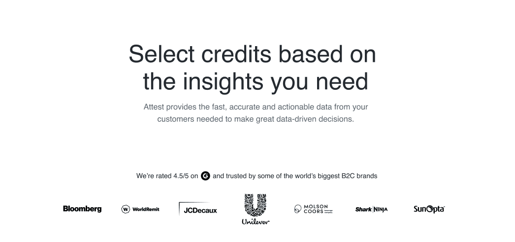
Alternative proposition of a headline for Attest’s pricing page
B2B Copywriting Example #7: Super.so
Red light 🔴
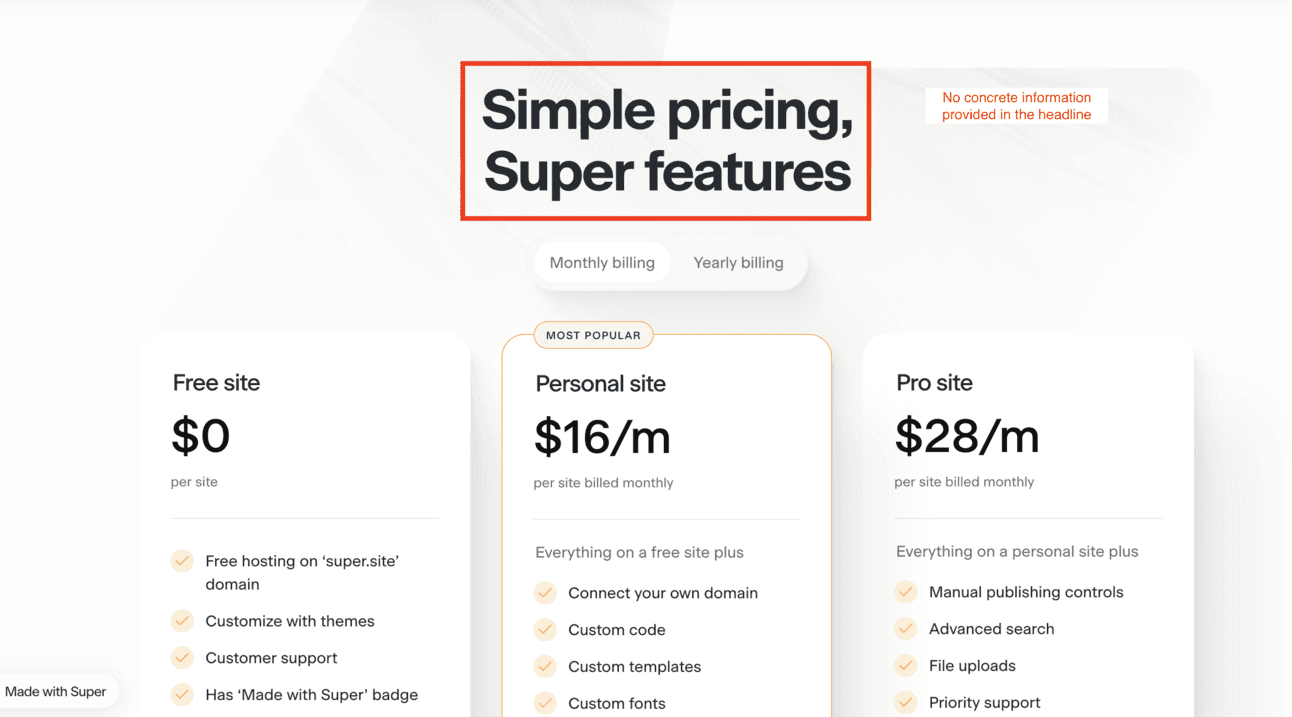
Super is an excellent tool that I personally used to quickly launch a personal website directly from a Notion page. However, I believe enhancing the copywriting of their headline could positively impact the conversion rate on their pricing page.
Here’s a revised copywriting suggestion: a headline that clearly describes the product and a sub-headline that emphasizes the freemium plan.
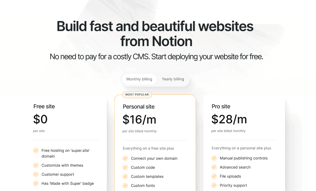
Alternative proposition of a headline for Super’s pricing page
B2B Copywriting Example #8: Buffer
Orange light 🟠
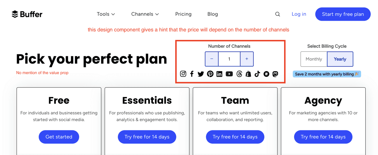
Sometimes, experimenting with an original layout can pay off. Buffer almost succeeded in doing so on their pricing page.
Instead of traditional copywriting in the headline or subheadline, they used a design component that lets users select the number of channels. This clearly indicates that pricing depends on the number of channels, which is an interesting approach worth trying in some cases.
However, I believe they should rephrase their headline to better convey their value proposition. For example, they could replace “Pick your perfect plan” with “Save 10 Hours Weekly with Automatic Social Scheduling.
B2B Copywriting Example #9: ShipStation
Green light 🟢
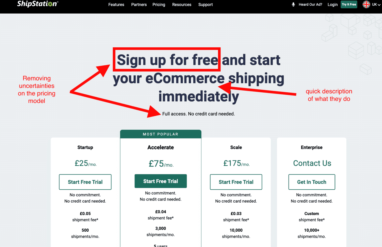
Shipstation's headline is a bit too long with 62 characters; I recommend keeping it under 50. However, it effectively combines reassuring insights about pricing with a brief product description.
Additionally, their subheadline helps eliminate uncertainties by stating: “No credit card needed”
B2B Copywriting Example #10: Screencastify
Red light 🔴
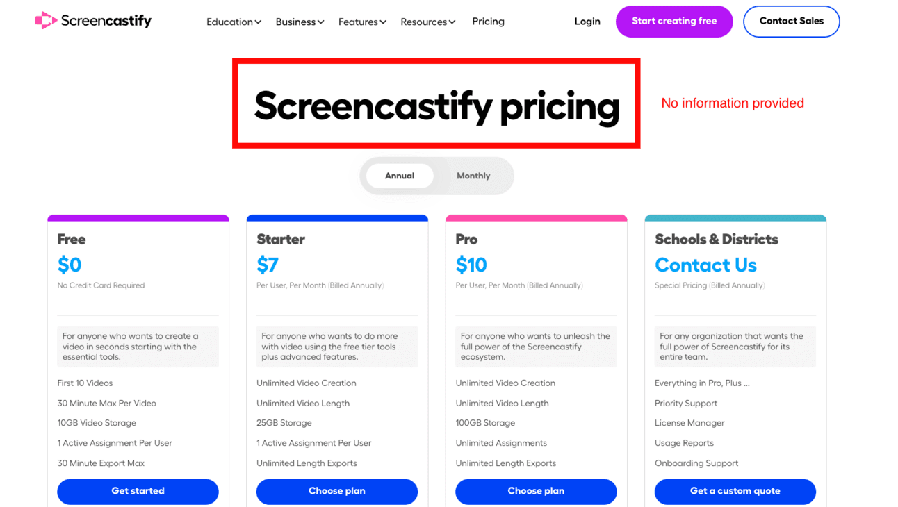
Here it’s clear that Screencastify do not make good use of their headline. Each element of the pricing page is important, and that includes the copywriting of their headline.
Here’s a revised proposition I would make to their marketing department:
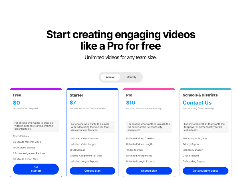
Revised proposition of Screencastify’s headline
In the headline, I want to emphasize that with Screencastify, users can create videos that engage their audience and have a tangible impact on their business.
By mentioning the free plan, I aim to make it clear that this is an irresistible offer. The subheadline should eliminate any doubts by assuring users that there is no limit to the number of videos they can create.
B2B Copywriting Example #11: Asana
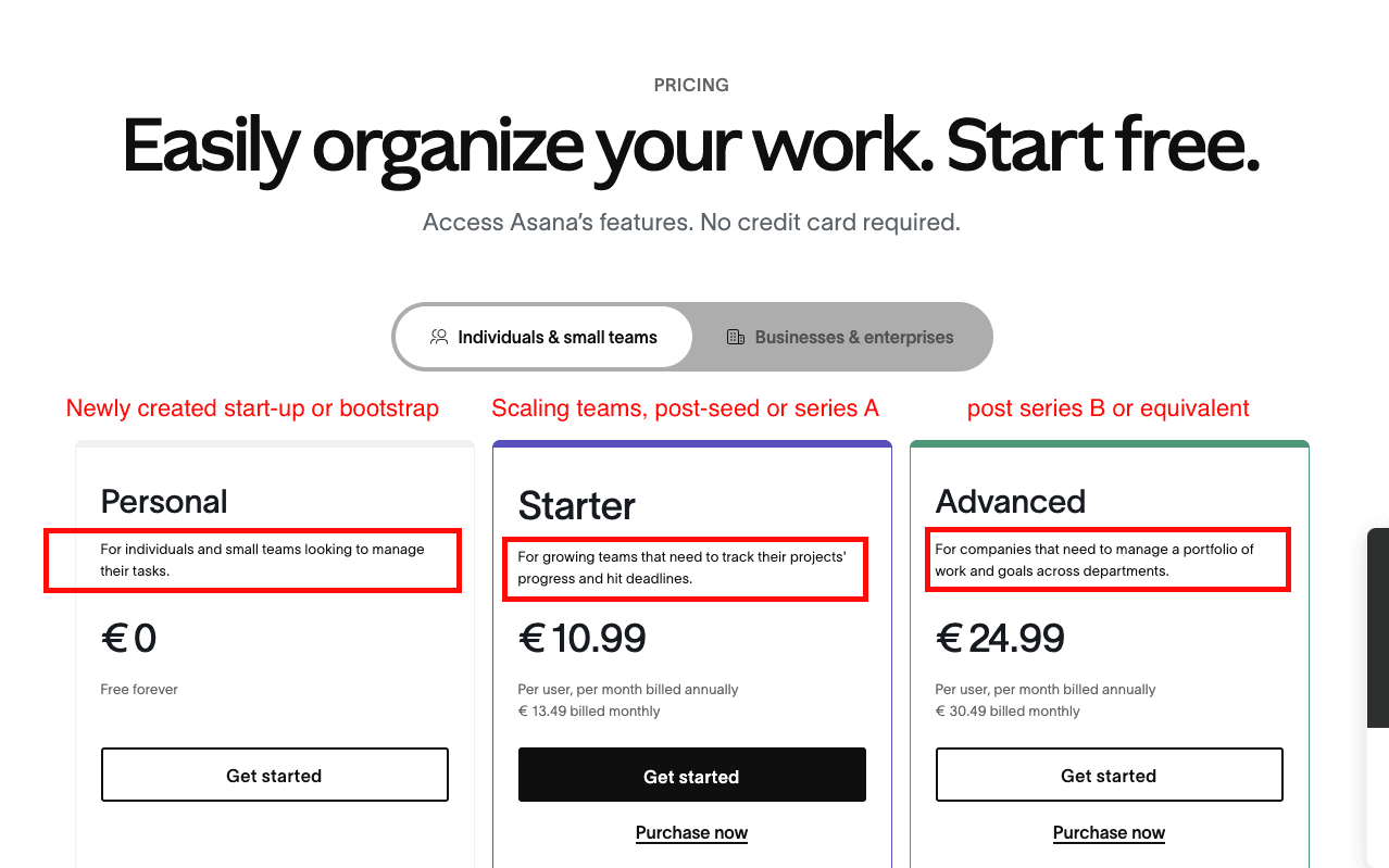
Green light 🟢
Asana’s plan description are very well put to practise. They make it really clear what are the plans that are the most adapted depending on the team size.
This is an example of very good copywriting to get inspiration from if your plans are broken down depending on the company or team size.
B2B Copywriting Example #12: Rayon
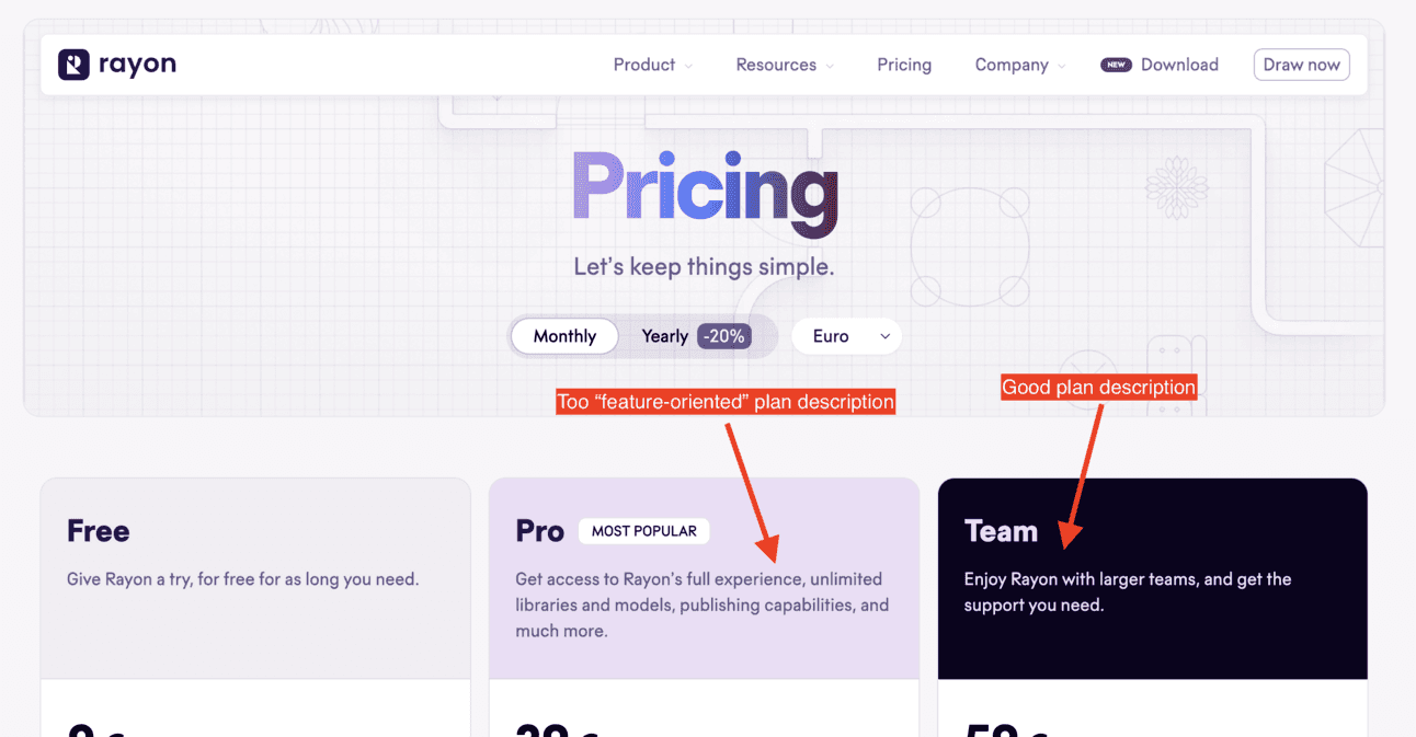
Orange light 🟠
The copywriting here could be a bit improved. The issue with Rayon’s plan descriptions is the inconsistency between the Pro and Team plans. The Pro plan focuses on available features, while the Team plan put emphasis on the company size it’s best suited for.
Ideally, all plans should be described using the same criteria, such as company size, job titles, or use cases.
Additionally, it's generally better to describe plans using use cases rather than features. Features should be detailed in the feature lists below the pricing.
B2B Copywriting Example #13: Typedream
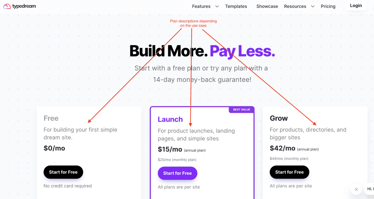
Green light 🟢
Here is another example of effective copywriting for plan descriptions. In this case, the plans are described based on use cases. For Typedream, these use cases depend on the “maturity” and complexity of the sites customers want to build.
The explanation is clear and concise, making the information easy to understand.
B2B Copywriting Example #14: Attest
Red light 🔴
I hope Attest won’t blame me for giving them low assessment of their copywriting despite their very-good looking design 😅
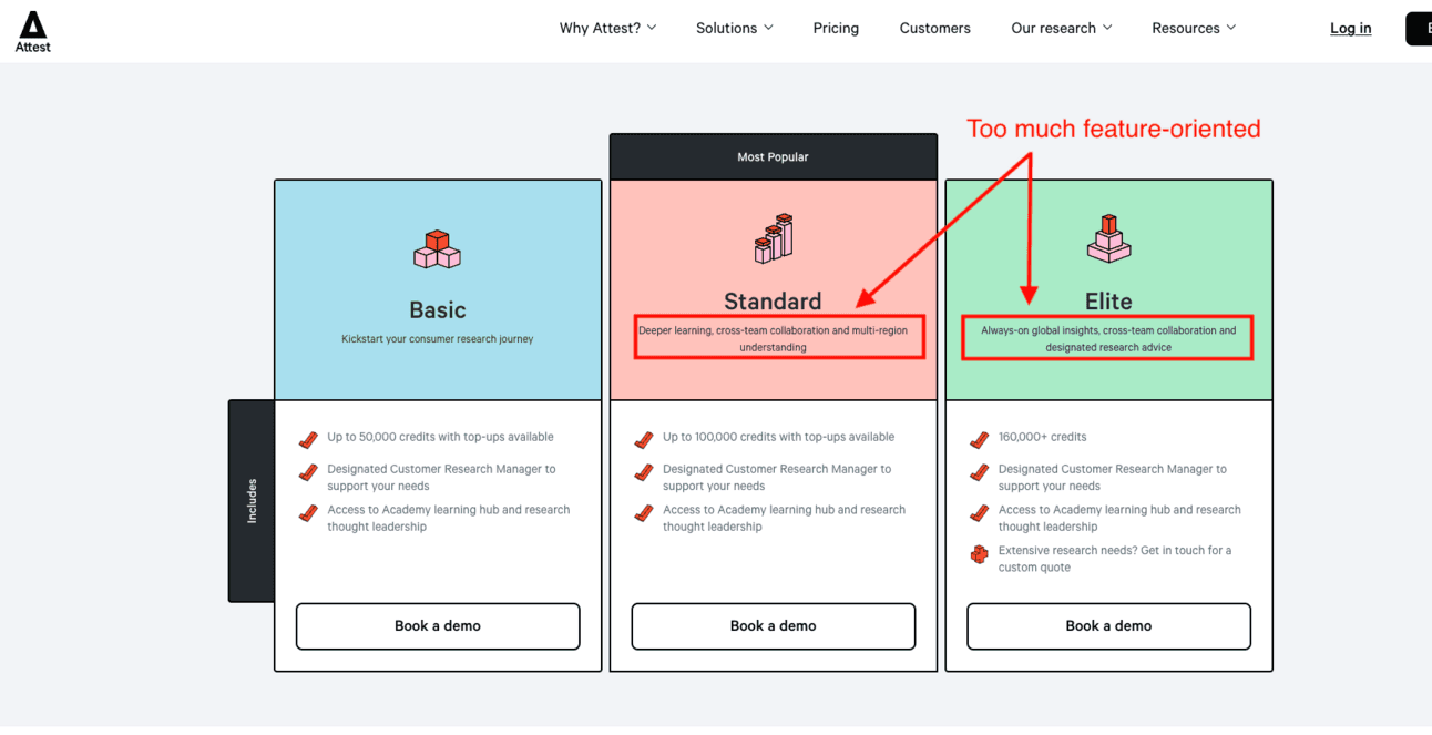
The problem with Attest's pricing page is that it's too feature-oriented. Prospects visiting the website are unlikely to understand all the specific features of Attest. Instead, they are more familiar with their company size, sector, and sometimes their use case. This is the information they expect when comparing plans.
To better organize your plans, data analysis can be useful. Look for patterns common among customers on each plan to guide your breakdown.
B2B Copywriting Example #15: Levity
Green light 🟢
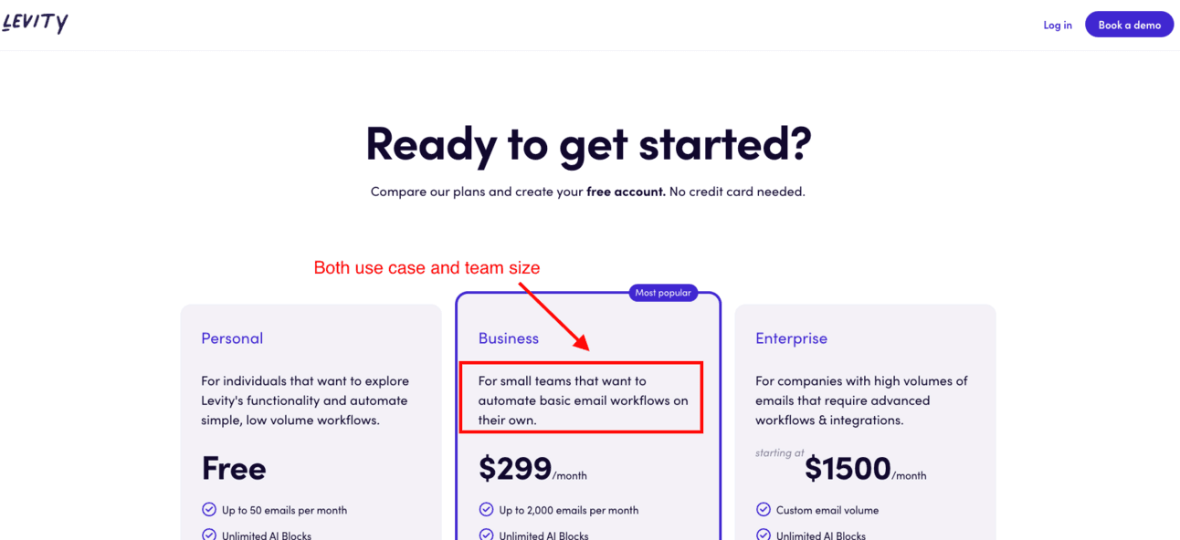
Levity successfully combines company category and use case for each plan, showcasing excellent copywriting. Note that this may not be applicable to all companies.
For example, have a look at their Business plan: “For small teams that want to automate basic email workflows on their own.”
"For small teams": While "small" may sound fuzzy, it becomes clearer when compared to "individuals" and "companies with high volumes of emails," helping prospects determine if they fit this category.
"Want to automate basic email workflows": This specification strengthens the anchor, significantly aiding decision-making.
B2B Copywriting Example #16: Miro
Green light 🟢
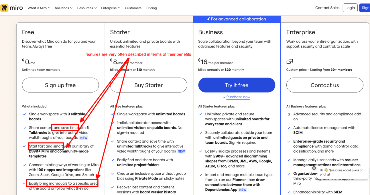
True, their feature list is a bit bloated. They could improve this by using tooltips that display when hovering over each feature.
However, the copywriting of their features often focuses on benefits, which is a very good practice: phrases like “save time” and “start fast and smart” reinforce the value proposition. These touches help facilitate decision-making for prospects on your website.
B2B Copywriting Example #17: Helpkit
Green light 🟢
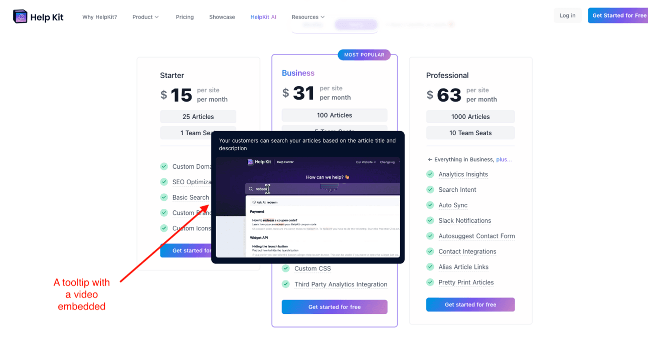
A great practice I've noticed more often on pricing pages is keeping feature descriptions concise and using GIFs or videos in tooltips. This reduces the text while providing detailed information in the tooltips and videos.
Additionally, it adds animation to the pricing page, which can increase the time visitors spend on the page and improve the chances of converting them into sign-ups.
B2B Copywriting Example #18: ActiveCampaign
Red light 🔴
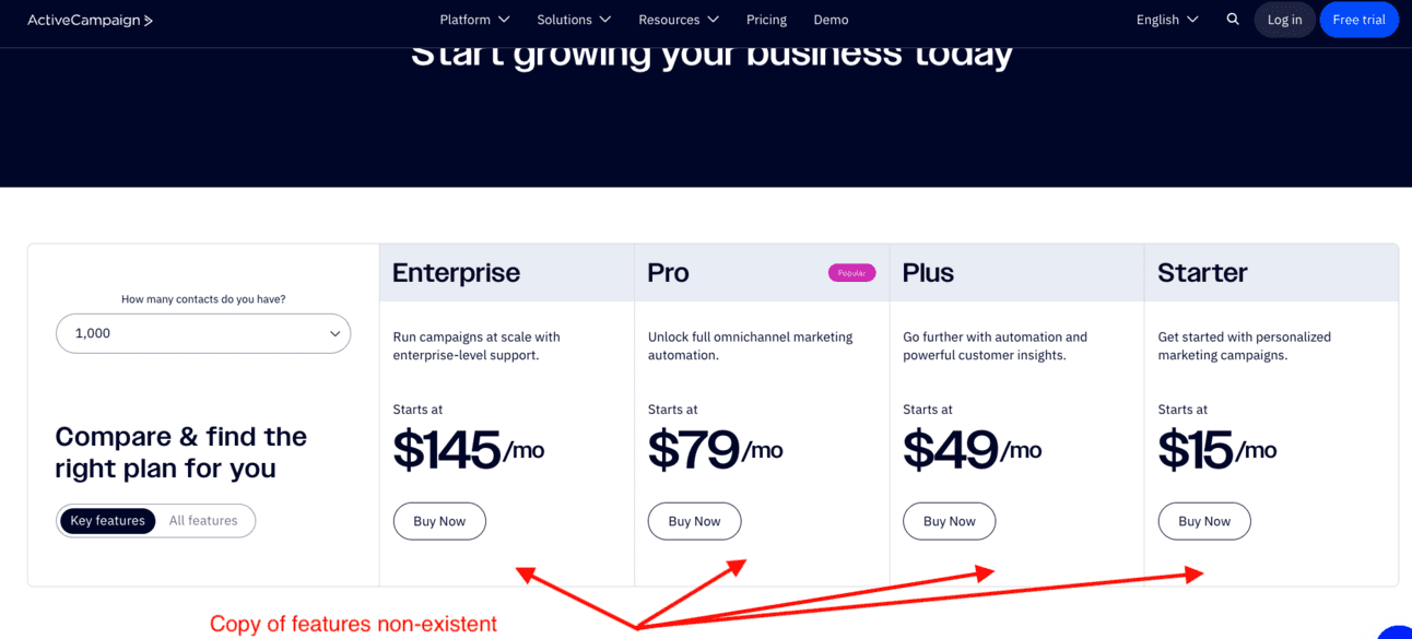
Here, the feature descriptions are missing from the plans themselves and are only shown in the feature comparison tables. However, important features often get lost in these tables.
You should highlight the most important features and those that vary by usage or users within the plans. Then, use the feature comparison table to provide comprehensive details about all existing and upcoming features.
B2B Copywriting Example #19: Zendesk
Green light 🟢
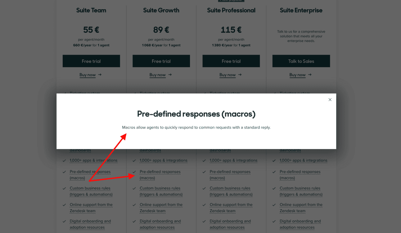
To keep feature descriptions concise while allowing users to access more details if desired, make the feature clickable to display a modal overlay.
This approach solves the issue of tooltips often being too small to use an accessible font size for everyone.
B2B Copywriting Example #20: Hubspot

Hubspot’s FAQ in their pricing page
Green light 🟢
The main goal of your FAQ should be to eliminate any uncertainties about pricing. Address common concerns such as cancellation policies and whether customers can upgrade or downgrade on their own.
HubSpot effectively uses this strategy by explaining the implications of selecting each tier and guiding users to choose the right tier based on their number of contacts.
What next?
With these BtoB copywriting examples, you now have inspirations to learn from to take your copywriting to the next level.
I can ensure you that taking copywriting of your pricing page seriously will reap rewards for your business.
