Top 5 Pricing Page Mistakes B2B SaaS Companies Make
I’ve reviewed hundreds of SaaS pricing pages. Here are the top 5 mistakes I see most frequently.

Aug 27, 2024
Your SaaS pricing page is the second most visited page on your site. Yet, based on various discussions I’ve had with SaaS founders, their pricing page design is often rushed.
Why? Because all the effort went into crafting an amazing home page, or they assume a great home page means the product will sell itself, regardless of how the pricing is presented.
The result? Neglecting crucial details on the pricing page that can hurt your business.
After reviewing hundreds of SaaS pricing pages, here are the top 5 mistakes I see founders and marketing teams make on their pricing page.
Lack of social proof
The most common and impactful mistake I’ve seen on SaaS pricing page is the lack of social proof.
The goal of social proof is to build credibility for your business. Just as you seek reassurance from reviews before booking an Airbnb, your prospects want to see testimonials from your previous customers of your SaaS.
Your pricing page should feature social proof in the form of testimonials or logos. Prospects may overlook these on your home page, focusing instead on your product. When they return to your site, likely landing on the pricing page, they’ll look for this reassurance.
If you lack testimonials, you can start gathering them by offering free services related to your business. A tool like Senja, which I use for collecting feedback from my roasts, can help with this.
In my review of Docusign’s pricing page, I highlight the absence of logos or testimonials—a critical oversight.
A good practice is to display logos under the corresponding plans. This not only boosts your business's credibility but also helps prospects identify with the plan that similar companies have chosen.
Livestorm applied that to perfection on their current pricing page:
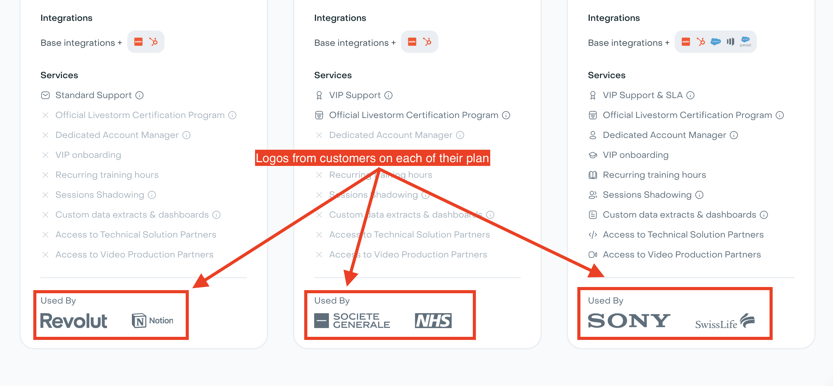
Logos from Livestorm’s customers associated to each of Livestorm’s three plans
Not making it possible to switch between currencies
Another pricing page mistake I still see many SaaS businesses do is that they don’t offer a currency switcher for at least the three most common currencies: dollars, euros, and pounds (I’m not taking into account Asian currencies here).
Allowing customers to select their preferred currency reassures them that your business isn’t limited to just the US market if you bill in dollars. It also increases transparency by clearly showing the precise and finale amount, reducing surprises during checkout. The more accurate your pricing, the less likely customers are to abandon their purchase.
Some companies display the amount in the currency based on the prospect’s IP address, but this approach can be inaccurate, especially with remote work becoming more common.
For instance, in my review of Asana’s pricing page, I noted the lack of this feature, while Zapier’s option to switch between multiple currencies is a best practice worth emulating.
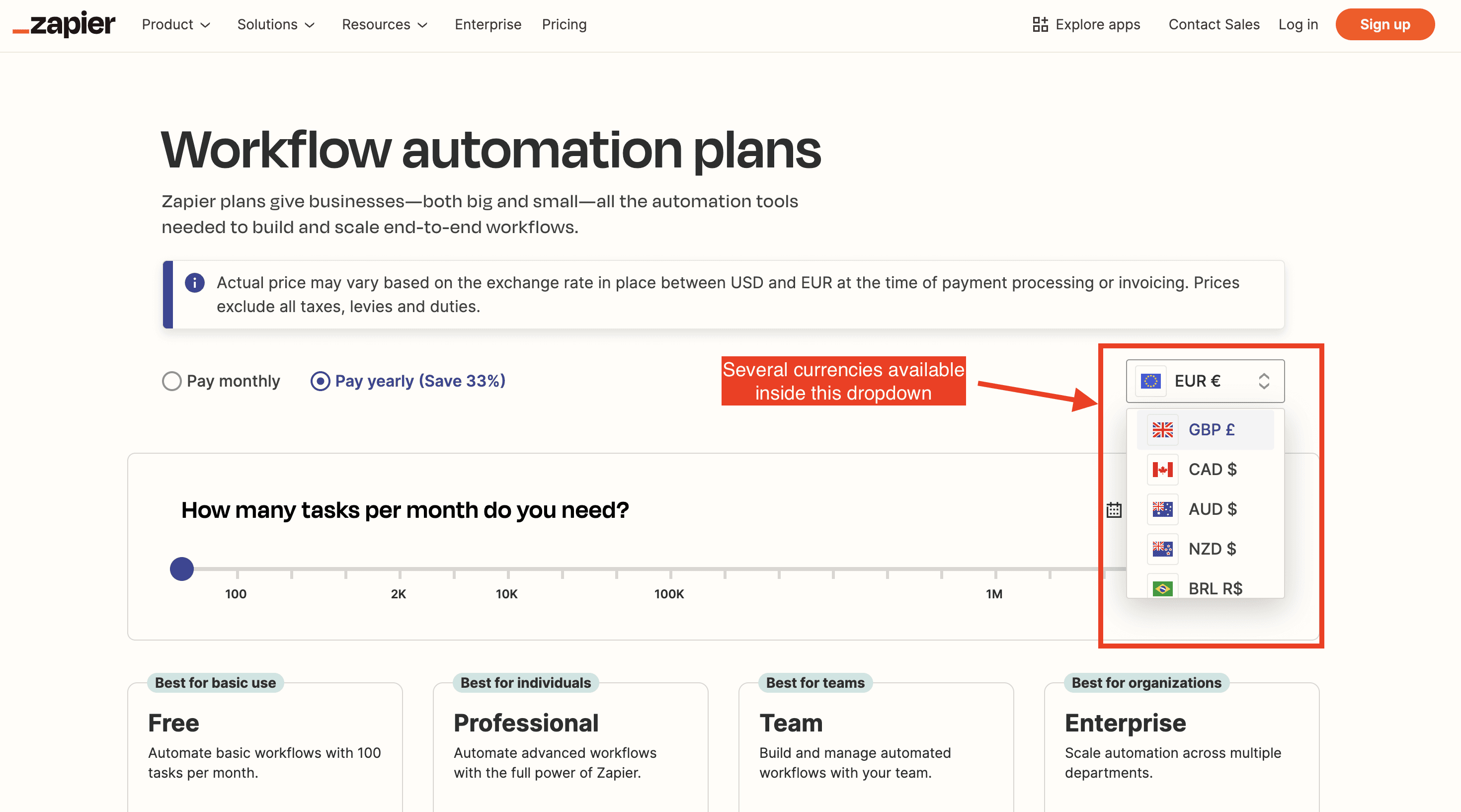
Prospect can choose between several currencies on Zapier’s pricing page
Neglecting the headline
The headline is my favorite design element to roast on a pricing page. It’s surprising how often this crucial part is neglected.
The headline is the first thing your prospect sees, yet many pricing pages miss the mark by failing to mention the product or its value proposition. Often, they only hint at the pricing model, offering little more. Generic phrases like "flexible and transparent pricing" are also common but add little value.
A strong headline should convey your value proposition while also reassuring prospects about the pricing model—such as mentioning a free trial or a free plan.
If you need more space to communicate these points, use a subheadline. An effective approach is to include a sharp testimonial in the subheadline, as Surfe did, to reinforce your message.
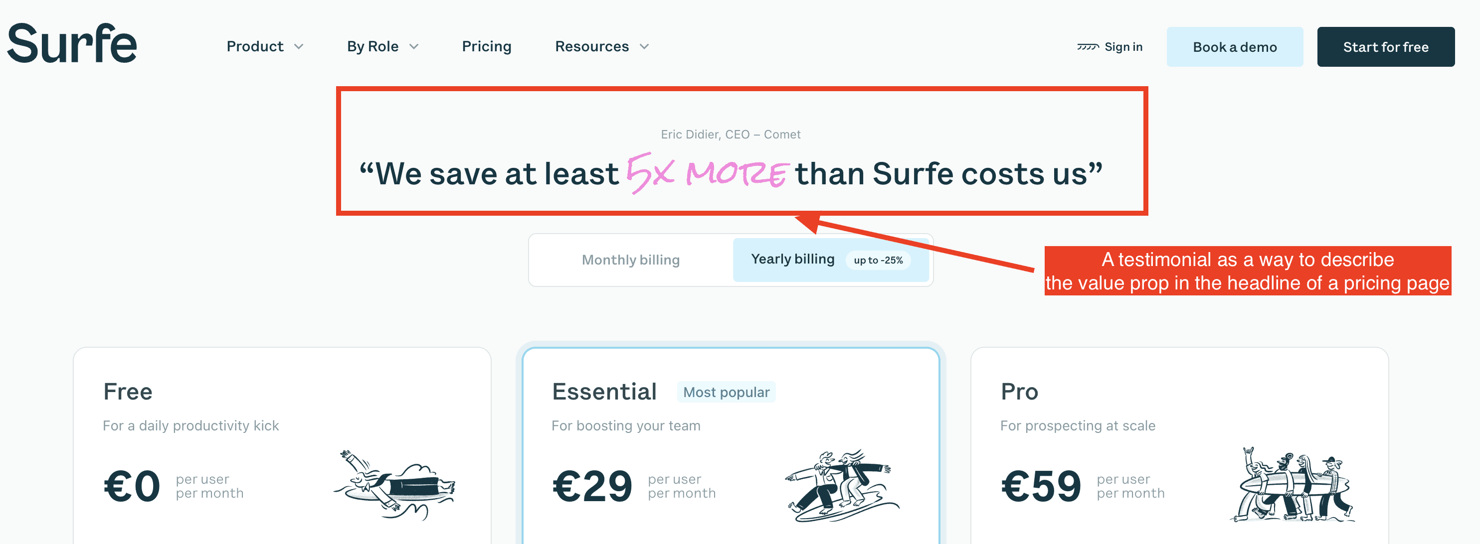
Surfe’s unique pricing page headline
Not removing doubts and uncertainties inside the FAQ
The FAQ is a crucial part of the pricing page, and while most companies remember to include it, I see many make mistakes in how it’s presented.
The FAQ should primarily address pricing-related questions that prospects might have—questions that could prevent them from subscribing. It’s important to keep the focus on pricing rather than the product itself, given that this FAQ is on the pricing page. One or two product-related questions are fine, but the majority should be about pricing specifics.
Key topics to cover include how to upgrade or downgrade a subscription, any refund policies or claw-back clauses, and similar concerns. Prioritize these questions based on the interactions you’ve had with prospects, especially focusing on the questions or objections they’ve raised.
Not highlighting enough the yearly discount
Many SaaS businesses offer yearly plans, which are beneficial because they reduce churn and provide customers with a discount, often up to 20-25%, or the equivalent of two free months.
However, this discount is often not highlighted effectively. Take Miro’s pricing page, for example: while they show the monthly cost for both monthly and yearly billing periods, the information is cluttered and hard to compare.
The comparison between billing periods should be clear and straightforward, with the exact discount prominently displayed, making it easy for customers to see the savings and make an informed decision.
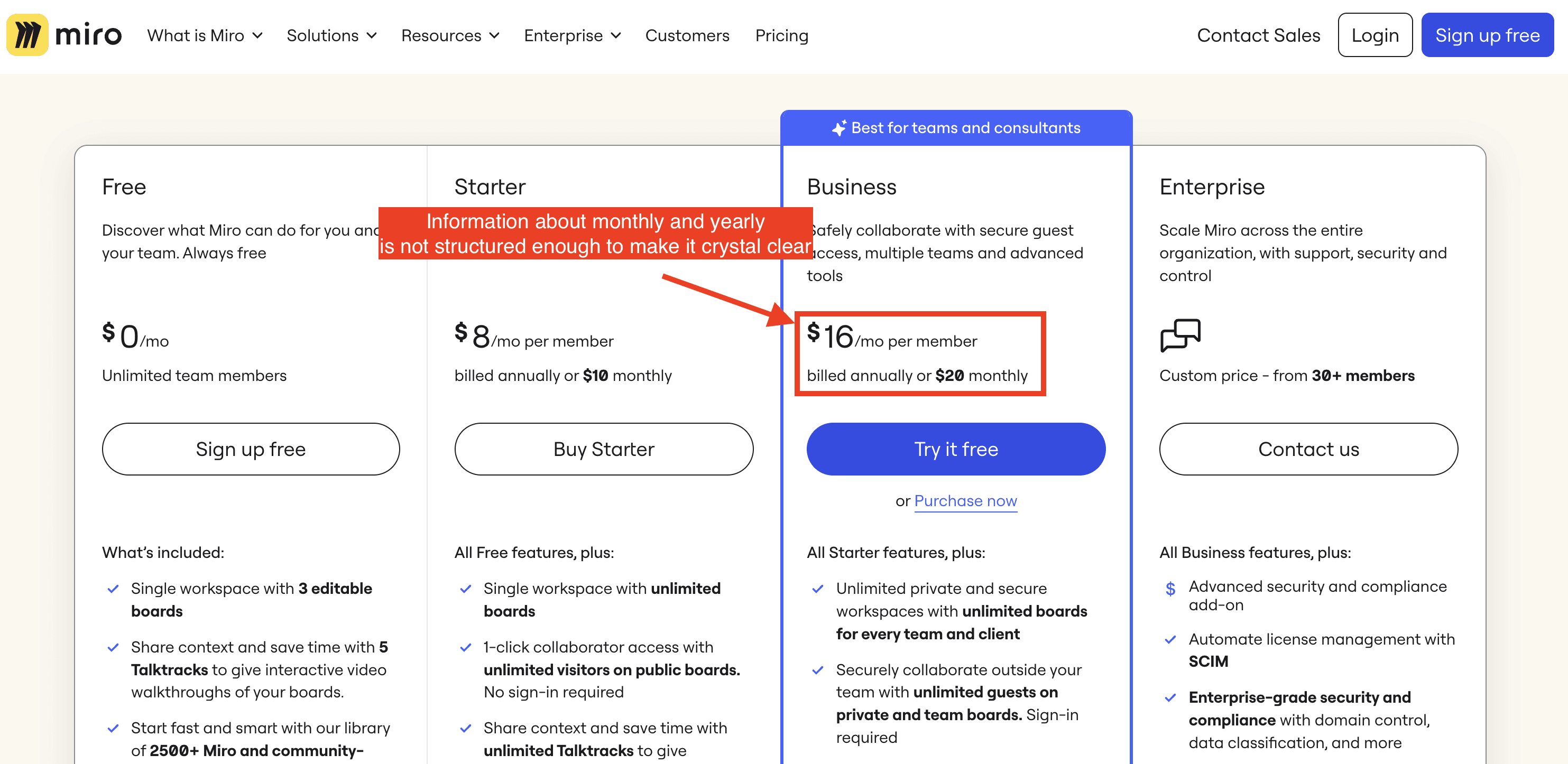
Current Miro’s pricing page
They should implement a toggle button above the pricing plans that allows users to switch between billing periods, dynamically updating the displayed amounts within the plans. This makes it easy for customers to compare costs and see the savings instantly. Contrast does this effectively on their pricing page, setting a great example to follow (see below)
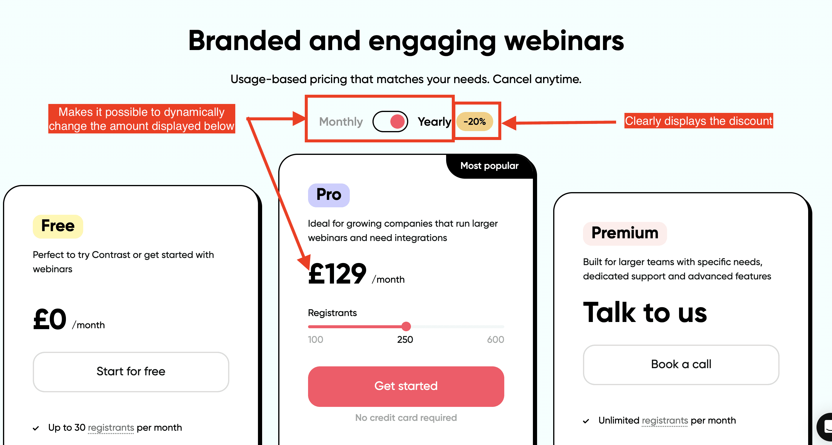
Contrast’s perfect use of a Monthly vs Yearly toggle button
To recap: Main mistakes on pricing pages
Failing to reassure prospects on your pricing page with social proof and a detailed FAQ
Missing the opportunity to use your headline to communicate key details about your product and pricing
Lacking clarity in pricing by not emphasizing the yearly discount and omitting the option to switch between currencies
