8 Proven Strategies for Crafting a Pricing Page Without Revealing Exact Prices
Learn how to design a high-converting pricing page without disclosing specific prices, using strategies that build value, foster transparency, and maximize lead generation.

Oct 25, 2024
We often assume that the primary purpose of a pricing page is to display product prices. However, some software companies deliberately choose not to include prices on their pricing pages for various reasons.
In such cases, it's essential to follow a few key principles when designing these pricing pages.
I’m going to give you 7 tips to design a high-converting pricing page, when you don’t want to reveal the exact prices.
Why choose not to display prices on a pricing page?
There are several reasons why you might choose not to display exact prices on your pricing page:
You may offer a complex pricing structures:
You may price based on features, allowing customers to choose a “menu” of options.
You may offer multiple products, making it too challenging to present all prices on a single page.
If professional services make up a significant part of your offering, their custom nature may make standardized pricing impractical.
You evolve in a market, where the norm is not to display prices.
In some markets like Enterprise software, it’s common not to display prices. While prospects may still get a general idea of your pricing from quotes shared with competitors, listing prices upfront might deter those who prefer to negotiate during calls. This is often because there is high elasticity in the range of possible prices, allowing for flexibility in what can be offered.
Regardless of your reason, having a pricing page remains crucial.
Principle 1: Put way more effort into describing your value
Your pricing shouldn't be determined simply by adding your costs to a desired profit margin. Instead, it should reflect the value you deliver to your customers—whether it's the time you help them save, the additional revenue you enable them to generate, or the number of new leads you help them acquire.
When communicating your pricing, focus on highlighting the value you provide to your prospects. Whenever possible, include estimated figures that illustrate this value.
Ninetailed, for example, effectively demonstrates this approach on their pricing page.
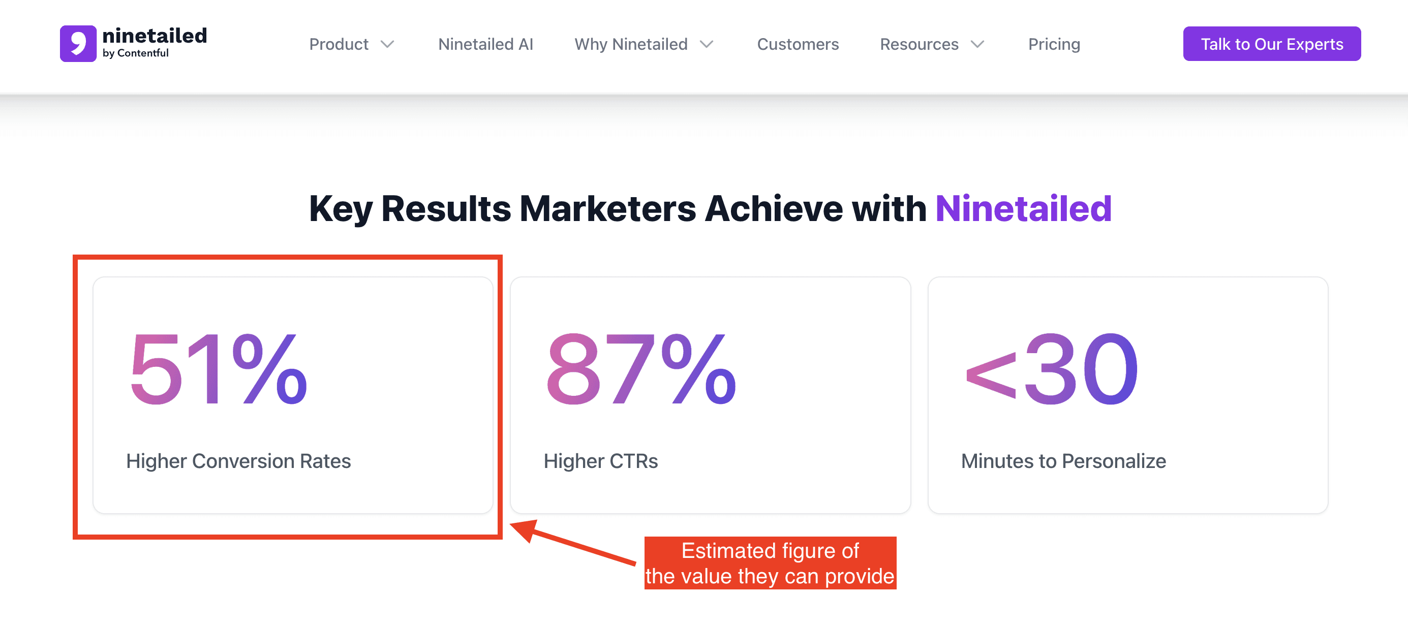
Ninetailed’s pricing page
Part of the value you provide is determined by the specific pain points you address for one or more customer personas. Clearly outlining these pain points and explaining how your product resolves them is a powerful way to demonstrate your value. This approach also sets the stage for smoother negotiations. When prospects understand the challenges you address from the beginning, they are less likely to be surprised when you present your Enterprise pricing.
For example, Qualtrics effectively highlights the pain points addressed by each plan tier on their pricing page.
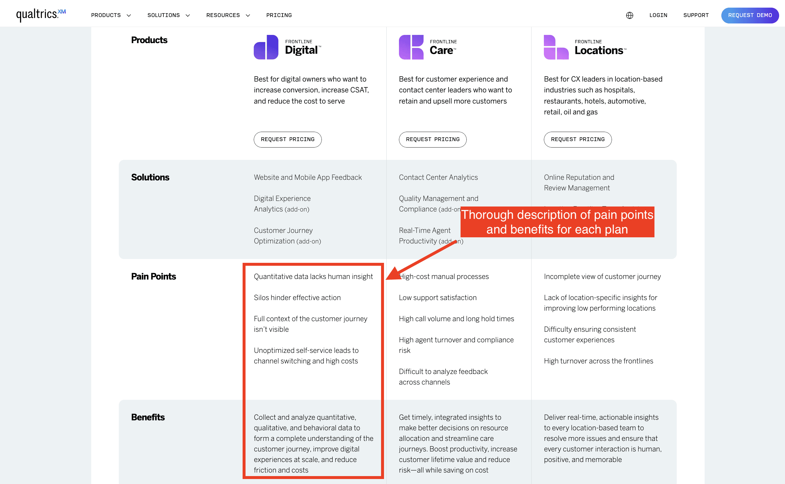
Qualtrics' pricing page
Another great example is Brandwatch, which goes a step further by providing a detailed description of the pain points addressed for each persona. This tailored approach helps prospects see exactly how the solution meets their unique needs, making the value of each plan even clearer.
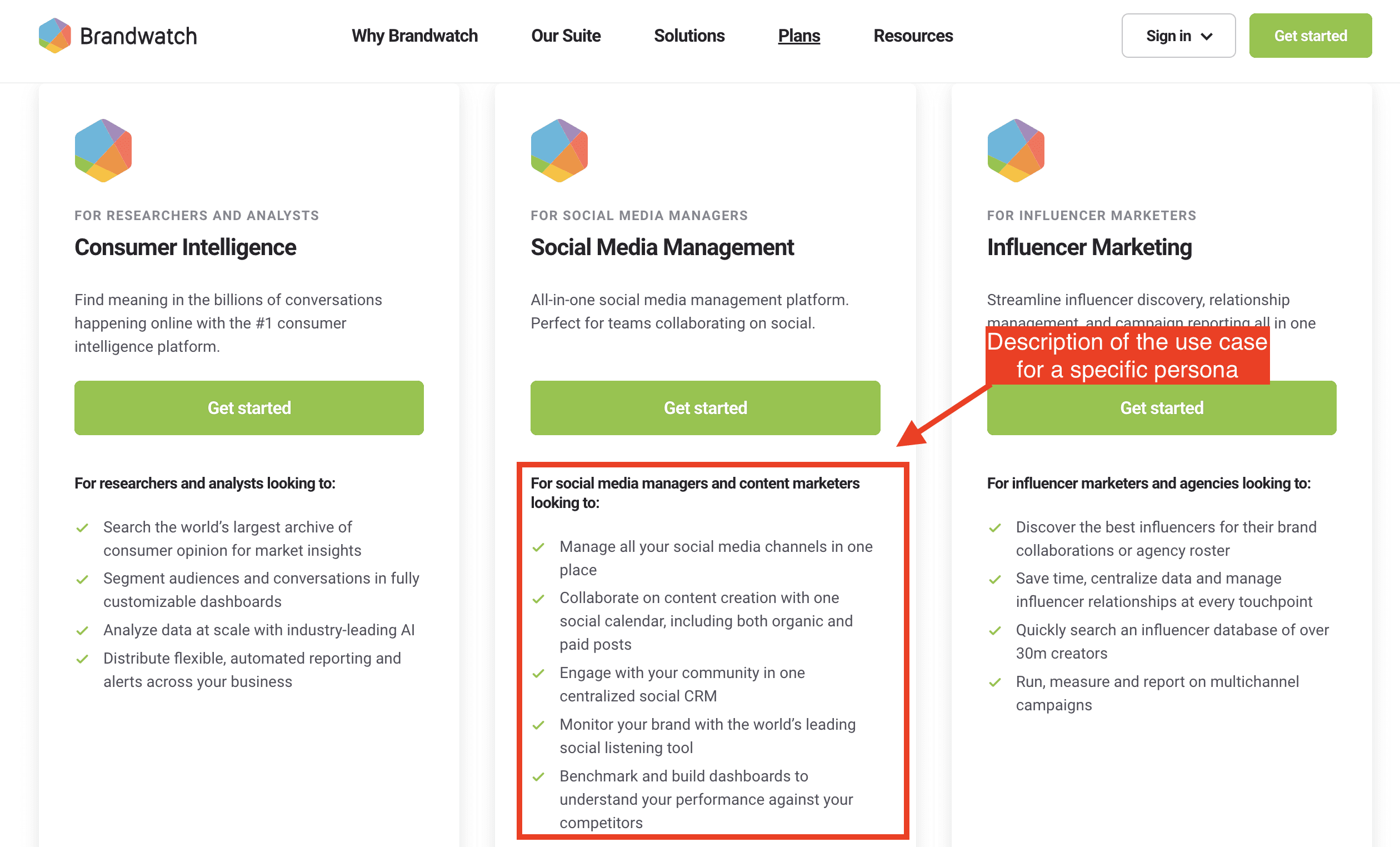
Brandwatch’s description of use cases for each persona
Conveying your value proposition in the headline of your pricing page is one of the most effective practices to implement. It sets the tone for your offering and helps potential customers quickly understand the benefits of your product. This is often the first piece of feedback I provide to my customers when roasting their pricing page 🔥
I've noticed that companies that don't display prices directly often excel in crafting headlines that clearly convey their value proposition. They focus on explaining the benefits of their solution, making it easier for prospects to see the value.
A great example of this is Workday's pricing page. Their headline effectively communicates key benefits like "make better decisions faster" and "a better way to plan," while also offering reassurance about their pricing model with phrases like "find the plan that’s right for your business" and "for every organization." This approach helps potential customers feel confident that they'll find a plan suited to their needs.
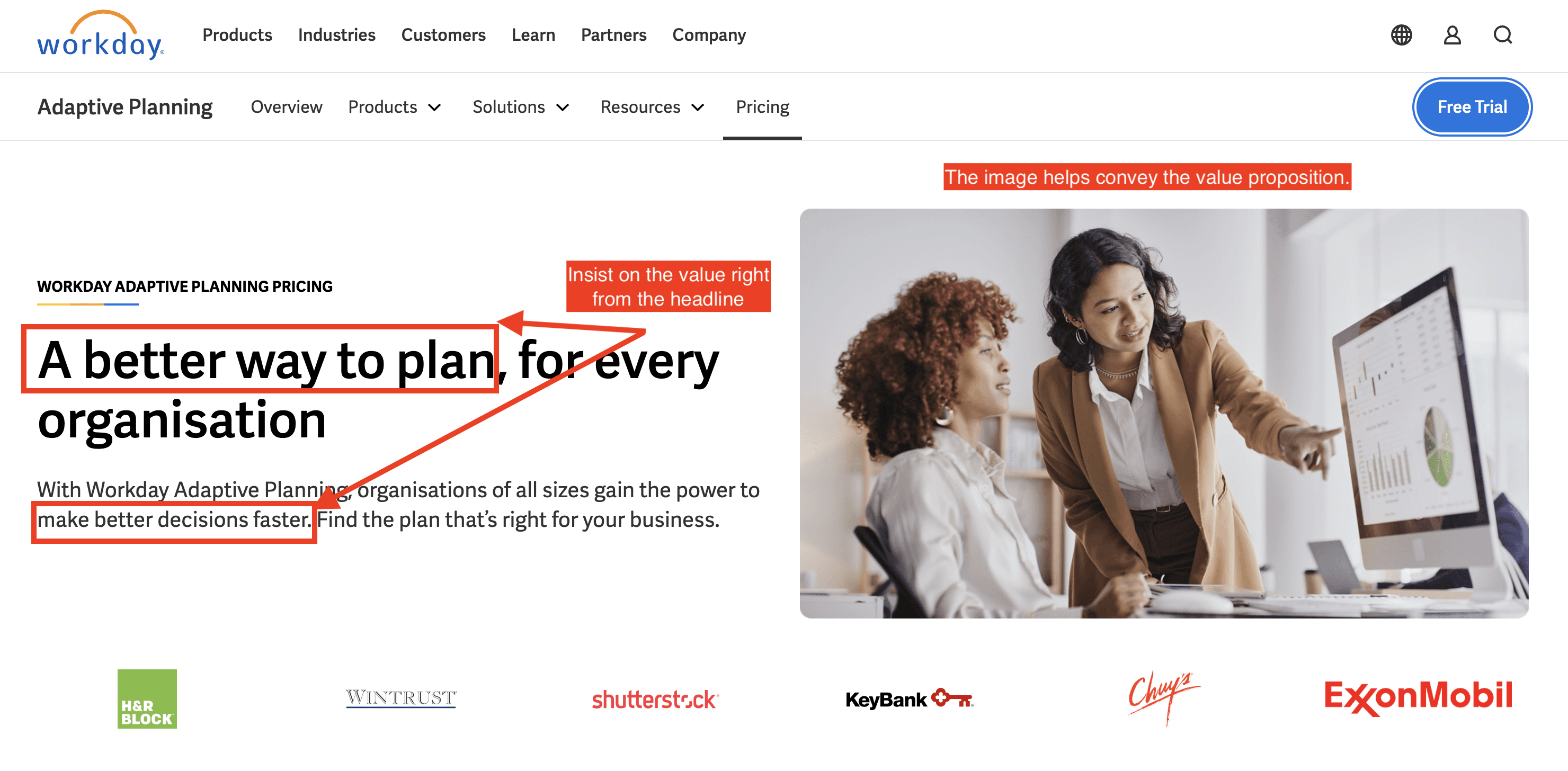
Workday’s top of their pricing page has a lot of elements that convey their product’s value
Principle 2: Compensate with a detailed description of our pricing model works
I've often encountered companies that hesitate to share exact prices on their pricing pages. However, it's rare to see a SaaS company that isn't willing to explain how their pricing works.
Is the pricing based on usage, the number of team members, or other criteria? Do they offer both monthly and annual billing, or only annual? In most cases, sharing these details doesn't compromise your go-to-market strategy.
In fact, being transparent about your pricing model can simplify sales conversations. Just as sharing the value of your product helps set expectations, explaining your pricing model upfront reduces the chance of misunderstandings. This transparency allows you to focus the conversation on deeper topics, rather than spending the majority of a meeting clarifying how your pricing works.
Here are a few examples to take inspiration from:
Splunk provides a great example of how to describe different pricing models without disclosing specific prices. They dedicate a separate webpage for each pricing model, offering detailed explanations. This approach allows them to clarify the structure and benefits of each model, such as usage-based or subscription-based pricing, while still maintaining flexibility in how they present their actual pricing. It ensures potential customers understand the options available to them, making it easier for them to choose a model that fits their needs, without the pressure of seeing exact numbers upfront.

Splunk’s pricing page links to other pricing page specifically describing each pricing model
New Relic sets a strong example with a dedicated section that explains how their pricing is calculated. Even though it offers a high-level overview, this section clearly outlines the parameters that influence the final price and how these components come together. This transparency helps potential customers understand the factors impacting their costs, creating a sense of trust and clarity. What stands out is how they position this explanation directly beneath the headline on their pricing page. This strategic placement ensures that visitors quickly grasp how the pricing works, setting the stage for a more informed and productive conversation with the sales team.

New Relic’s pricing model description
Huboo provides another interesting example. While they do display some pricing information, it's not immediately visible—it's tucked away, with numerous “Get a quote” buttons throughout the page. This suggests that they likely follow an Enterprise pricing model with bespoke pricing tailored to each customer.
What’s noteworthy is that Huboo uses most of their pricing page to explain how their prices are determined. They break down their pricing structure by country and other key parameters, offering a detailed view of the factors that impact costs. This approach helps potential customers understand the complexity behind the pricing, emphasizing transparency while still encouraging direct contact for a tailored quote. It’s a smart way to balance openness about the pricing model with the flexibility of custom pricing.


Principle 3: Provide more info about your set of features
Quite the same principle as for the Principle 1 and 2, but applied on the set of features of your product
If you strategy allows, you can compensate the lack of pricing description with a more comprehensive description of features.
This is clearly visible on some pages I came across:
Mews.com provide a very complete feature comparison table. This kind of design elements is a key element to add on any pricing page of SaaS businesses. However, I often advise my customers to hide them under a “Collapse” button that enables to hide or display the full table. Indeed, it often takes a lot of spaces on the page, so you don’t want to overwhelm the customer. But in the case of pricing pages with no prices, you can allow yourself to full display it as Mews does.
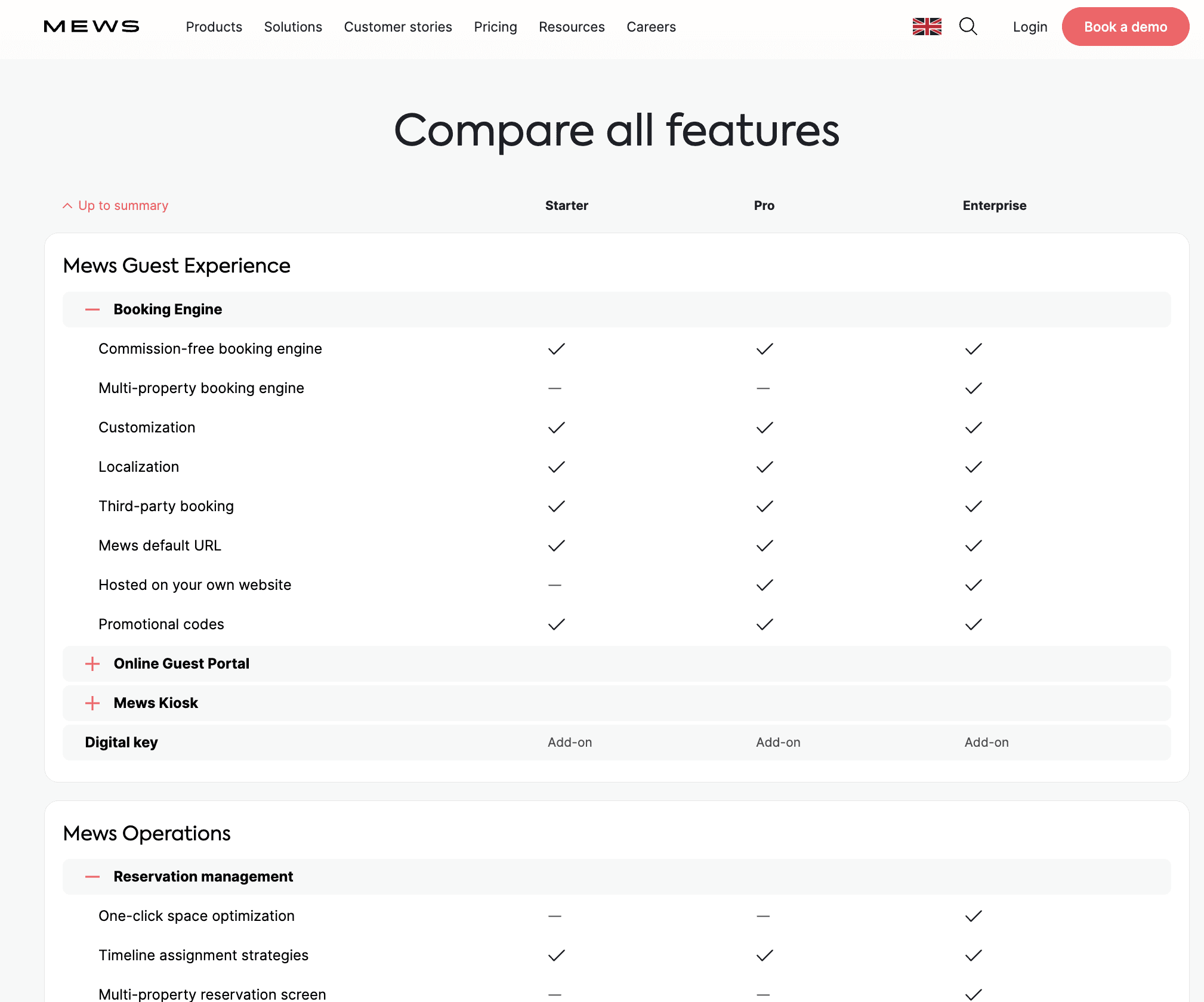
Mews’s feature comparison table display an exhaustive list of features
This more comprehensive description of features can be done via a FAQ that is more product oriented rather than pricing oriented. Generally speaking, my recommendation for FAQ pricing pages is to show a majority of questions that are related to pricing. However, in those specific use cases, you can choose to describe more features in the FAQ. Here’s the example of Datadog, where the list of questions are very much focused on the feature set they do offer.
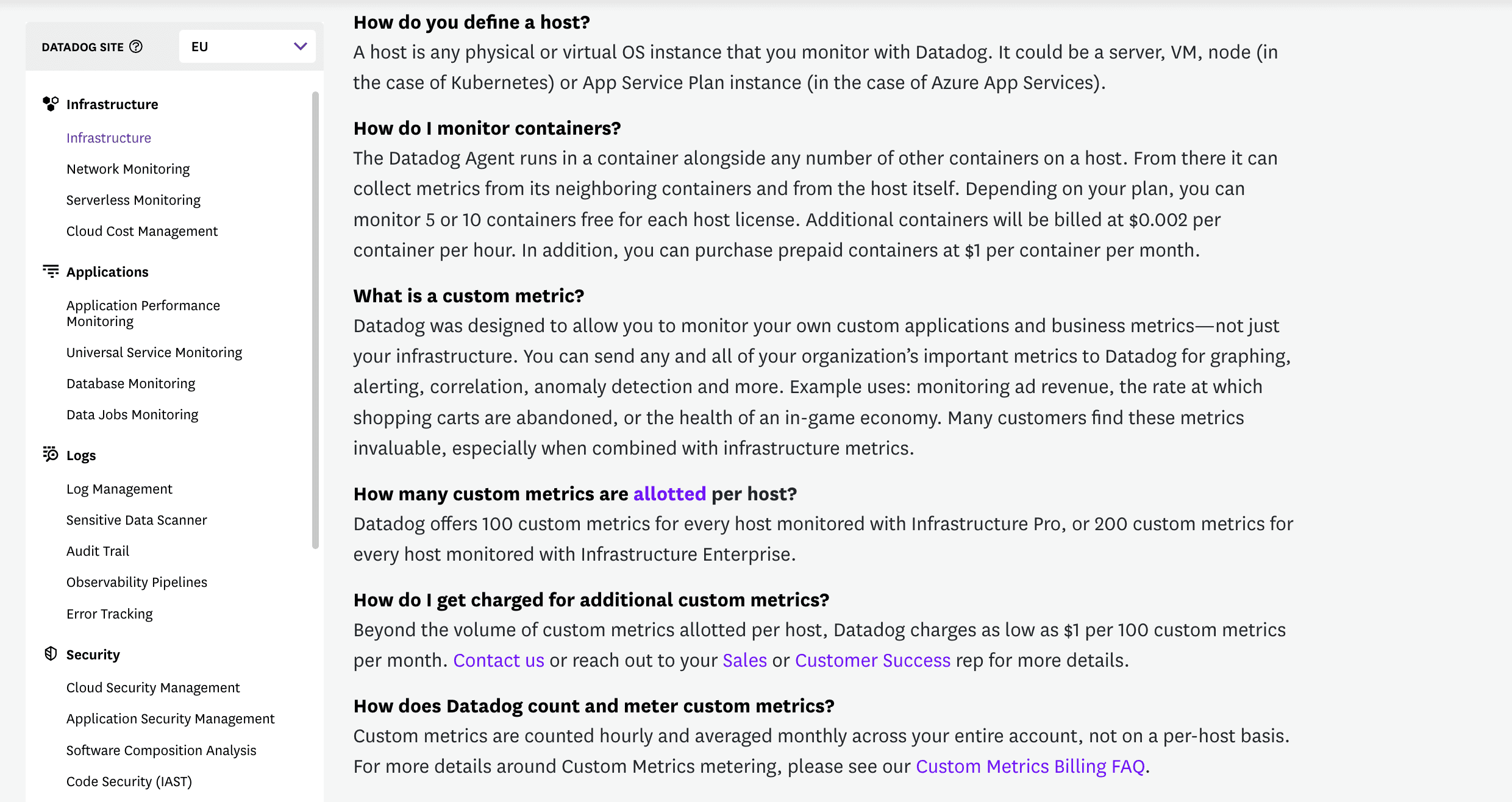
Datadog's FAQ on their pricing page
Another good practise is to explicitly redirect your user to a page that is dedicated to describing the full set of features the product does offer. This is not necessarily something I would advize my customer, as what you want is nudge the users to sign-up, and not switch to another page. But in this specific case, that can work. Here’s an example with Brevo’s Customer Data platform that is tailored for Entreprise customers:
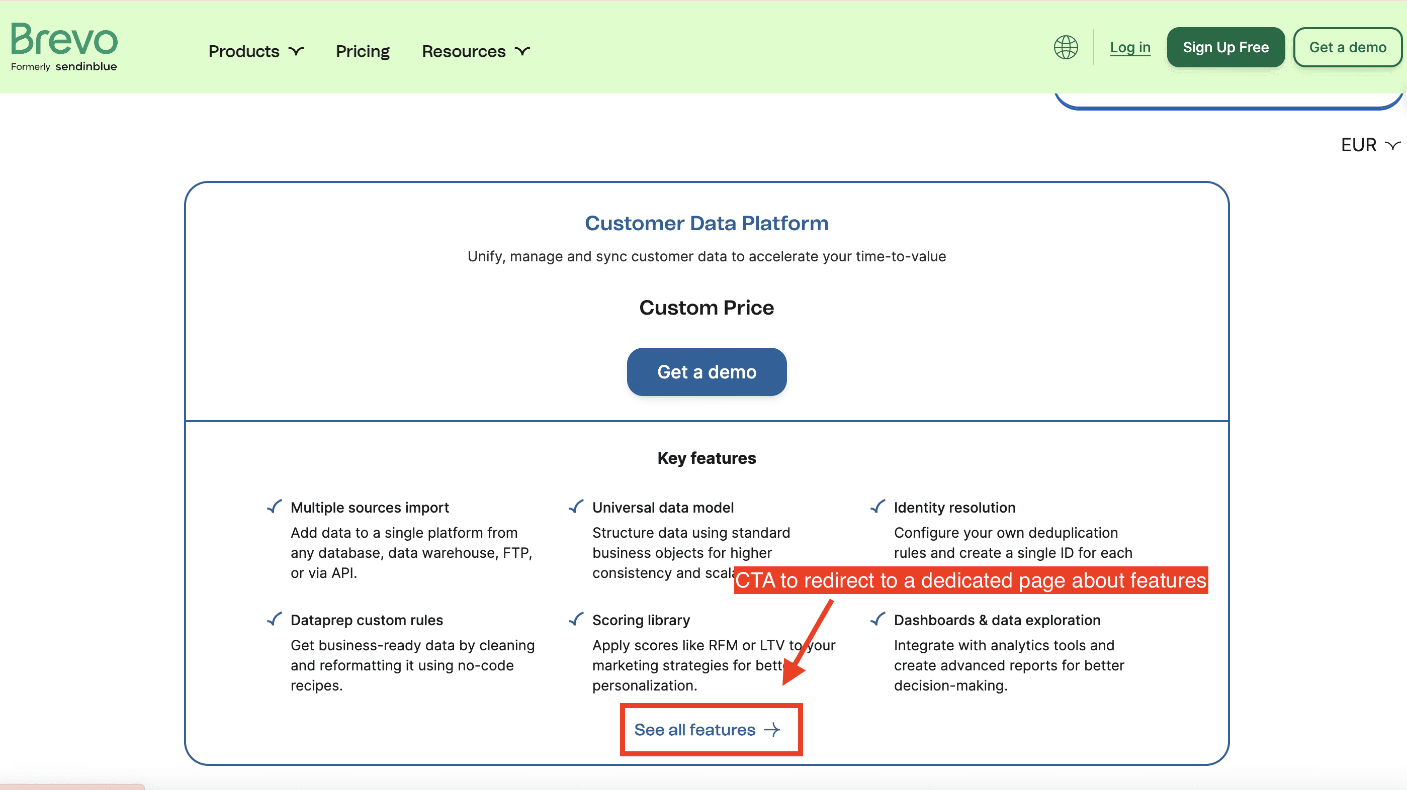
Brevo's pricing page on their Customer Data Platform offer
Principle 4: Include Call-to-Action (CTA) for scheduling calls
If you don't offer the option for prospects to sign up directly, start a free trial, or explore a freemium plan, the primary goal of your pricing page shifts. It becomes crucial to maximize the number of scheduled calls or demo requests from website visits.
One effective way to achieve this is by prominently highlighting your CTA, such as “Get a demo” or “Ask for a quote.” While I generally don't recommend placing CTAs directly in the headline for most pricing pages—especially those that clearly display prices—this approach can work well when you choose not to display prices. In these cases, a well-positioned CTA can help guide prospects toward direct engagement with your sales team.
Segment serves as a great example of this strategy. They place their “Get a demo” CTA just below the subheadline on their pricing page. This ensures that visitors quickly see a clear next step, encouraging them to reach out for more information and increasing the chances of converting page visits into sales conversations.
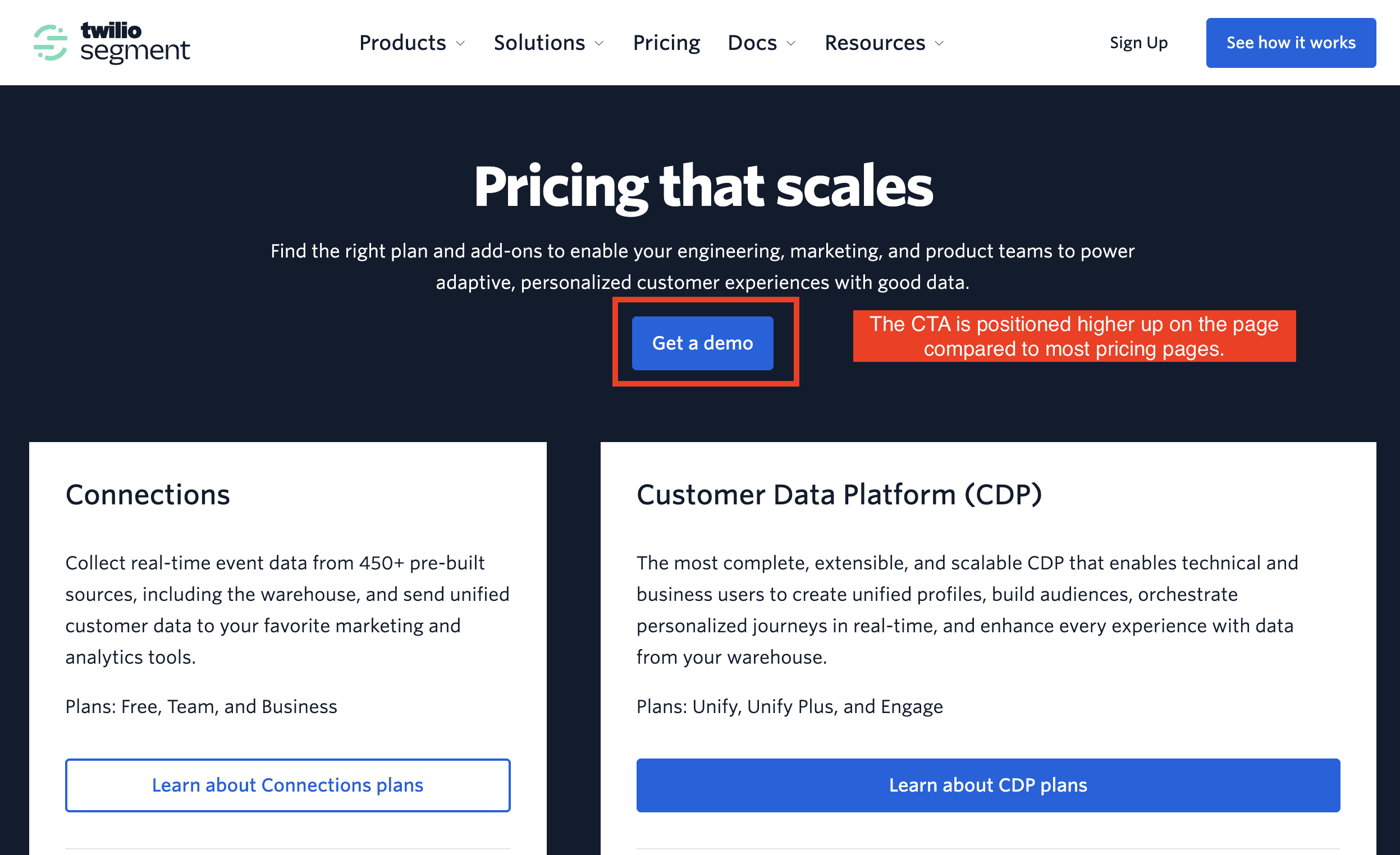
Segment’s pricing page
You can even gently nudge prospects into booking a call by using clever wording for your CTA. For example, ZoomInfo uses the copy “View pricing” with an arrow pointing upward. This design mimics the style often used for buttons that open additional content or a new page in another tab. It gives the impression that clicking the button will reveal more detailed pricing information directly, which can subtly lead prospects into a booking flow without them initially realizing it.
This approach leverages user expectations and design familiarity, creating a smoother transition from browsing to engaging with your sales team. It’s an effective tactic for encouraging prospects to take the next step while maintaining a user-friendly experience.
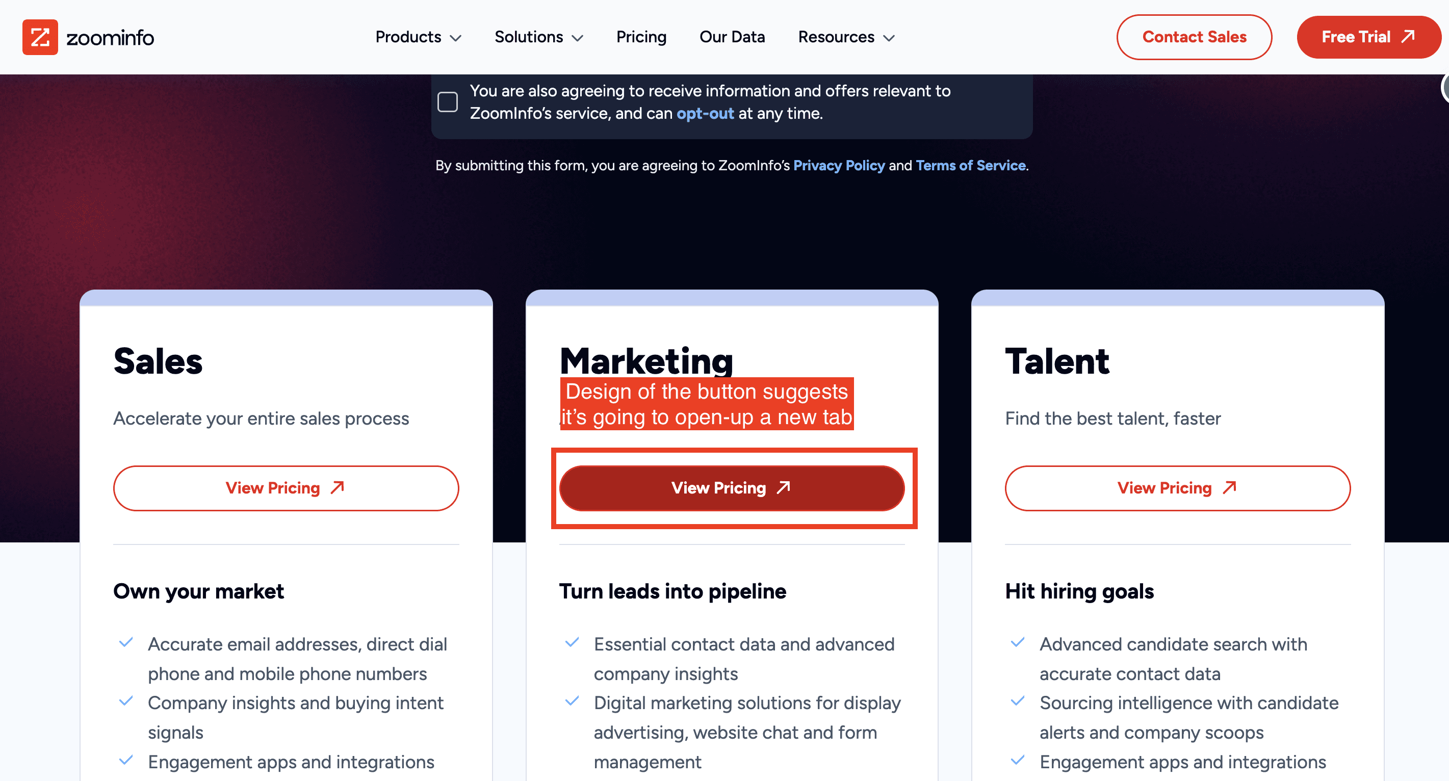
Focus on the copy of the buttons on the pricing page
In this specific case, a form opens up for you to fill out, where you are asked to provide your phone number. However, you do not gain direct access to the pricing offers; instead, you need to speak with someone over the phone.
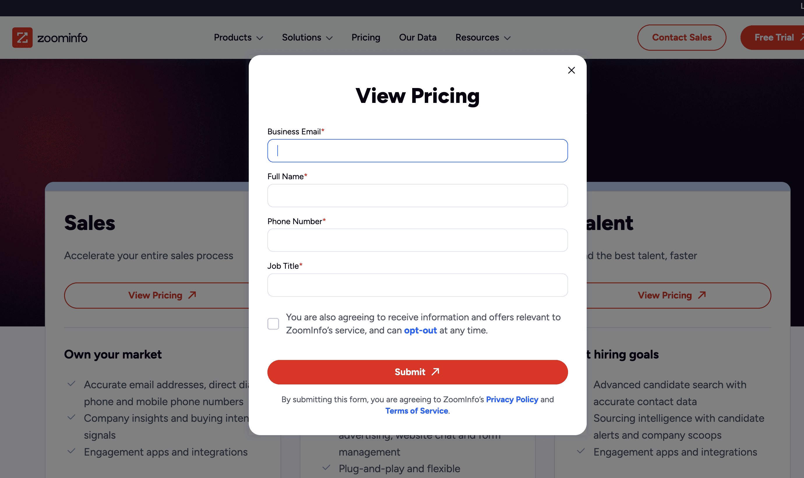
Form that pop-up after clicking on the button
To optimize the conversion rate of prospects signing up, you can embed a form directly on your pricing page for scheduling a call. By eliminating an extra click, this approach reduces friction in the user journey, which, in theory, can lead to a higher conversion rate—especially when dealing with a large volume of visitors.
Talkwalker follows this strategy on their pricing page.
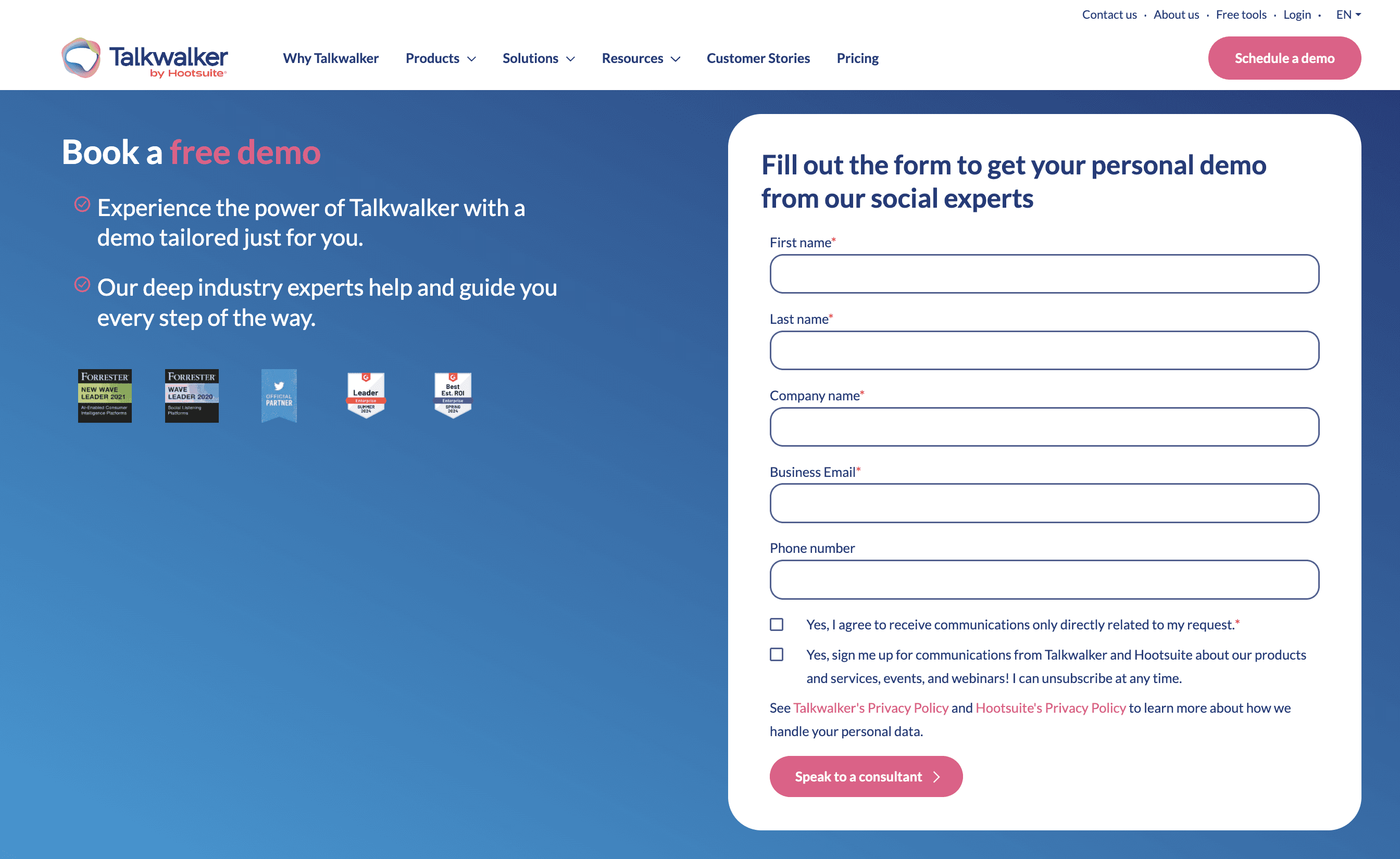
Talkwalker's form on their pricing page
Principle 5: Provide a “ballpark” of your pricing
Even if you choose not to display your exact prices, you can still provide a rough estimate of the price range. Are you offering a solution that costs in the hundreds, thousands, or even tens of thousands? Providing this context can be especially valuable for potential customers who may be unsure if they fit into your Ideal Customer Profile (ICP).
One approach is to follow Okta’s strategy, where the pricing page includes numerous price points, making it challenging for prospects to pinpoint the exact price they would pay. This technique serves two purposes: it subtly conveys that Okta’s pricing varies widely, helping customers gauge the ballpark they might fall into, and it highlights the breadth of Okta's offerings. By displaying multiple products each with their own price, Okta emphasizes the versatility of their product suite and reinforces the perception that they have solutions for a wide range of use cases. This approach can be effective for showcasing the depth of your product line while still maintaining flexibility in pricing.
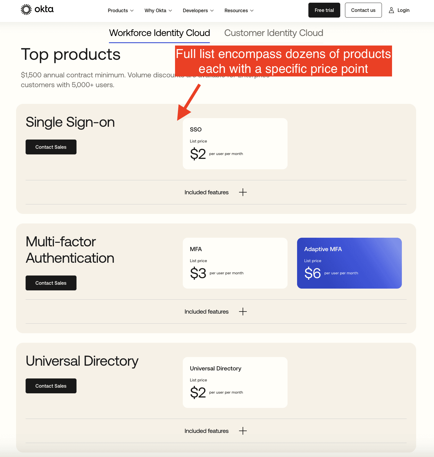
Okta’s pricing page
Another common practice is to be vague about certain aspects of the pricing model, making it difficult for potential customers to determine the exact cost.
For example, Snowflake mentions that they charge based on "credits," but they don't provide a clear explanation of what a "credit" actually represents, leaving customers unsure about the true cost.
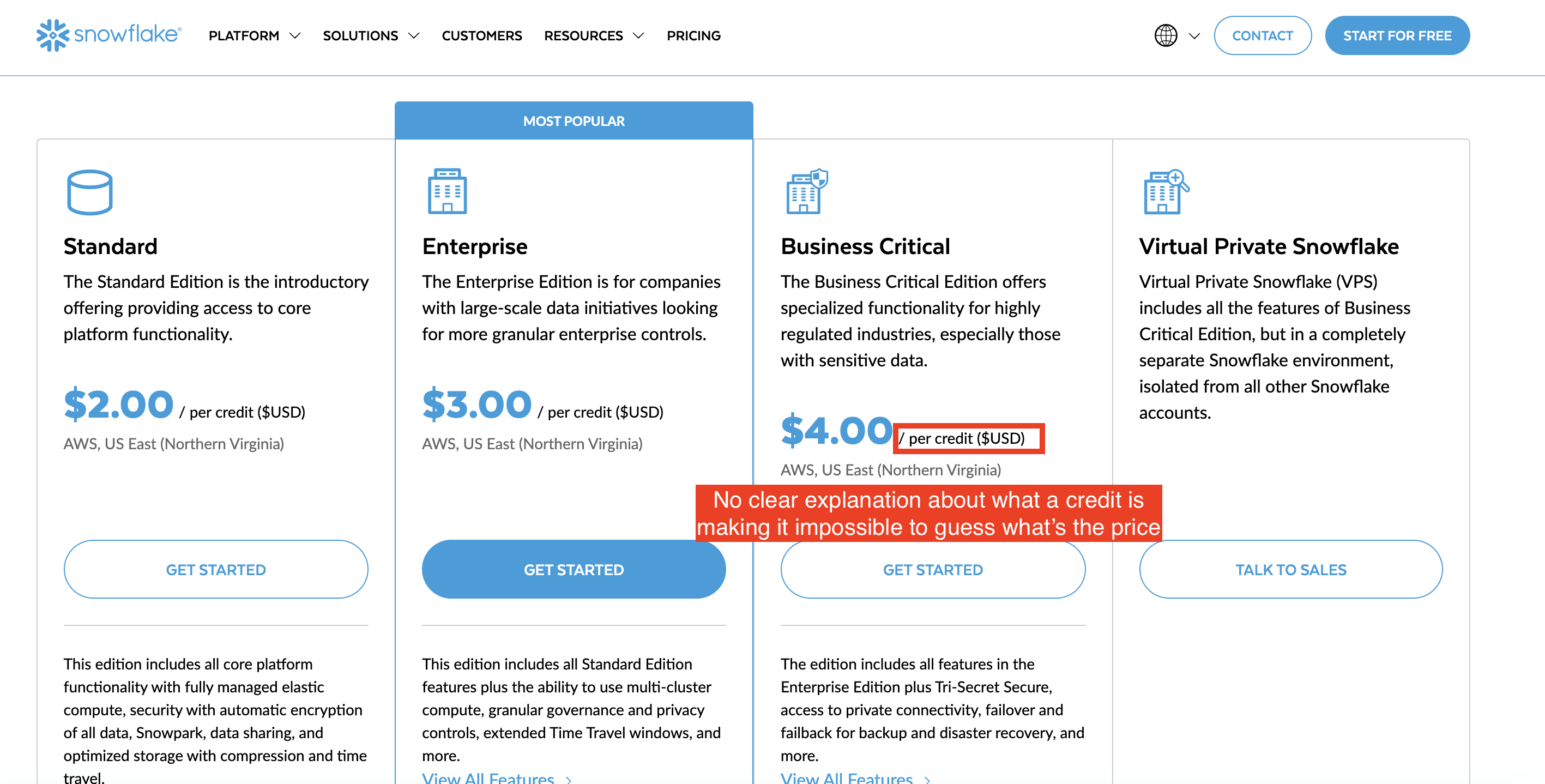
Snowflake’s pricing page
The last practice, which is perhaps the most common, involves using phrases like “Starting at...” This approach provides a general idea of the pricing range without revealing too many details.
For example, UIPath uses this strategy, giving potential customers a rough estimate while keeping the specifics under wraps.
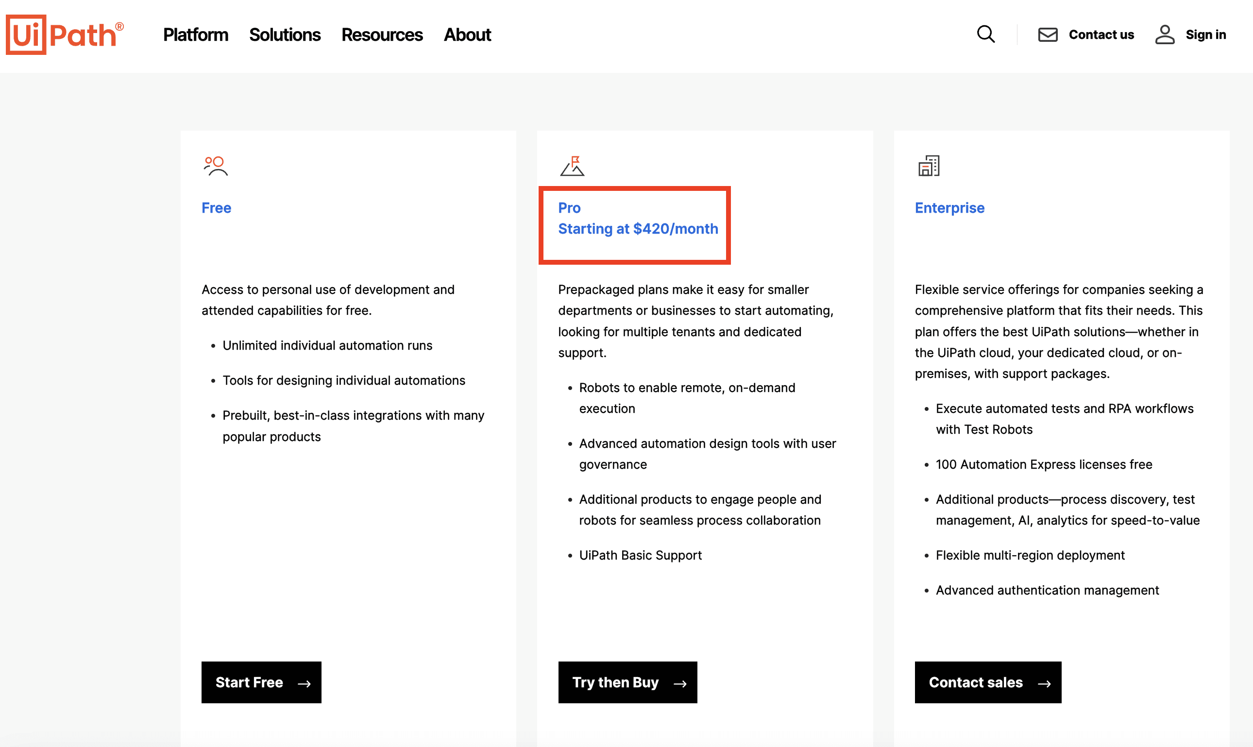
UIPath’s pricing page
Principle 6: Make sure your free trial or self-served plans don’t “cannibalize” your entreprise plans
As a SaaS focused on Enterprise sales, offering a free trial or self-serve plan can generate leads. Tracking usage on these plans helps qualify leads, streamlining the process of converting them to Enterprise customers.
However, it’s important to ensure that self-serve offers don’t undermine your Enterprise focus. The goal is to book meetings, present Enterprise pricing, and close larger deals.
Some companies, like Adjust, clearly differentiate self-serve and Enterprise plans. They use a credit-burndown model, showing a 1,500-credit monthly limit for their Base plan, versus a 250,000-credit yearly limit for their Core plan. This contrast helps steer Enterprise prospects towards higher-tier plans.
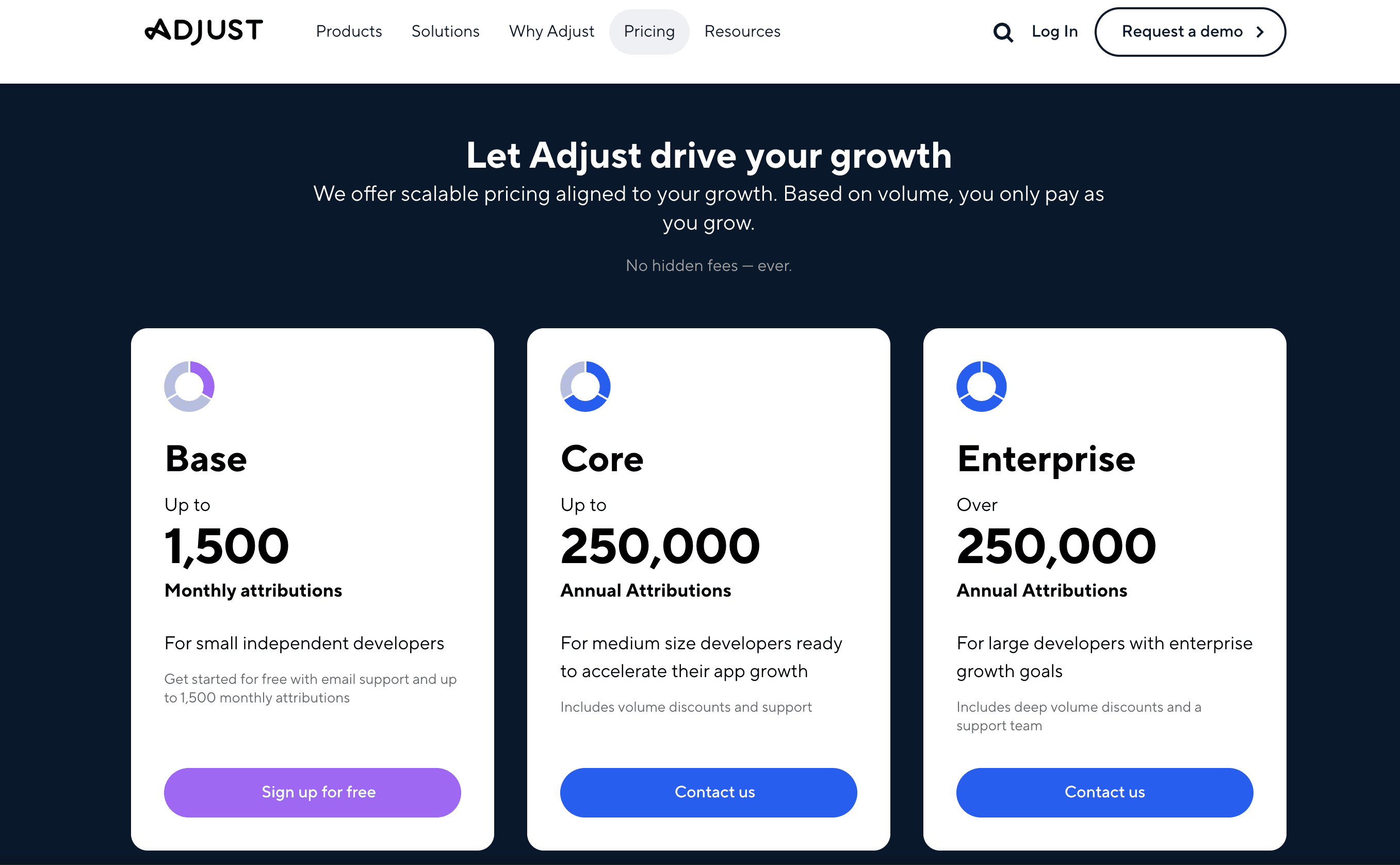
Adjust’s pricing page that combines a self-served plan (Base), and a sales-served plan (Core)
To prevent self-serve offers with visible pricing from overlapping with Enterprise plans, where the focus is on discussing prices during sales calls, you can tailor your pricing page design based on the prospect's company type. Often, firmographic data (like company size or sector) correlates with their likelihood to choose a self-serve or Enterprise plan.
Using IP enrichment tools (e.g., Clearbit) combined with tools like Mutiny, which allows for JavaScript modifications based on criteria, you can dynamically adjust the page design for Enterprise prospects. This might include emphasizing CTAs for scheduling calls and applying strategies suited to Enterprise leads. Livestorm uses this approach on their pricing page, as detailed in my article about their new pricing page and how it fits their new GTM strategy.
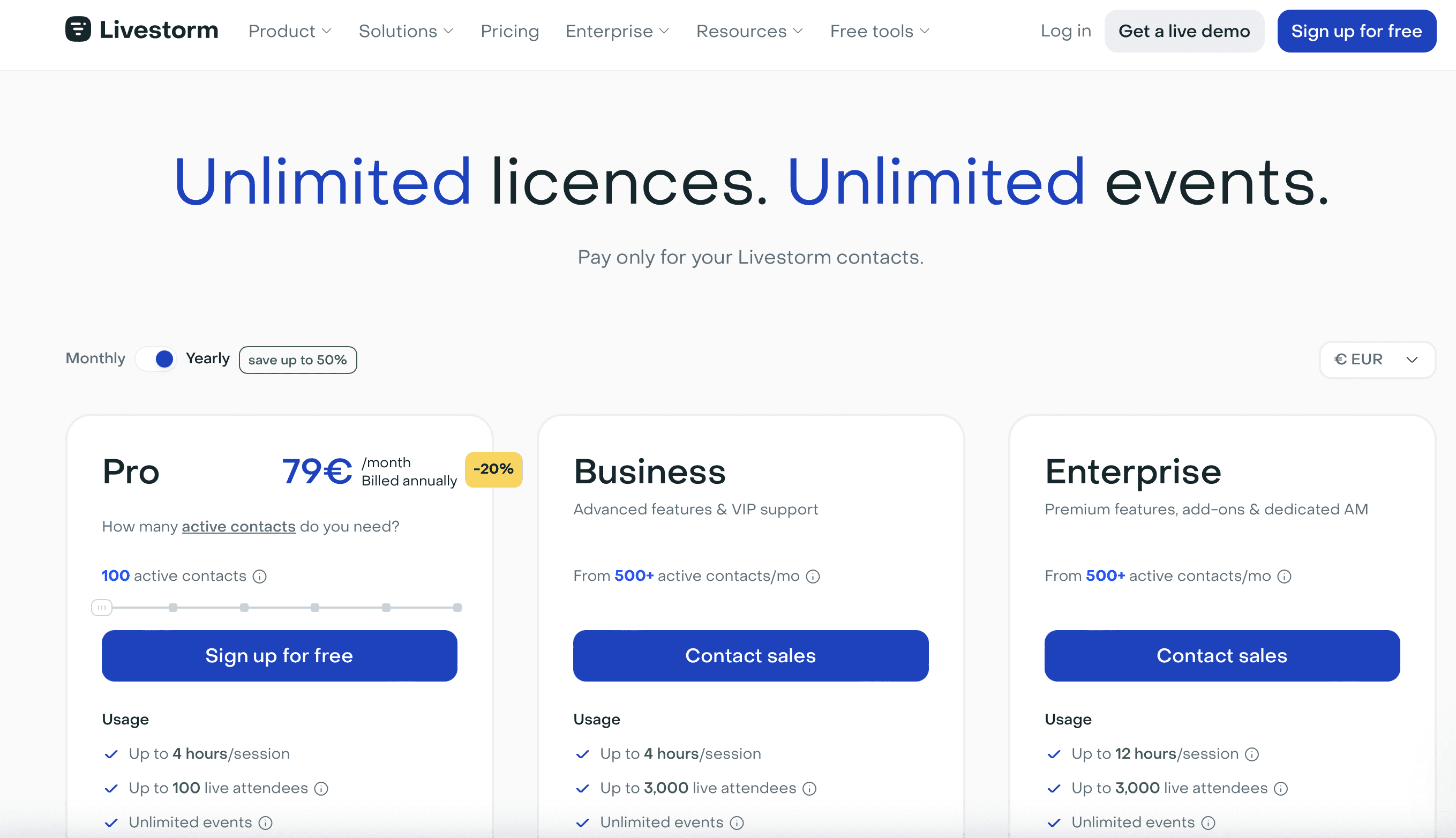
Livestorm’s pricing page changes depending on the IP address of the prospect
Livestorm’s pricing page changes depending on the IP address of the prospect
If you push too much of your traffic toward a sales-driven process because you fear that self-serve plans might cannibalize your sales efforts, you risk involving low-value prospects in sales conversations. This means your sales team may waste time with leads who lack the budget for your Enterprise offerings, leading to frustration and reduced sales efficiency.
To avoid this, you can offer a pre-recorded demo instead of a personalized one with a salesperson. This ensures that only qualified prospects reach your sales team, saving time and improving efficiency. Livestorm uses this strategy on their pricing page, asking prospects if they prefer a pre-recorded or personalized demo when filling out the scheduling form.
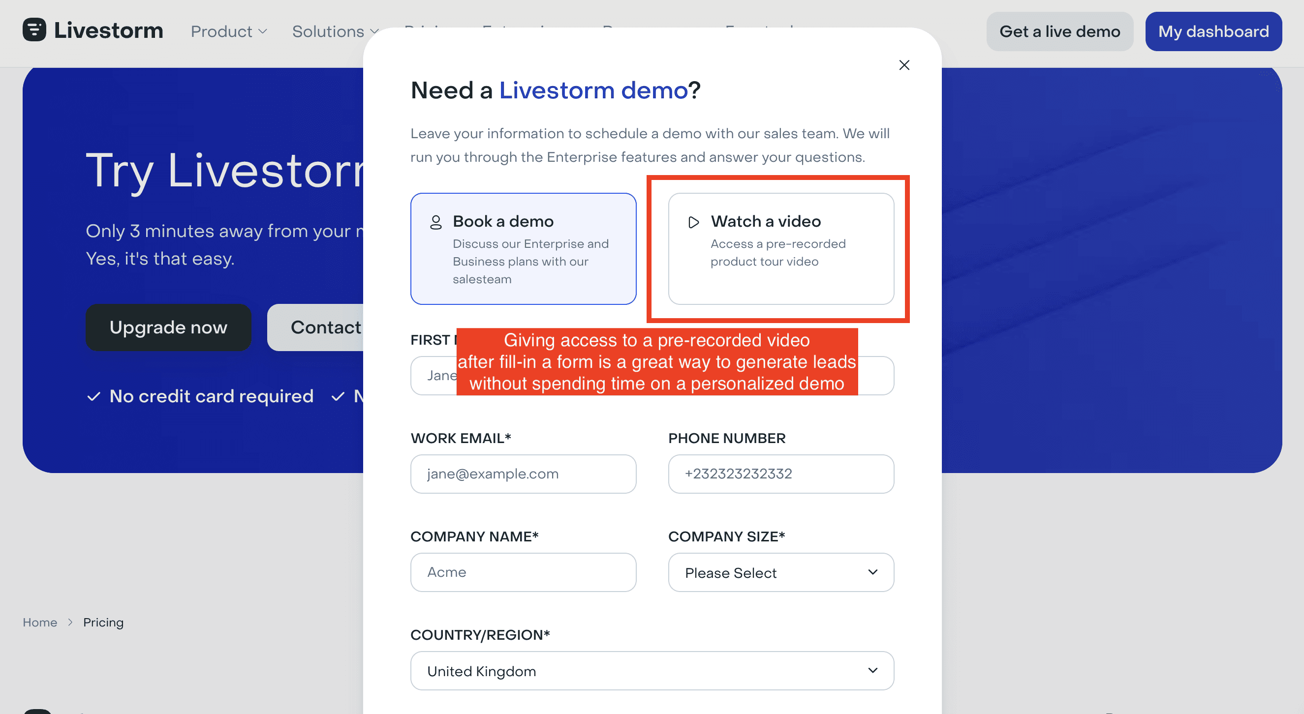
Livestorm’s sales form enables to choose between a personalized or standard demo video
Principle 7: Focus on creating more trust
Just like with Principles 1, 2, and 3, when you choose not to display your prices, you can offset this by building trust in other ways to boost your chances of success.
Typically, the customers you’re targeting with this approach are those considering Enterprise plans, which usually come with a much higher price tag. This makes trust even more crucial in these situations. Demonstrating credibility and reliability can help reassure prospects about the value of your offering, even when pricing details aren't immediately available.
Here are various examples of how you can reinforce trust on your pricing page:
Instead of simply sharing written customer testimonials, consider using video testimonials. This format feels more authentic and detailed, helping to build stronger trust with potential customers. For instance, LocalRanker uses this approach on their pricing page, making their testimonials feel more genuine and engaging.

Localranker’s pricing page uses video to display customer’s testimonials
You can also make it super easy for potential customers to access case studies directly from the pricing page. By showcasing real-world success stories alongside your pricing, you help prospects understand the tangible benefits of your product and how it has delivered results for others. This can provide additional context and confidence for those considering your service. For instance, Komin incorporates case studies right on their pricing page, allowing visitors to quickly see the impact their solution has had on other customers.

Komin’s pricing pages leverages links to dedicated pages to describe the corresponding study case
To reinforce trust on your pricing page, you can prominently highlight any awards or recognitions your company has received. Showcasing these accolades helps to validate your credibility and assures potential customers that your product or service has been recognized for its excellence. For example, Tomorro emphasizes their awards on their pricing page, which helps build trust and reassure prospective clients about the quality of their offering.

Principle 8: Insist on exclusive offers
What justifies an Enterprise plan is typically a higher level of customization, premium support, or exclusive features throughout the customer's journey with the product. When prices aren’t displayed, emphasizing these tailored benefits can help convey the added value of the plan.
Take the example of Cycle, whose pricing page highlights partnerships they have negotiated with popular podcasts that reach the same target audience. This strategy not only enhances their credibility but also shows potential customers that they are aligned with trusted voices in the industry, making their offering more appealing.
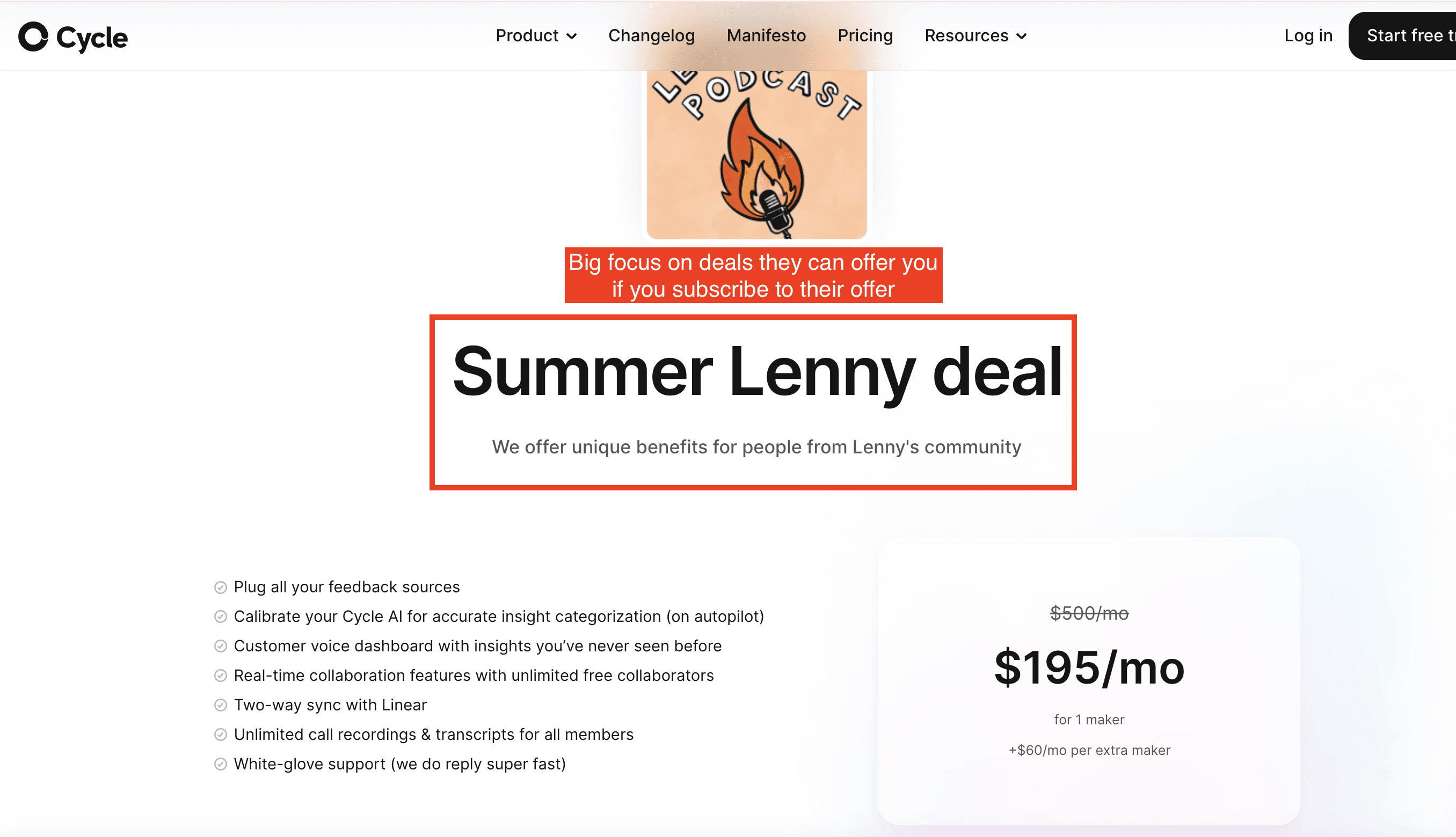
Cycle’s pricing page solely focuses on the deal they have with Lenny’s podcast
Gong, on their side, ensures they qualify your needs by using copy that focuses on how their solution can specifically help you. They achieve this through an interactive form available directly on their pricing page. This approach makes the experience feel more personalized and tailored, giving potential customers a sense of exclusivity right from the start.
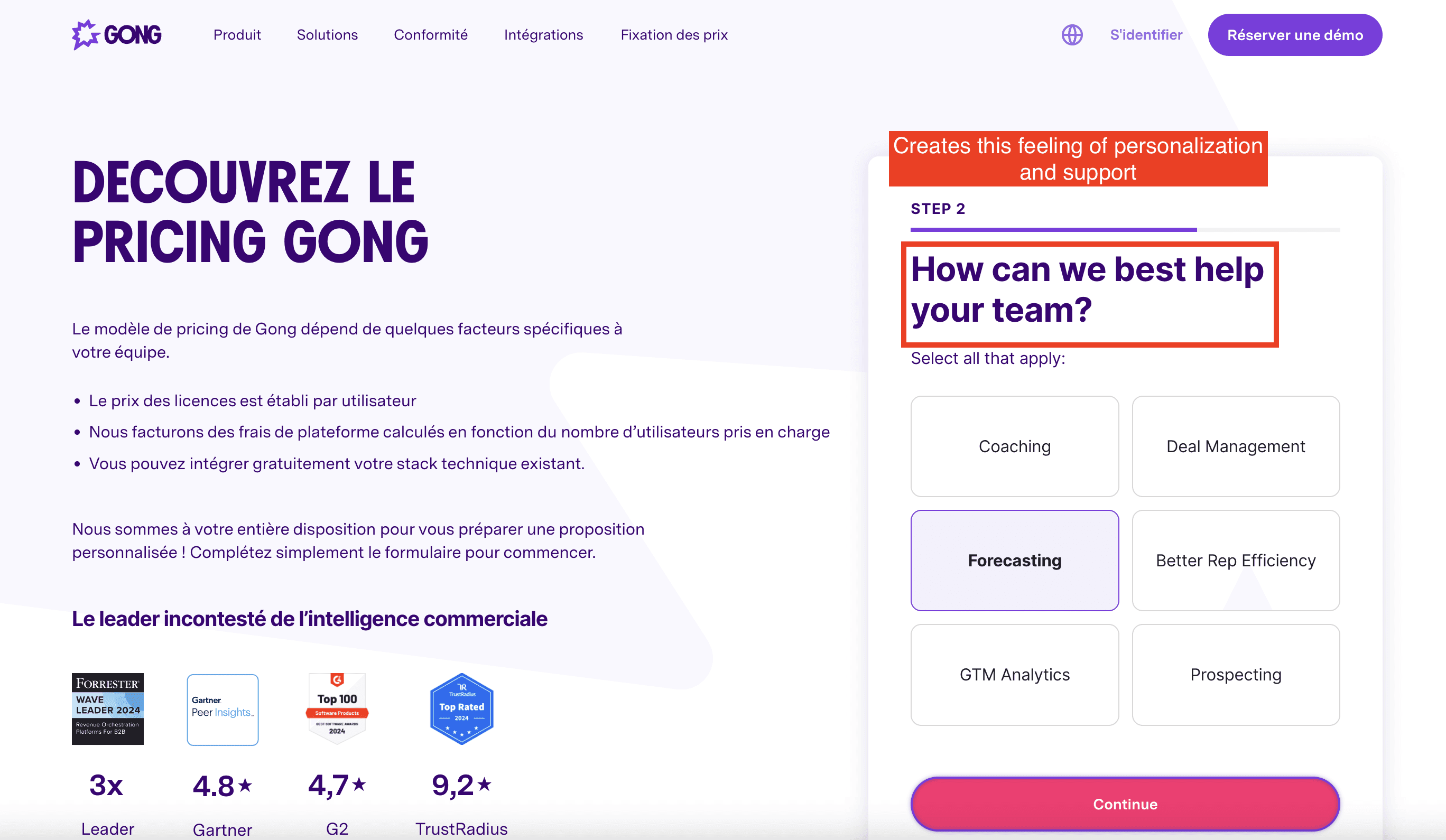
Gong’s pricing page offers a form that allows prospects to personalize their experience.
