[ROAST DEEP DIVE] Descript’s Pricing Page
Dissecting Descript’s Pricing Page: Key Copywriting Tactics, Plan Optimization, and Design Tweaks for Maximized Conversions

Oct 18, 2024
It’s been a long time I haven’t shared the roast of a pricing page. Let’s focus today on Descript’s pricing page.
Descript is a SaaS platform that streamlines video and podcast editing, making it really fast and efficient. It's the ideal tool to complement any software you use for recording videos and podcasts.
Here’s a concise description of Descript’s business:
Company name: Descript
Date of creation: 2017
Revenue: ~28M ARR in 2023
Pricing model: Licence-based
Self-served?: Yes
Start for free?: Freemium plan
Headline of their pricing page

Descript's headline
The headline on a pricing page is one of my favorite design elements. It's less about design and more about copywriting.
Many SaaS businesses overlook the headline, yet it's crucial. It should communicate both the product's value proposition and a key aspect of the pricing model, especially if it offers reassurance to customers.
In this case, the headline gives a small hint that the pricing adapts to different project types. This could suggest it adjusts to project size, implying a license-based model. But it's a bit of a stretch, and there's room for improvement.
Here’s an example using a sub-headline (no more than 100 characters):

A proposition to improve Descript’s headline leveraging a sub-headline to provide more info about the value prop.
Plans
Toggle on the billing period

Toggle button annual vs monthly
I like that the annual billing is selected by default. This is a common and effective practice. It’s familiar to prospects, so they won’t feel tricked, and it allows you to display lower prices, which is always a plus.
I also appreciate that the discount is shown, even when monthly plans are selected. I would enhance it further by using a tag instead of plain text (see alternate designs below).
The toggle element feels a bit too small compared to other SaaS pricing pages. Also, it’s more common to place Monthly on the left and Annual on the right, even if you default to annual billing.

A proposition to improve the toggle to switch billing periods
Plans description

The plan description should be located between the plan name and the price point. When the description is below the price point, it tends to be overlooked, because the eye and brain focus on the price.
The Hobbyist plan description mention “watermark-free”. It’s a good thing to mention an important feature that makes the plan stand-out. However, this does not create in my opinion a big enough anchor for the prospect to really associate with the plan.
The plan name kind of start doing the job: when you read “Hobbyist”, you understand that this plan may be purposed for BtoC customers. However, to create a better anchor with the plan description, it’s important to formulate it in such a way that it mentions the main use case and/or the corresponding persona.
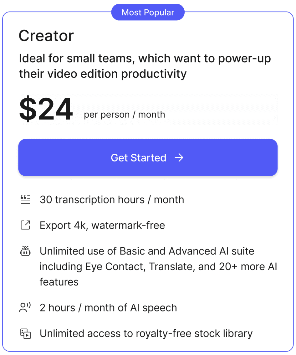
Proposition of a new plan description for the Creator plan
Feature lists within the plans
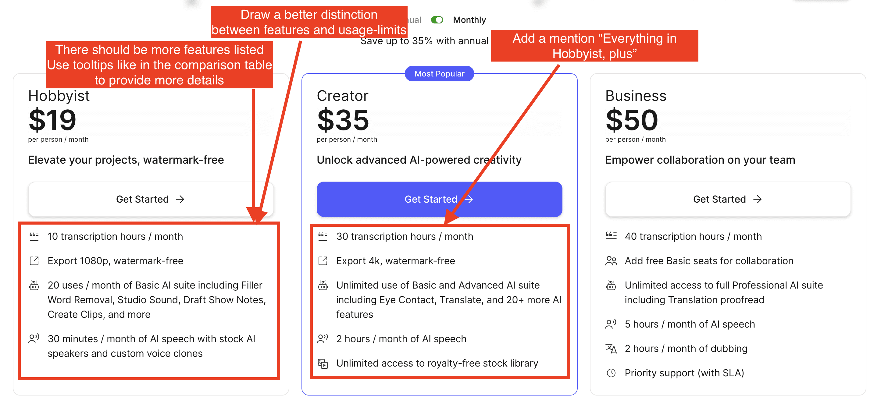
List of features within Descript's plans
The feature list is concise, which is great since many SaaS tend to overwhelm users with too many features within the plans.
To structure the features within a plan, I like to categorize them into two types:
Features limited by usage. In the Hobbyist plan, for example, this includes “10 transcription hours/month,” “20 uses/month of Basic AI,” and “30 minutes/month of AI speech.”
Features that are either included or not, without usage limits. For example this would be “Export 4k, watermark-free”, “Unlimited access to royalty-free stock library”,…
This distinction makes it easier for prospects to see the usage limits and understand which features are included in each plan. You can even highlight features that are not available in certain plans.
For additional clarity, you can use tooltips that show more information when hovering over features, similar to what’s done in the feature comparison table (see screenshot below).
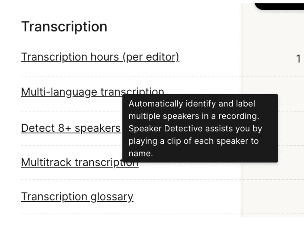
Tooltips while hovering on a feature
Descript could also mention for the Creator and Business plan, the following text to introduce the list of features: “Everything in Hobbyist, plus”, and “Everything in Creator, plus”
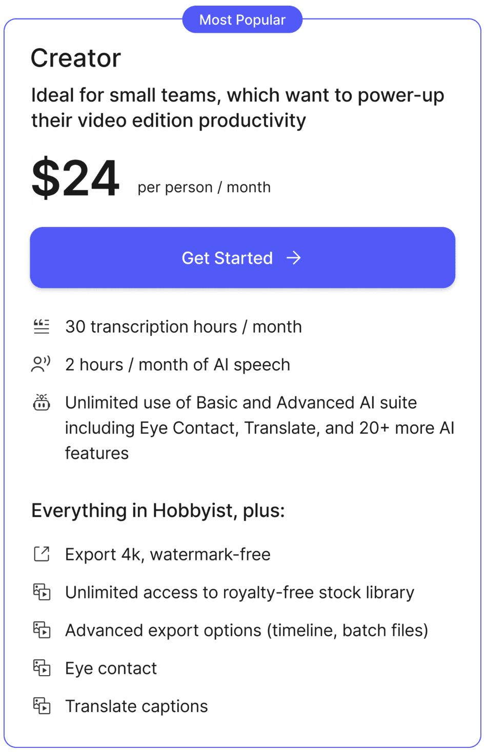
Proposition of a new way of listing features within the Creator plan
Overall layout of the plans
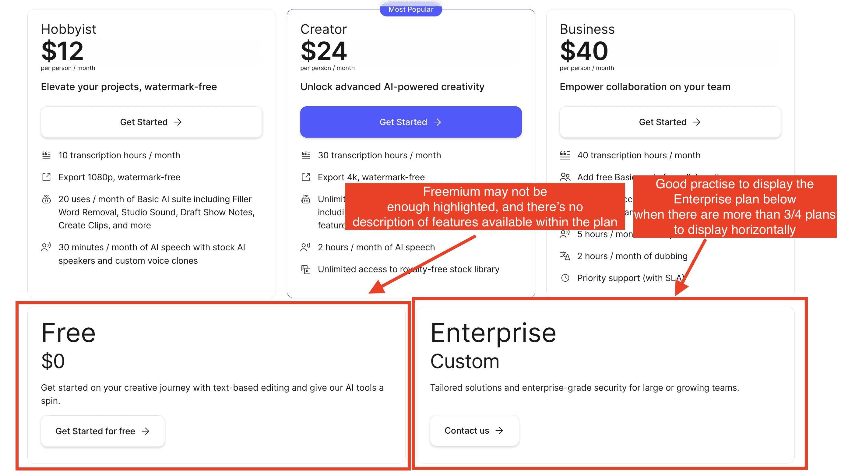
It's a good practice to limit the number of plans displayed horizontally. It’s widely accepted not to show more than four plans horizontally, as this makes it easier for prospects to compare plans.
I feel the “Free plan” isn't highlighted enough. A “Freemium” plan should be a key part of your GTM strategy. The goal is to encourage sign-ups, even with limited usage. Users start to experience your product’s value, while your onboarding process—complete with in-app guidance and email workflows—helps convert them into paying customers once they’ve grasped enough of your value proposition.
Here, I would place the “Free” plan at the same level as the others and better emphasize the features included in each plan.
Unless their go-to-market strategy targets Enterprise customers, offering a Freemium plan can undermine a sales-led approach, which relies on booking calls and converting those leads into Enterprise customers. However, this doesn’t seem to apply here, as their Enterprise plan is not prominently displayed. This is another reason why I’d recommend prioritizing the Free plan to drive more visitor sign-ups.
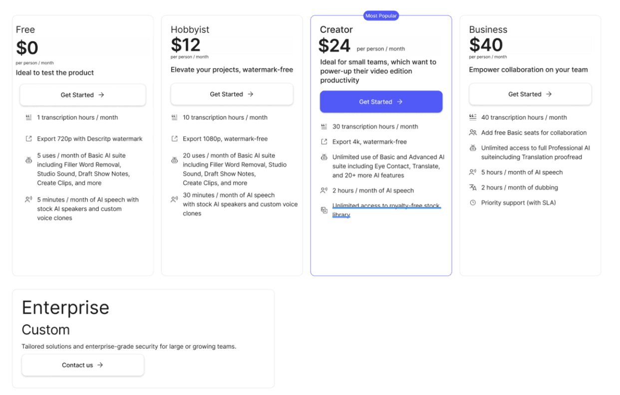
Proposition of a new layout to A/B test
Feature comparisons table
It’s generally a good practice to include a feature comparison table. This allows you to provide a more detailed list of your product's features, which is something you should avoid within the individual plans to maintain conciseness, as mentioned earlier.
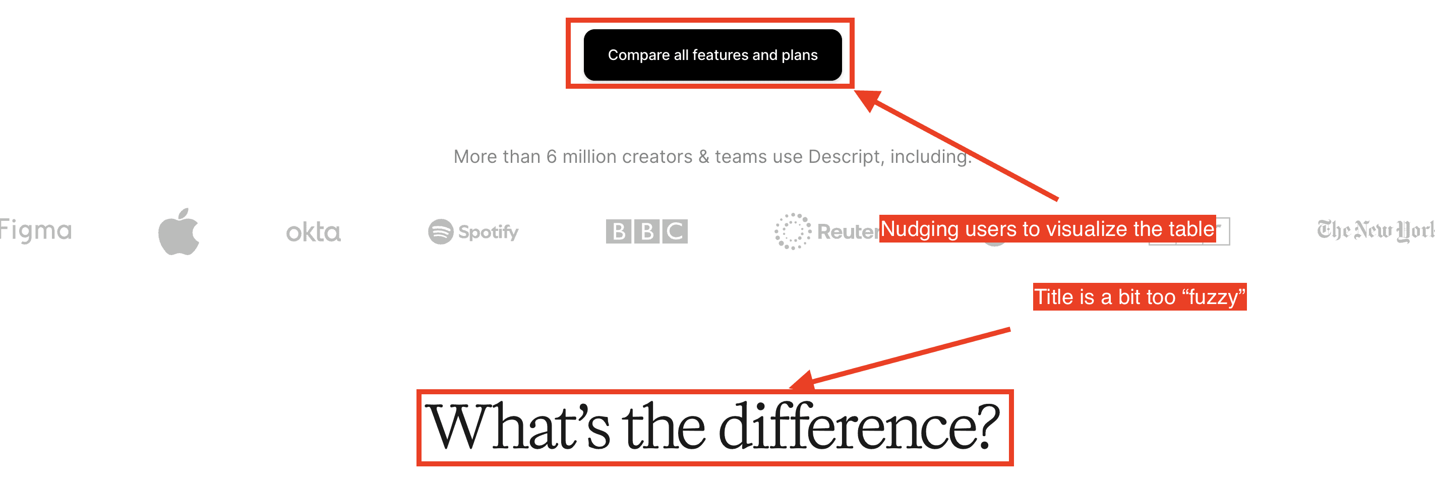
The title "What’s the difference" feels a bit vague and could be more precise. Typically, titles for these types of sections are more straightforward, such as "Discover all features" or "Plans and features."
Descript uses a good approach by nudging users to explore the table with the button “Compare all features and plans.” This is an effective practice. Some companies choose to display the full table immediately when the button is clicked, which can also work well.
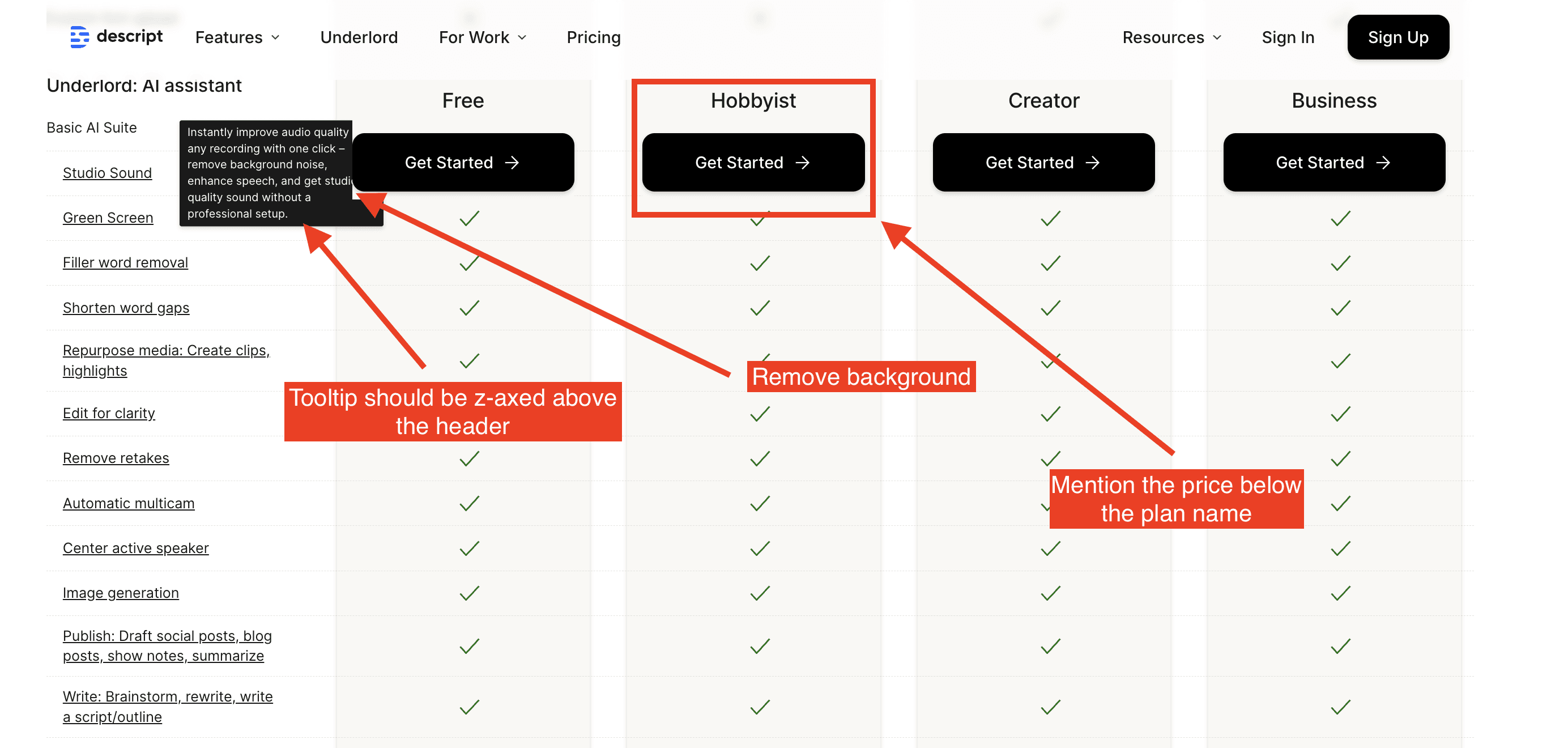
Feature comparison table
The table header should include the prices for each plan, as prospects often remember the price more easily than the plan name. The header is "frozen" while scrolling, which is a great practice to ensure users can always match features to the right plan as they scroll.
I also like the use of tooltips for providing more details about features. As mentioned earlier, this is something that should also be applied within the feature lists of the plans. However, I’m a bit surprised by the use of underlined text. Underlining usually indicates a clickable link rather than a hover effect. It would be better for Descript to use an info icon that users can hover over to view the feature description.
Social proof
Social proof is a crucial element of a pricing page, yet it's often overlooked by SaaS companies. It involves showcasing logos and testimonials to build trust and reassure potential customers that businesses similar to theirs have successfully benefited from the service.

Descript uses a ticker to display logos from their customer base
Descript uses a ticker to display customer logos, which is a great way to showcase their client base. However, I would caution them on two points:
Do these logos align with their Ideal Customer Profile (ICP)? While they have impressive logos like Nike and Coca-Cola, these are all large enterprise clients. It's important to ensure the displayed logos resonate with their target audience.
The logos are somewhat hidden and should be positioned higher on the page to make a stronger impact.
As for testimonials, I don’t see any on the pricing page. It's essential to feature customer quotes that reinforce your value proposition. These reviews should be concise and clearly explain why customers are willing to pay for your service.
FAQ
The FAQ is a really important element of a pricing page to remove fears, doubts and uncertainties for your prospect in order to push them to sign-up.
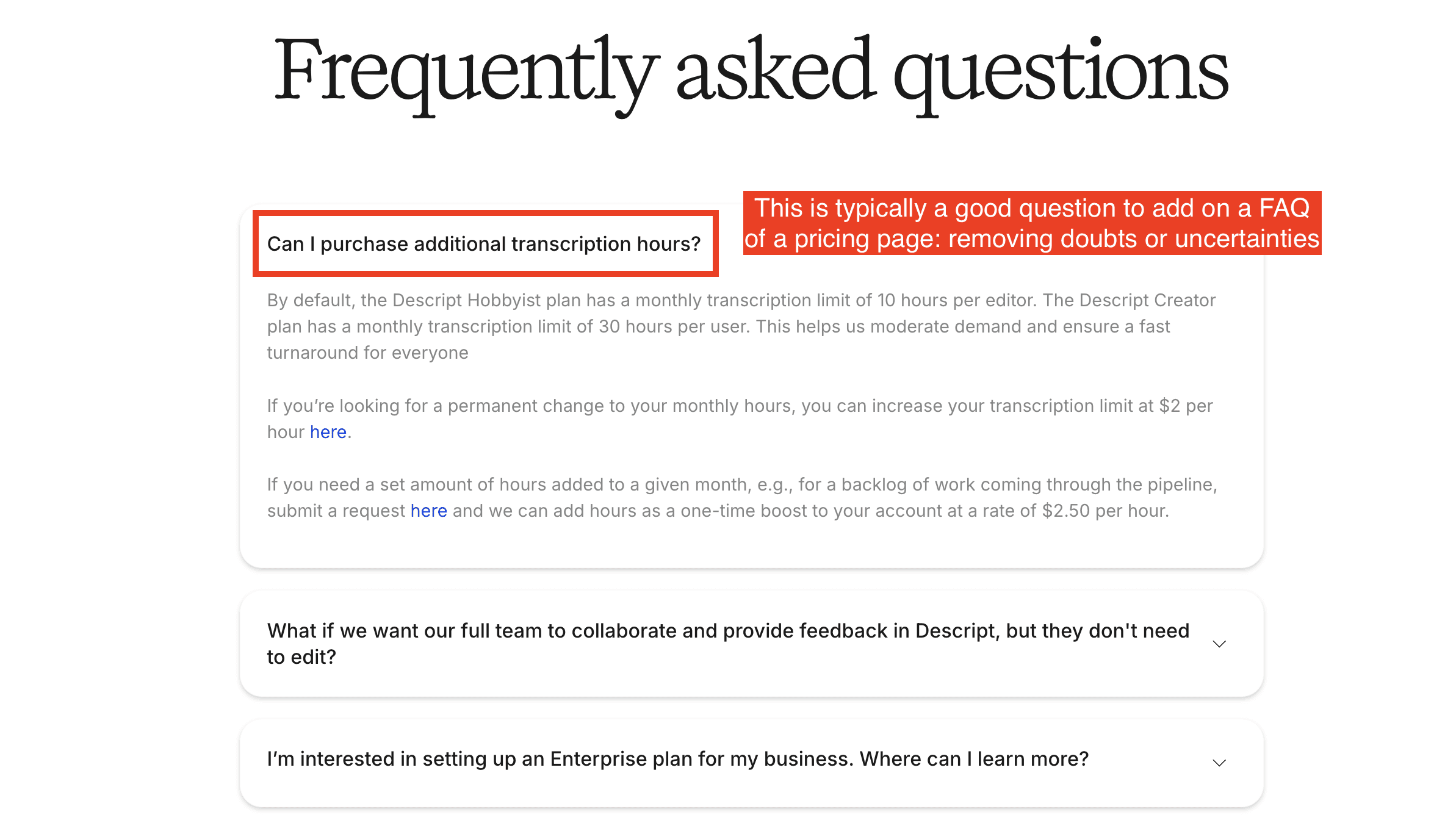
Descript addresses key questions about the "trickier" aspects of their pricing model, which is a smart approach. For example, they ask, “Can I purchase additional transcript hours?” This addresses a common concern with usage-based pricing—what happens when you hit your usage limit? Prospects often worry they'll have to upgrade to a higher plan, creating uncertainty and potentially lowering conversion rates. Descript reassures them by explaining that additional transcription hours can be purchased, which works in their favor.
I feel there may be a few questions missing like: “How can I upgrade or downgrade my plan?” or “Do I get a refund if I deactivate one or several users during my billing period?”.
Most of the questions focus on pricing, which is a good practice. Many companies make the mistake of addressing product-related questions instead of directly tackling the more difficult pricing concerns.
Want More?
If you want more examples of roasts, check out those articles:
And if you need a roast of your pricing page, book your roast here 👉 https://www.roastmypricingpage.com/
