How I designed Roast My Pricing Page’s Pricing Page
Insights from building Roast My Pricing Page’s pricing page: Master the Best practices for Crafting a High-converting Pricing page

Sep 4, 2024
As a former Product Manager in B2B SaaS, I often heard the phrase “Eat your own dog food.” It means using your SaaS to solve your own problems. This approach helps you make better decisions because you can truly understand your customers' perspective.
Recently, I designed my own pricing page and applied my "Roast My Pricing Page" methodology. I wanted to apply this methodology to create the best possible pricing page. My goal was to design offers that reflect the insights and feedback I received from my first customers.
Although my methodology is mainly tailored for SaaS businesses, I decided to test it on Roast My Pricing Page, which is a “productized service”.
This also provides an opportunity to share insights into my methodology and explain the reasoning behind Roast My Pricing Page’s offers.
The overall layout
For my first pricing page, I chose not to spend too much time selecting specific background colors for each section or testing new colors to add to my design system.
I focused on a few key principles:
Use light colors for the background: Dark colors can convey "weight" and create a perception of expensiveness.
Maintain adequate spacing between design elements: Ensure the design "breathes."
Ensure sufficient contrast between colors: This helps convey all information clearly.
As a result, I opted for the same white background used on the home page and reused the red colors from the home page design.
The headline
The headline is part of the top 5 mistakes SaaS founders and marketers make on their pricing page.
I aimed to follow the exact guidelines that I share with my customers:
Clearly convey both your value proposition and a key aspect of your pricing model.
Use a subheadline to reinforce this message.

The pricing headline of Roast My Pricing Page’s pricing page
On Roast My Pricing Page’s headline, I mentioned my product twice: in the headline, stating I'll "boost your pricing page," and in the subheadline, promising to "optimize your pricing page."
I highlighted two key aspects of my value proposition:
I'm affordable compared to an agency or a freelance marketer, offering "the cheapest way" to achieve 80% of the same results.
I used "conversion boost" to emphasize the ultimate goal of optimizing a pricing page.
I also specified the target audience—“from indie makers to scale-ups”—to make my value proposition clearer.
The important aspect of the pricing model I wanted to highlight is one that I believe will reassure prospects: the 30-day refund guarantee if customers don’t see a conversion rate increase.
Plans
Breaking down my plans
I thought about my plans based on insights from my first customers. These can be broken down into two types:
Indie makers or solopreneurs who hadn’t given too much thought to their pricing pages to date
Startups between around 10 and 30 employees who either needed help after updating their pricing model or felt their current page wasn’t converting well.
This logically led me to create two distinct plans tailored to these personas. Since it's a common practice in SaaS to offer three plans, I decided to add a third option resembling an Enterprise plan with a broader set of features. This for example includes continuous access to the always-updated "Roast My Pricing Page" methodology.
Designing the plans
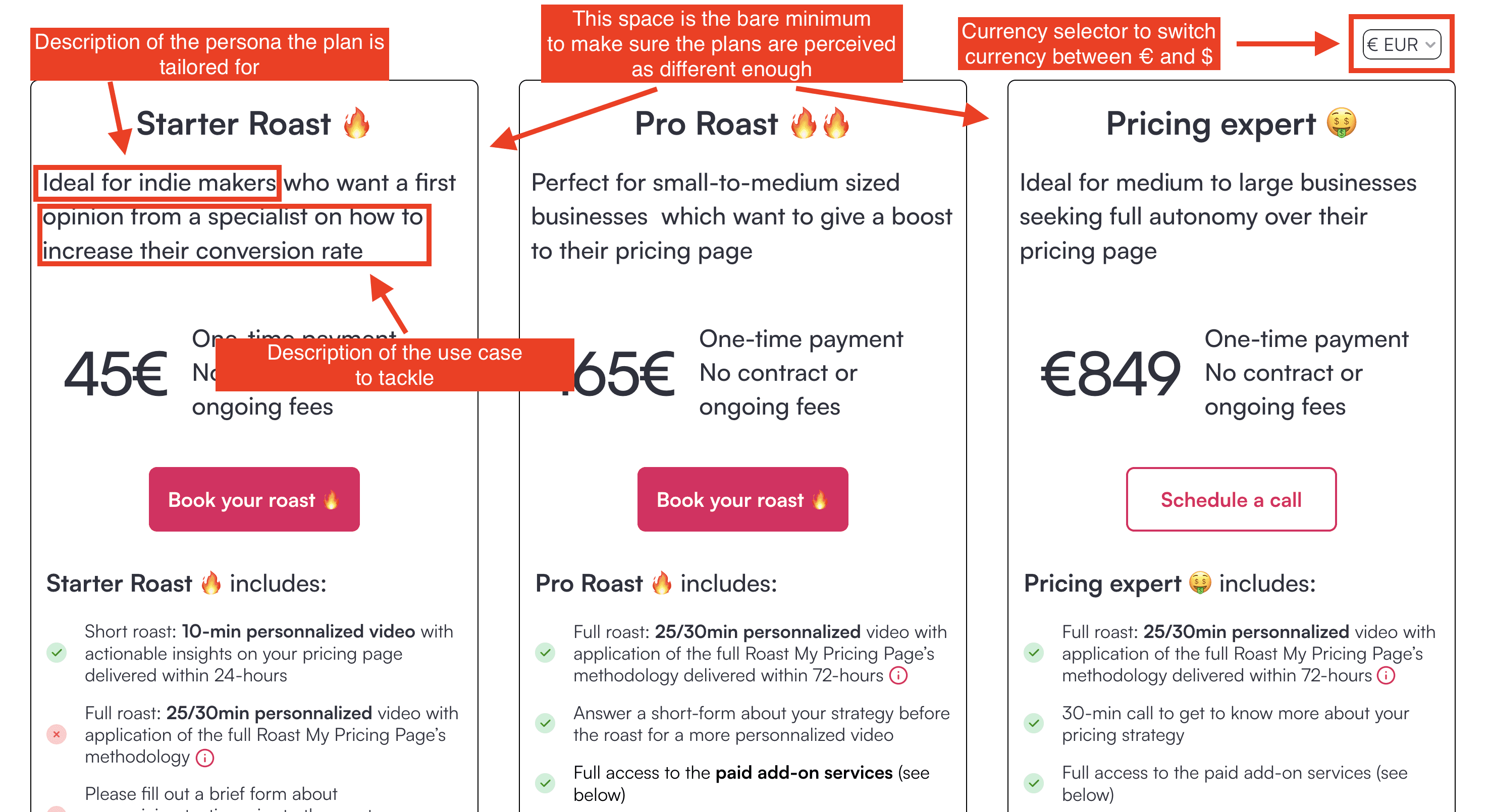
A common practise in the SaaS world is to arrange those plans horizontally. They should have the same height to make sure the content of each plan is easy to compare. They should not be too close in order to make sure they are not perceived as having the same feature set. You really want to justify the feature set associated with more expensive plans.
Design of the top of Roast My Pricing Page’s pricing page
I gave each plan a description that addresses both the persona and the use case they can tackle within that plan. “Ideal for indie makers who want a first opinion from a specialist on how to increase their conversion rate”. The aim of this plan is to help founders who are more or less isolated and have a few money get an external opinion on their pricing page. You can also formulate it by highlighting the need or the problem you’re trying to solve instead of describing the use case.
I also added a currency selector, allowing users to switch between $ and €. So far, all my customers have paid in €, but since my target audience is global, including many in the US, I created plans in Stripe for both currencies. This led me to use a currency selector on my pricing page, which is a good practice. I chose this over using the visitor’s IP address to automatically display prices in € or $, as I've found this latter approach doesn’t yield significant results.
Listing features within the plans
Any SaaS should list the most important features in their plan tables. These features should be chosen because they reflect the core of your value proposition and also highlight key differences between plans.
Since Roast My Pricing Page is not a SaaS, I don't really have features but rather various services. To clearly show which services are included in each plan, I listed these services in all plans, even if they aren't offered, using a ❌ icon next to the description. For example, I included the “design of alternative pricing pages” in the Starter Roast 🔥 and Pro Roast 🔥🔥 plans, even though this service is only available in the Pricing Expert 🤑 plan.
I also chose to order items in a way that the services which are available for each plan are displayed at the top of each list (those marked with a ✅).
Additionally, I advise my customers to use visual aids to explain features within the plans, as it's often challenging to describe a feature in a few words. Images, videos, or GIFs can provide clearer understanding. I implemented this on my pricing page by adding a modal that pops up when you click the info icon next to each feature, a practice inspired by Asana’s pricing, which I find very effective.
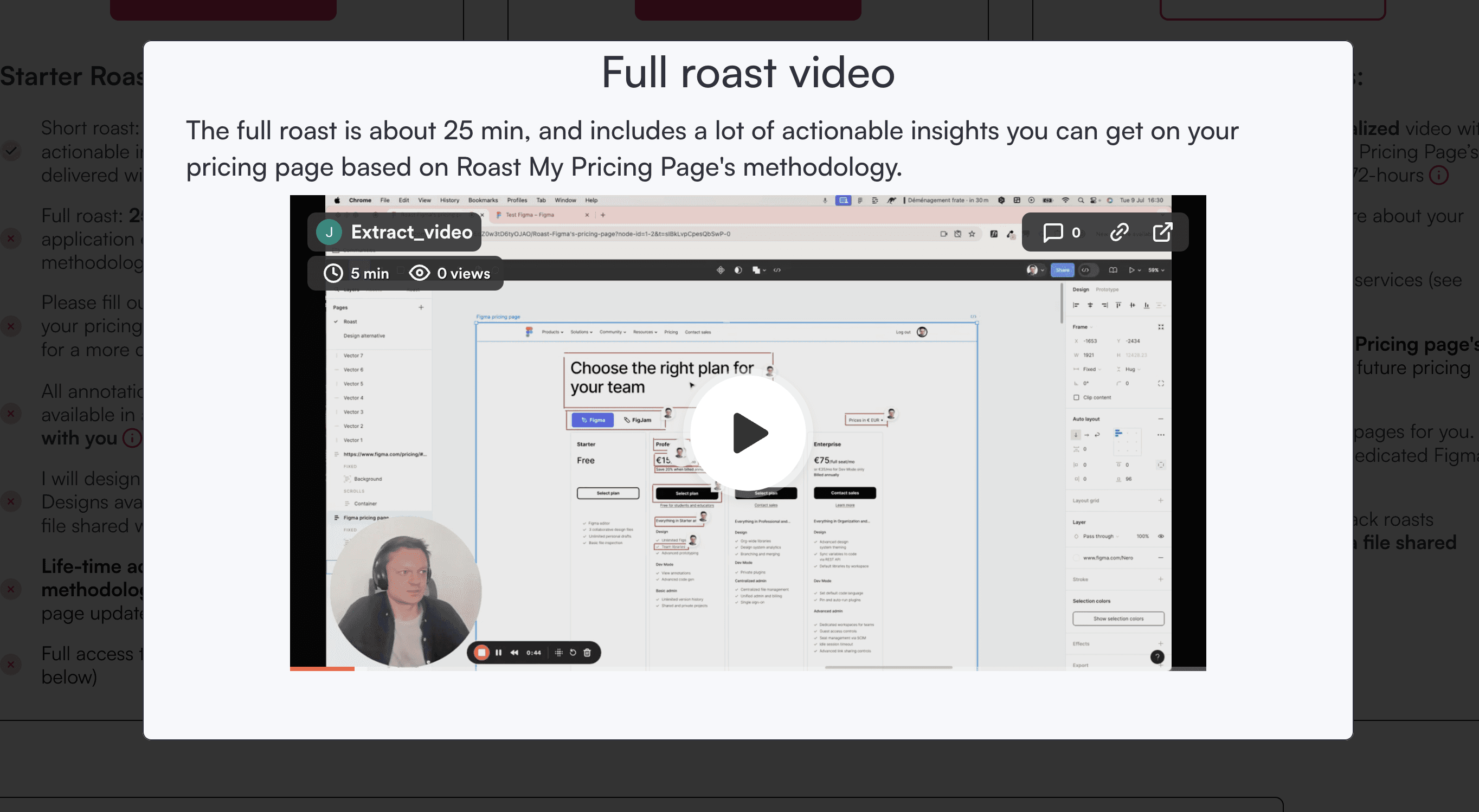
Here’s the type of modal you can visualize when you click on the info icon next to the most critical services I offer at Roast My Pricing Page
Add-ons
I offer service add-ons like pricing page implementation, pricing discovery, and pricing page A/B tests,… I discuss these add-ons with customers once they have subscribed to at least the Pro Roast 🔥🔥 plan, and depending on their specific needs.
For displaying these add-ons, I drew inspiration from how SaaS businesses showcase their AI add-ons. These add-ons are typically displayed below the main plans in a horizontal layout, similar to the approach used by Aircall and Airtable for their AI add-ons (see below)

Examples from Aircall and Airtable about how to display add-ons on a pricing page
For Roast My Pricing Page, I chose a similar design approach, displaying the add-ons in a horizontal layout. I also added a CTA to schedule a call with prospects, as these services come with bespoke pricing. This way, customers can easily inquire about tailored pricing for the add-ons they’re interested in.
Social proof
I chose a standard approach for adding social proof to my pricing page:
A ticker displaying a list of my past customers, placed right below the headline and subheadline.
Customer testimonials displayed below the pricing plans. I selected the most concise testimonials to ensure they are quick and easy to read. I use a tool called Senja to collect and display these testimonials.
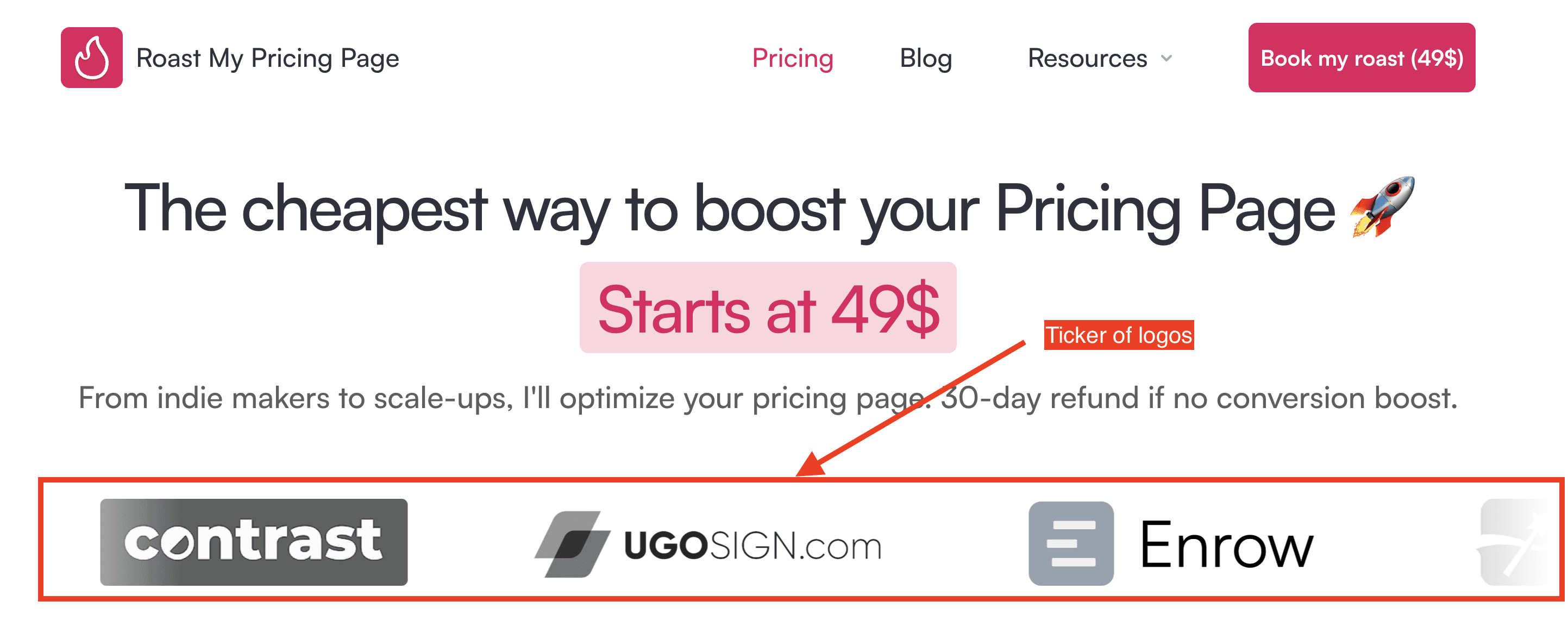
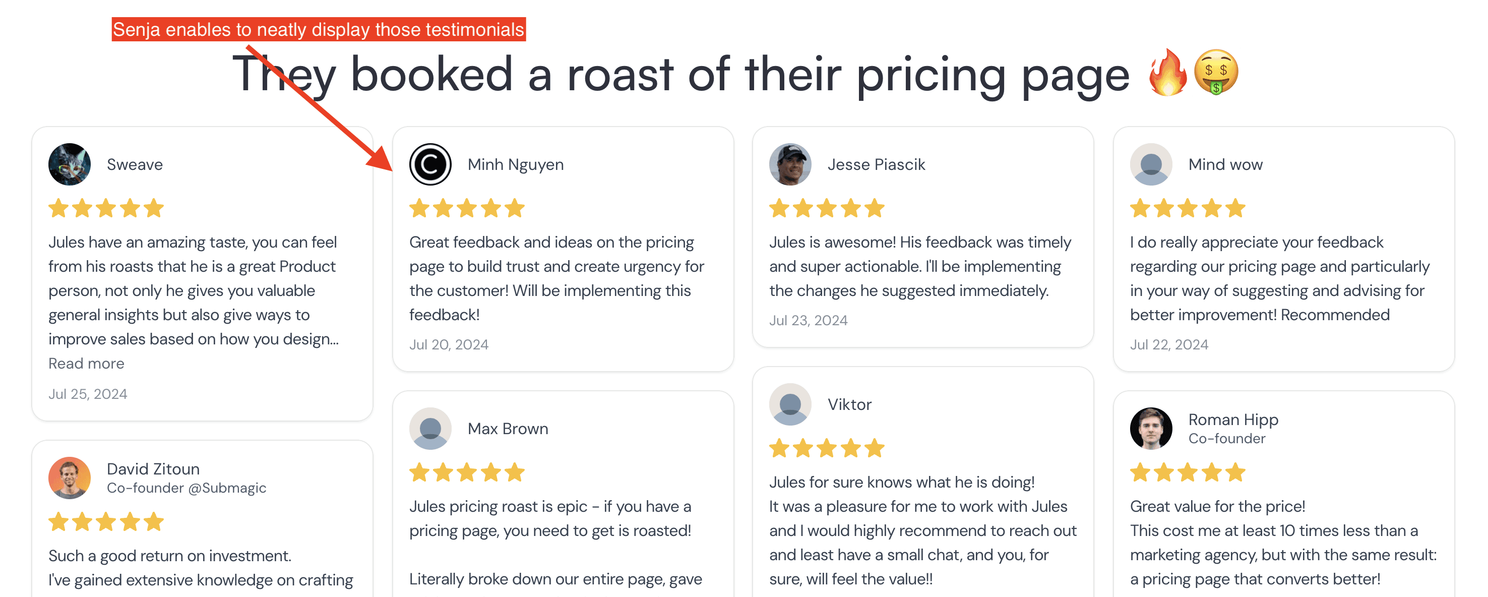
Displaying social proof on Roast My Pricing Page’s pricing page
Social proof is commonly displayed on the home page, but SaaS founders and marketers often overlook adding corresponding design elements to their pricing page. However, prospects may spend more time on the pricing page than on the home page. This makes it crucial to include those important elements of social proof from your home page on your pricing page as well.
FAQ
The main role of FAQs is to reassure prospects who are interested in your offer but haven’t yet signed up. It's important to prioritize questions that address doubts and uncertainties about your pricing.
For Roast My Pricing Page, the pricing is more straightforward than for the majority of SaaS businesses: a one-time payment with no recurring fees or usage-based charges, and add-ons are discussed individually with each customer.
However, I made sure to highlight the 30-day refund policy that I offer my customers who see no conversion increase, as it's a key part of my pricing model designed to alleviate doubts. I also included a question about privacy, reassuring customers that their roasts will remain private, as this is a common concern that often arises.
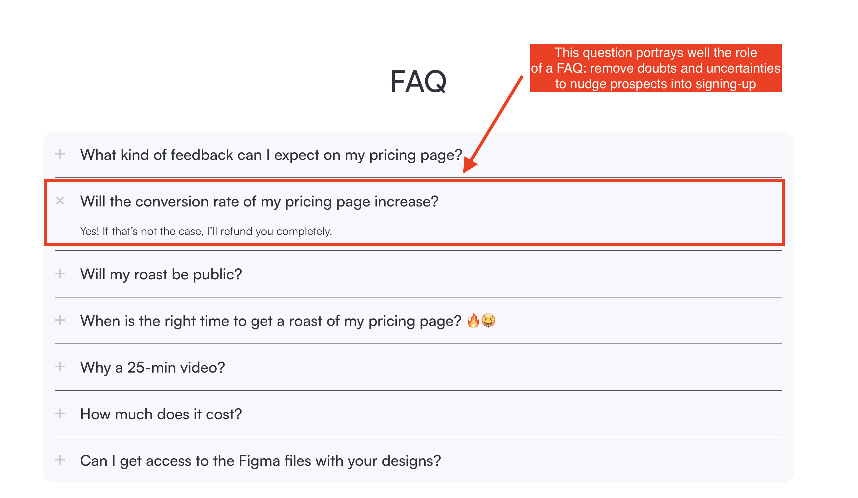
Roast My Pricing page’s FAQ
Analytics
Last but not least, you should not forget to track usage on your pricing page. I added tags in Google Tag Manager to track various events on the pricing page. I also use Hotjar to get some recordings of the pricing page.
Lastly, it's essential to track usage on your pricing page. I added tags in Google Tag Manager to monitor various events on the page. I also use Hotjar to capture recordings of user interactions on the pricing page.
It's important to set aside time, at least weekly, to analyze this data. Regular analysis helps you understand user behavior, identify areas for improvement, and make data-driven decisions to optimize your pricing page.
