[ROAST DEEP DIVE] Docusign’s Pricing Page
Analyzing Docusign's pricing page: a deep dive into best practices, effective copywriting, and design enhancements for higher conversions

Aug 11, 2024
This time, let’s focus on Docusign’s pricing page.
A few information about Docusign before diving into the roast:
Company name: Docusign
Date of creation: 2003
Revenue: ~700M annually
Pricing model: Licence-based
Self-served?: Yes, but with payment checkout before creating the account
Start for free?: No free trial, no freemium plan
Given the revenue Docusign generates per year, we can assume they have a lot of traffic on their pricing page. Their offers are accessible in self-served directly from their pricing page, so it’s also safe to say that optimizing the conversion rate of their pricing page can have a huge impact on their revenue.
Let’s dive right in!
Reviewing the copy of their headline
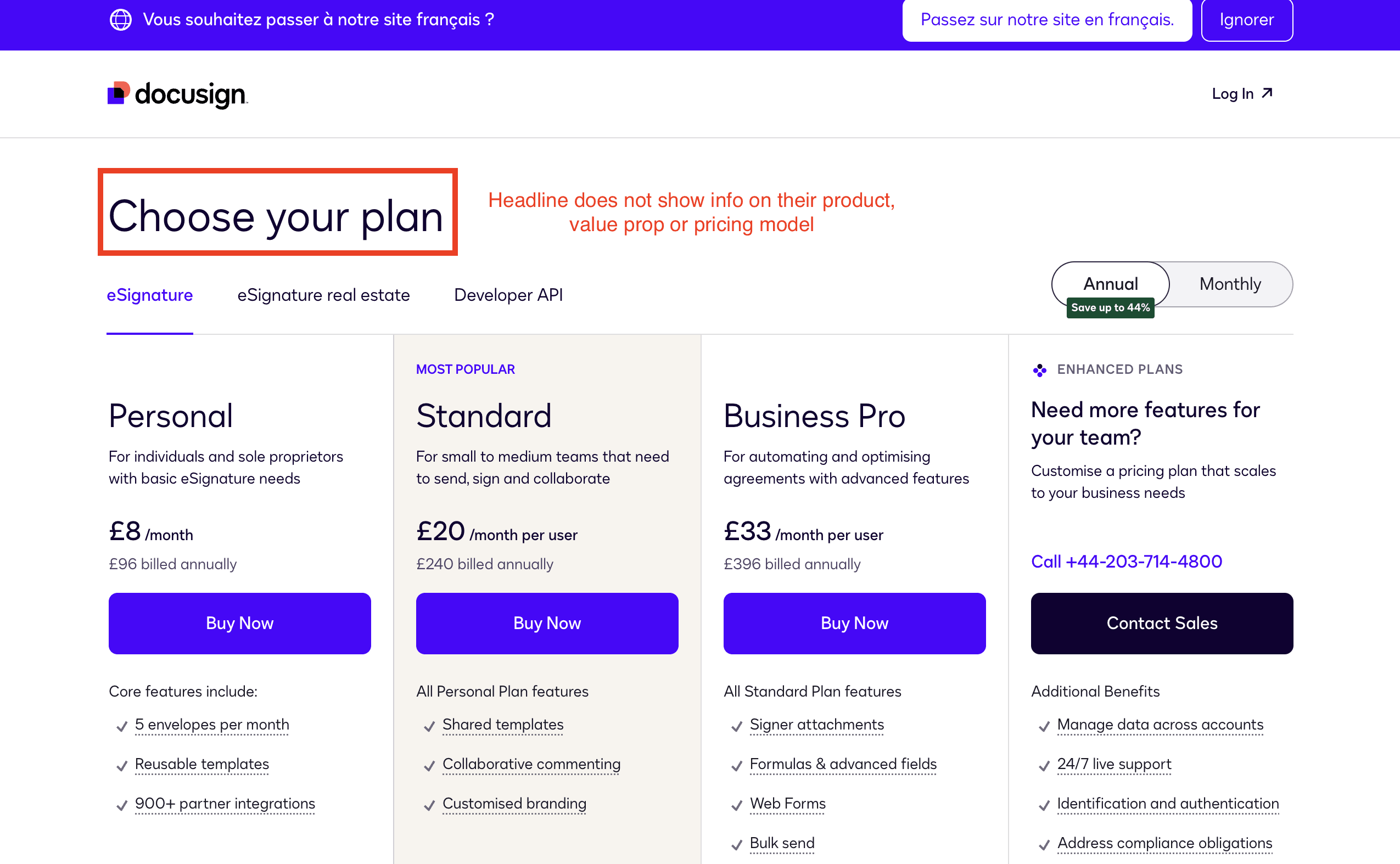
Docusign’s headline on their pricing page
I wrote this article about 20 copywriting examples to take inspiration from. Many of these examples analyze how the headlines are crafted.
In the case of DocuSign, their headline does not convey any information about the product or their pricing model.
While it's true that DocuSign is well-known in the industry, they could still benefit from applying best practices for the copy of their headline:
Use both a headline and a subheadline.
Provide a hint about the pricing model. For example, if they use a license-based model, mention that the pricing is flexible according to team size.
Concisely summarize the value proposition or the product. A prospect should be able to understand, at least roughly, what the product offers without having to navigate away from the homepage.
Toggle annually vs monthly
Toggle annually vs monthly
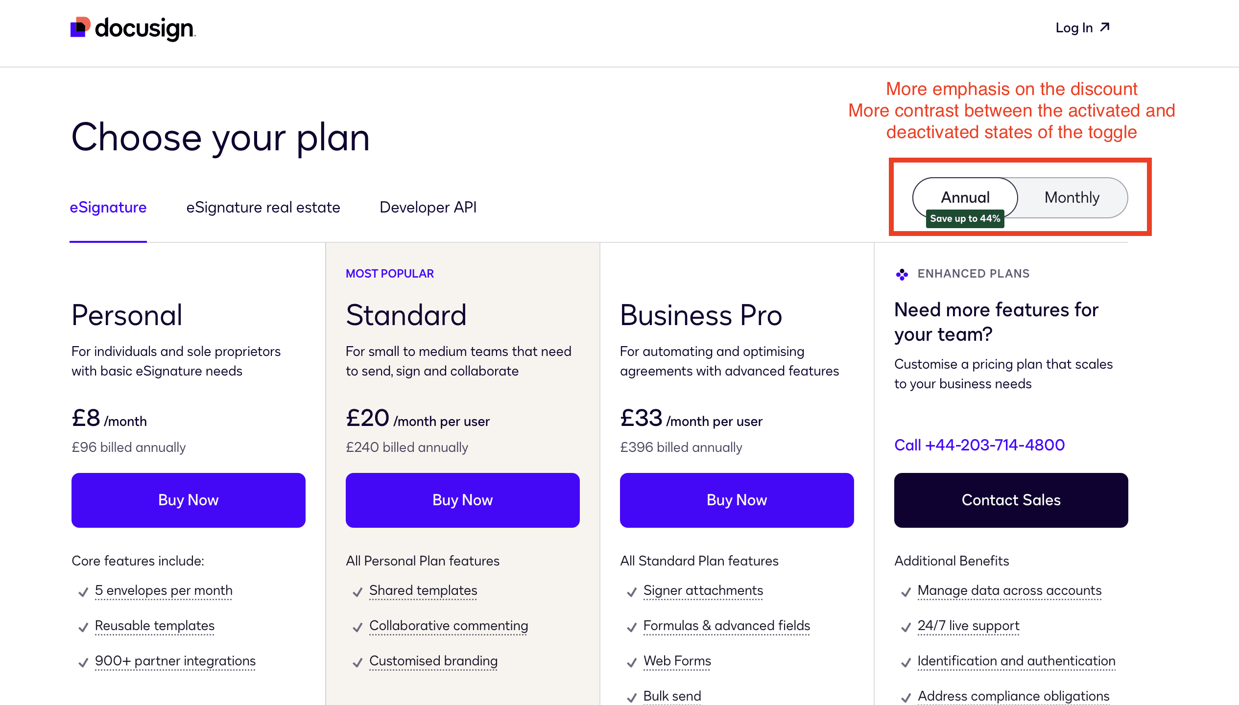
Using a toggle that allows switching between yearly and monthly plans is a good practice. I always advise my customers to set the annual fee as the default option. Prospects are accustomed to this, and it enables to display a lower price, which serves as a good psychological nudge.
However, I would suggest the following changes:
Place the annual option on the right.
The grey color of the deactivated toggle state does not provide enough contrast compared to the activated state in white. I recommend using a darker grey or another color from the visual guidelines.
Emphasize the annual discount more. The current tag is too small. Adding the discount right next to the "Annual" label is a simple yet effective way to highlight the discount.
Rewriting the copy of plan descriptions
One of the most frequent copy mistakes that I’ve seen on pricing pages involves the plan descriptions.
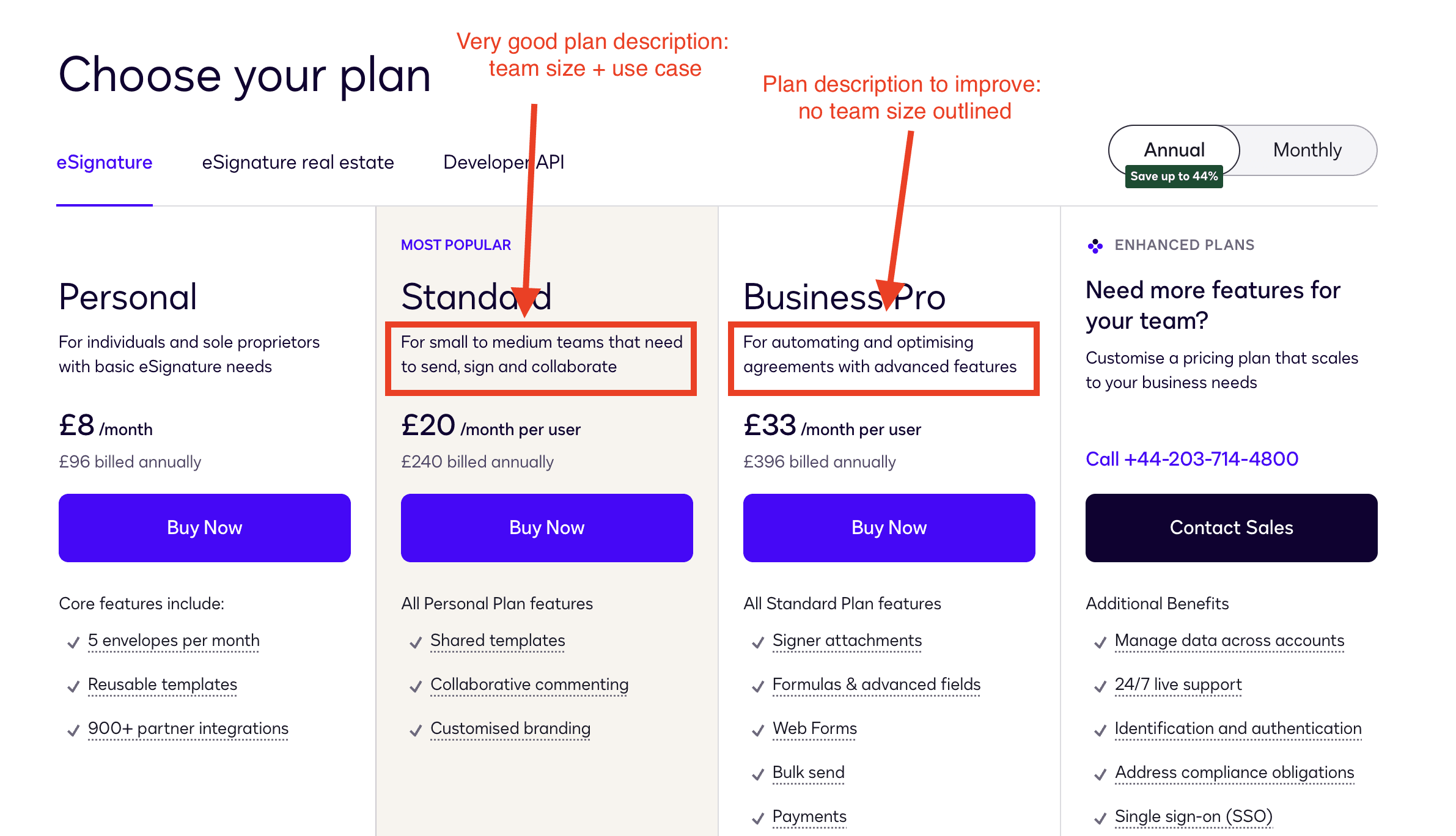
The plan description should clearly state the specific use case, target persona, company size, or relevant job roles for each plan. This is crucial, as the plan description, along with the plan name, helps create an anchor for the prospect, guiding them to choose the plan best suited to their needs.
In the case of DocuSign, the “Standard” plan description is well-executed. It mentions the team size (“small to medium teams”) and the specific use cases (“need to send, sign, and collaborate”).
However, this approach is not applied to the Business Pro plan. If the same persona is targeted by this plan, it should still reference “small to medium teams” but then highlight a different use case to clearly distinguish between the plans.
Plan description
Improve the way Docusign’s prices are displayed
Docusign’s price point
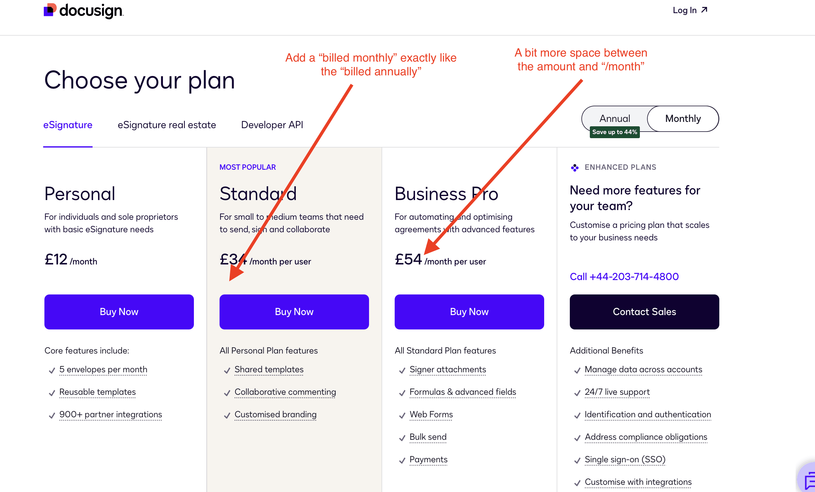
I recommend keeping the "billed monthly" label below the price when the monthly billing period is selected, just as "billed annually" is displayed when the annual option is selected. This helps make the billing period clear to the customer without adding too much clutter.
Additionally, the price is too close to the "per user/month" label. Adding more space will make it easier for prospects to compare prices. It's easier for people to compare plain numbers than comparing numbers combined with text.
Make it possible to change the currency
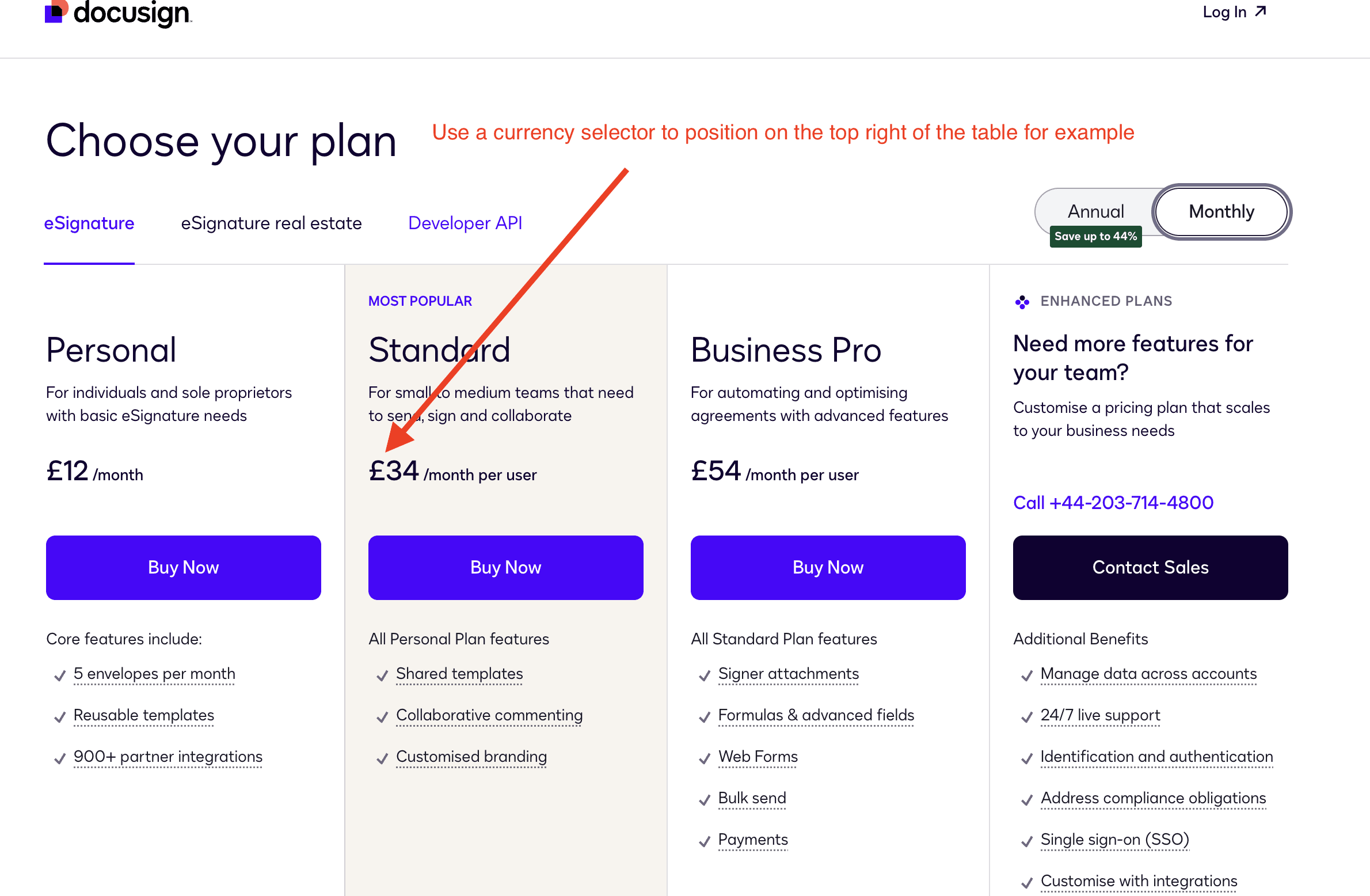
Websites from well-know SaaS often display the right currency depending on the IP address of the visitor. However, in a world where work is more and more distributed, the IP address is less and less reliable to know the currency in which the prospect will pay.
Thus, it’s useful to add a currency selector to make it possible to switch currencies, and display the exact corresponding price.
Currency on Docusign’s pricing page
“Most popular” plan
“Most popular” plan on Docusign’s pricing page
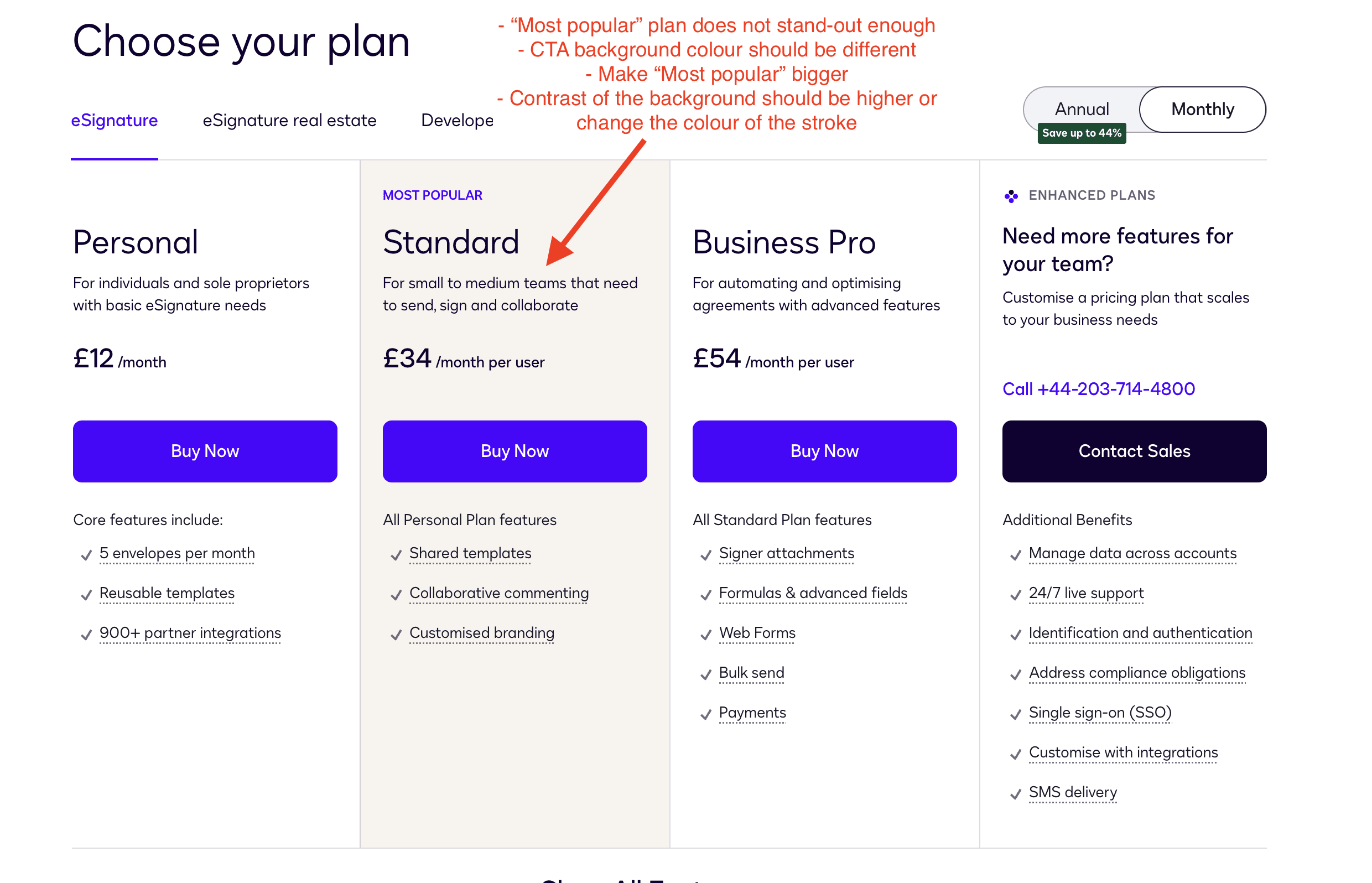
The “most popular” plan doest not stand-out enough. To nudge the user into opting for this plan, Docusign should make this plan more “eye-catching”.
This means doing the following actions:
they should change the background color of the CTA to make it different from the other plan’s CTA
they should make the “Most popular” stand-out more. Make the font size bigger, and put it on the top right of the plan to “kill” the alignment
they should use a background for the plan that is a bit darker to create more contrast with the other plans. Or use a different color for the stroke of this specific plan.
List of features within the plans
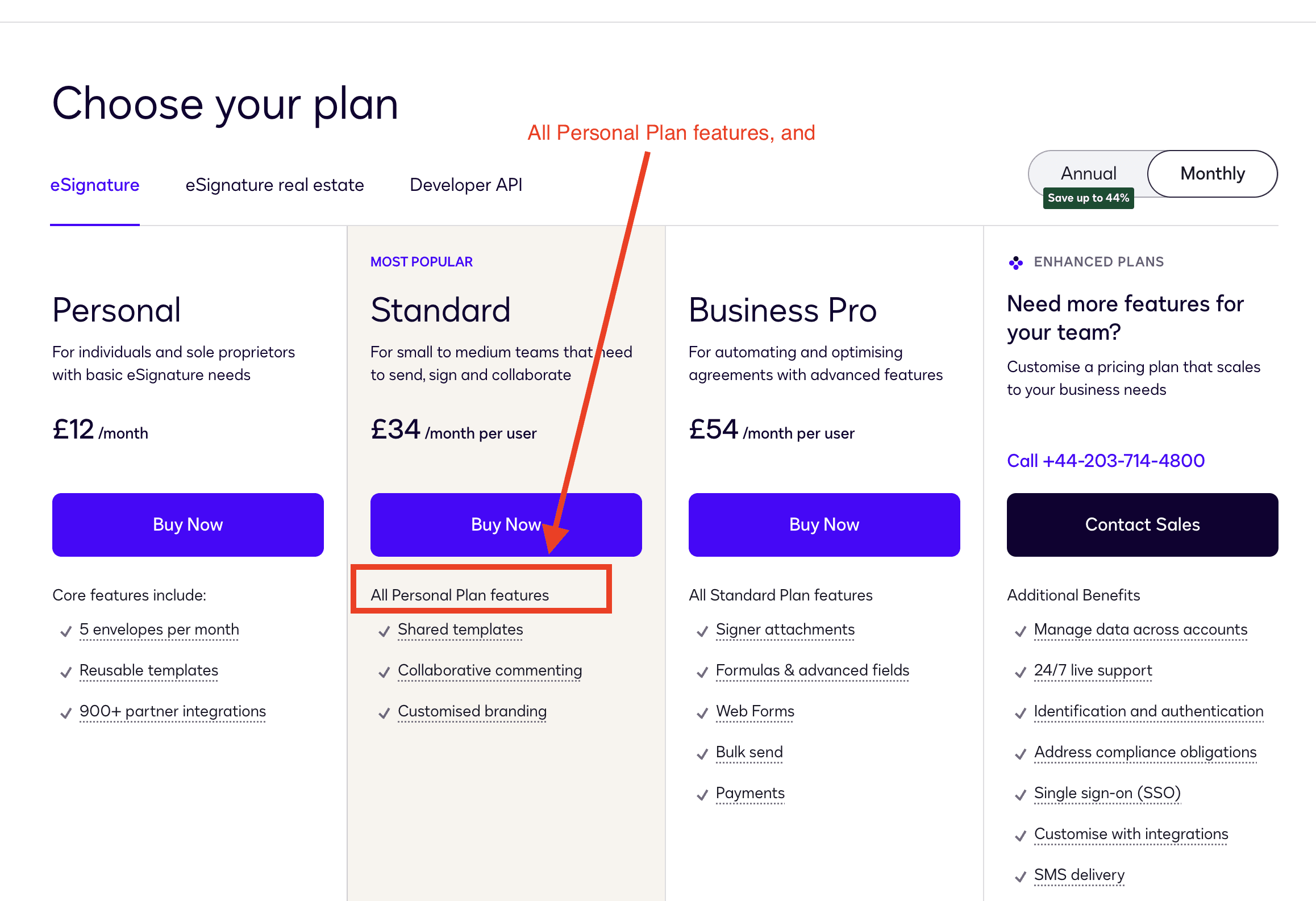
List of features within Docusign’s pricing page
Simple feedback: Even if it seems obvious, I would update the copy of “All Personal Plan features” to include the word “and.” Not all visitors to DocuSign’s pricing page are familiar with SaaS pricing pages, so it's crucial to be very precise.
Additionally, when you click on the features, a modal overlay pops up to provide more details (see screenshot). This is an excellent practice, as it allows for the display of images, GIFs, or even videos.
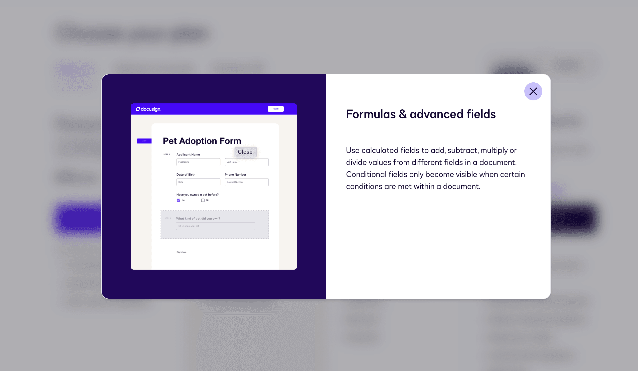
Feature modal overlay
DocuSign's FAQ for their pricing page is well executed. It's concise, focusing primarily on pricing questions, which helps reassure potential customers and address concerns that might prevent them from subscribing.
I recommend placing the question “Do you offer a money-back guarantee?” at the top of the FAQ section to make it more prominent. This is a crucial answer that will reassure customers about signing up, knowing they can get their money back if needed.
For companies that can handle a certain volume of inquiries, I suggest adding a mailto link below the FAQ headline with a message like “Can’t find an answer to your question?” This can help capture leads, identify missing information, and assist in converting leads into customers.
FAQ
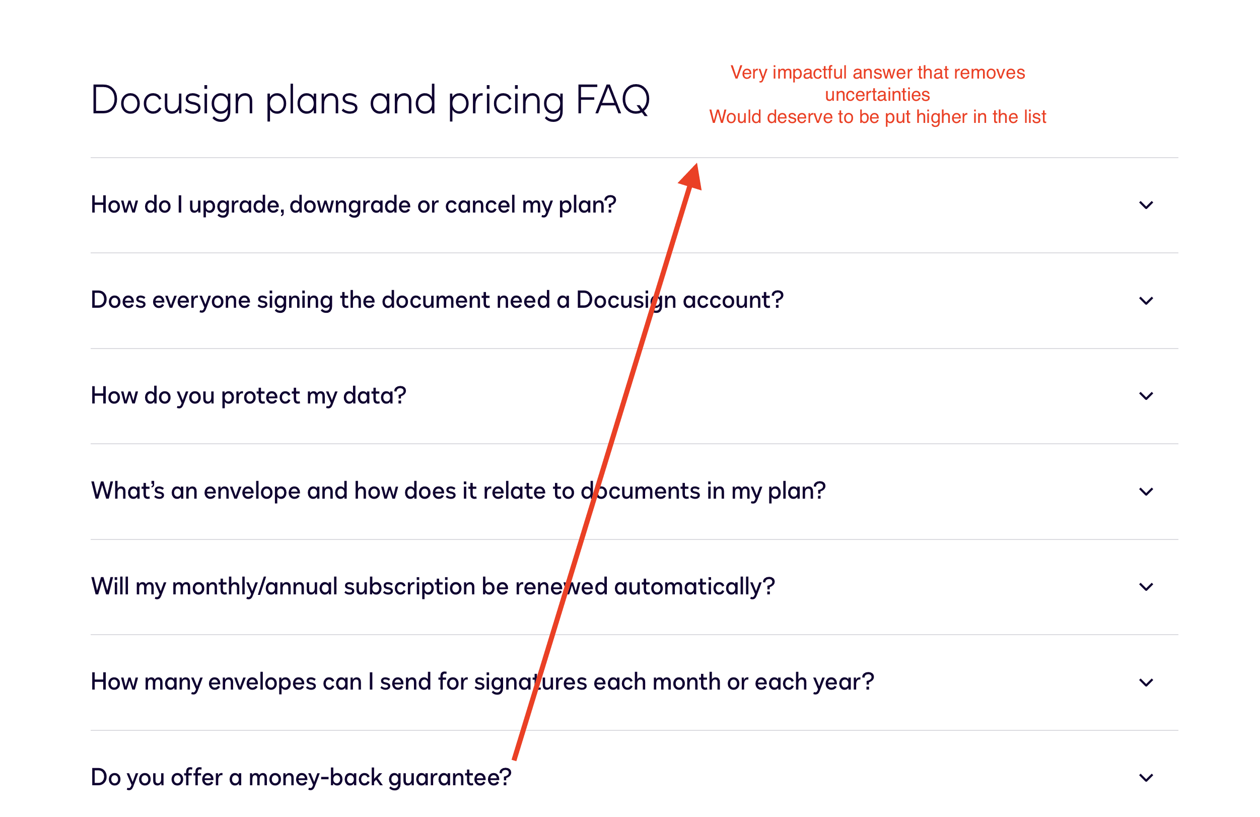
Docusign's FAQ on their pricing page
DocuSign's FAQ for their pricing page is well executed. It's concise, focusing primarily on pricing questions, which helps reassure potential customers and address concerns that might prevent them from subscribing.
I recommend placing the question “Do you offer a money-back guarantee?” at the top of the FAQ section to make it more prominent. This is a crucial answer that will reassure customers about signing up, knowing they can get their money back if needed.
For companies that can handle a certain volume of inquiries, I suggest adding a mailto link below the FAQ headline with a message like “Can’t find an answer to your question?” This can help capture leads, identify missing information, and assist in converting leads into customers.
Social proof
DocuSign's pricing page lacks social proof. The pricing page is the second most visited page on your website, so adding credibility here is crucial. This is where logos and testimonials are essential.
Include logos that fit your ideal customer profile (ICP) or a new market you're targeting. For example, if you're a post product-market fit company aiming for the enterprise market, display logos from larger companies to reassure potential customers that you already serve this market.
Want More?
What did you think about this roast?
If you want more examples of roasts, check out those articles:
