[ROAST DEEP DIVE] Figma’s Pricing Page Teardown
Even as a top SaaS success of the last decade, there's room to improve your pricing page 🤪

Jul 10, 2024
On 10/07/24, I shared a video roasting Figma’s pricing page:
I had prepared this video a few weeks before the publication date. However, I realized that Figma rolled out a new pricing page following their Figma Config 2024 Event.
I wanted to create a new teardown of their pricing page to see if their changes aligned with my suggestions in the video.
Disclaimer: they only implemented two of my suggested changes 🤣
Headline

📌 Your headline should subtly convey both your value proposition and key aspects of your pricing model.
Figma’s headline does not mention the value proposition. However, it does hint at their license-based model with the phrase “right plan for your team.” I believe they should also mention that Figma offers different plans tailored to the maturity of your design organization.
Here’s how I would rephrase the headline:
Plans
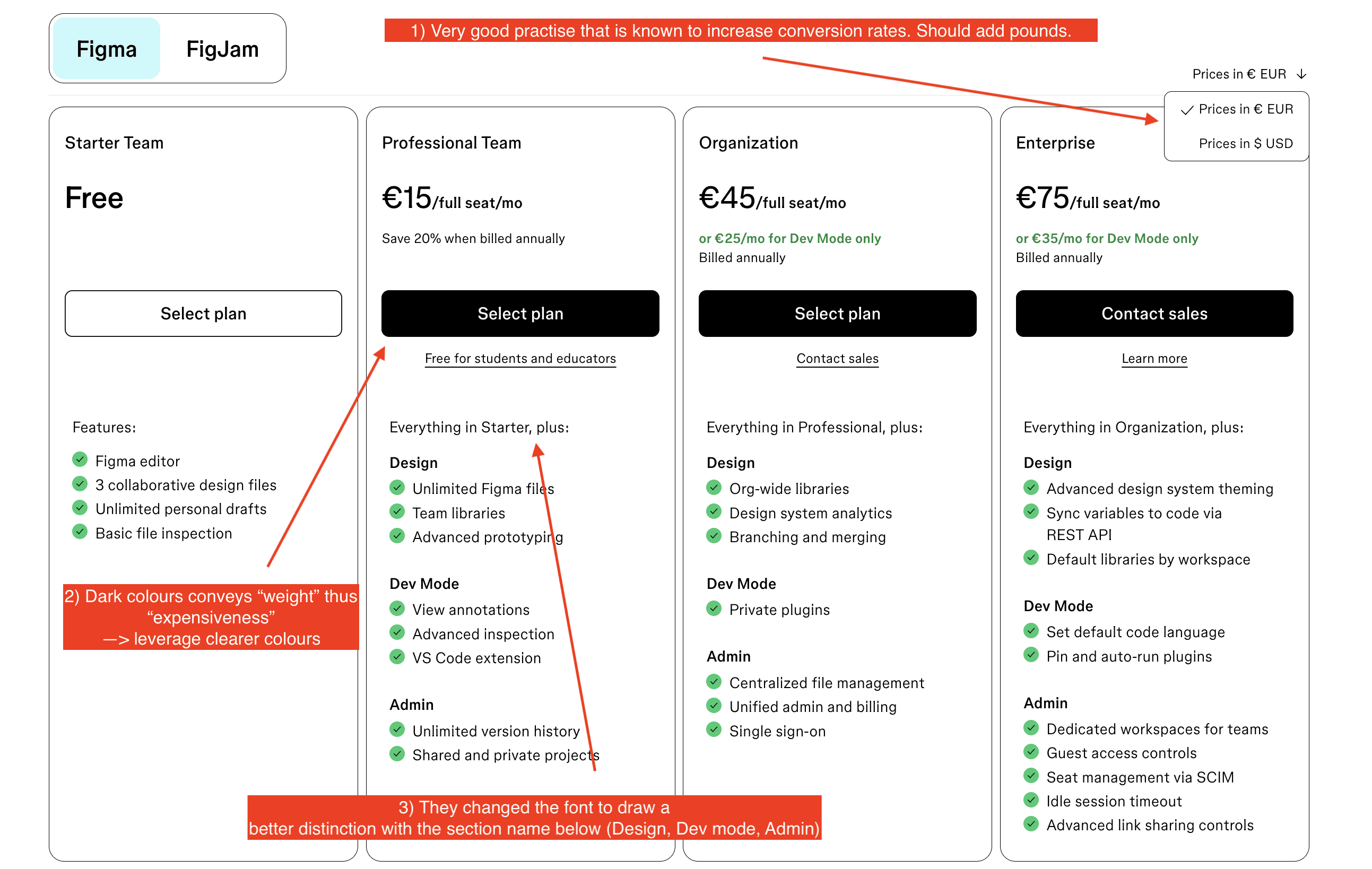
1) Their currency selector is more visible compared to the previous version. It’s a very good practice to implement such a component when you have customers paying in different currencies.
2) If you don’t sell directly to developers, avoid using dark colors. Dark colors are associated with "weight" and therefore "expensiveness."
3) They adapted the font as I suggested in my video, making the phrase more distinctive from the section title below.
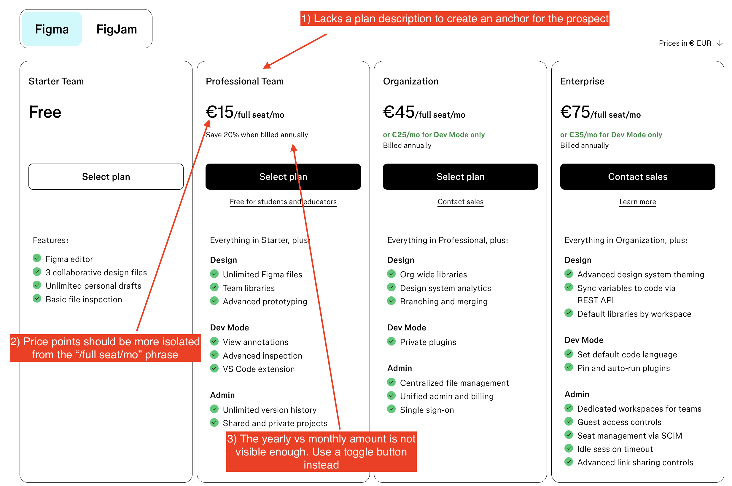
4) Plan descriptions are missing. These descriptions help prospects quickly understand which plan is best suited to their use case and company size.
5) Price points should be more isolated. It’s easier for people to compare numbers alone rather than "numbers + strings."
6) A common practice is to use a toggle button to switch between monthly and yearly fees. Display the yearly fee by default to show lower prices.
7) The price for “Dev mode” could be more clearly displayed with a toggle that operates independently from the other toggle buttons.
Here’s how I would redesign the plan tables (using their former blue color #5551FF):

Features comparison table
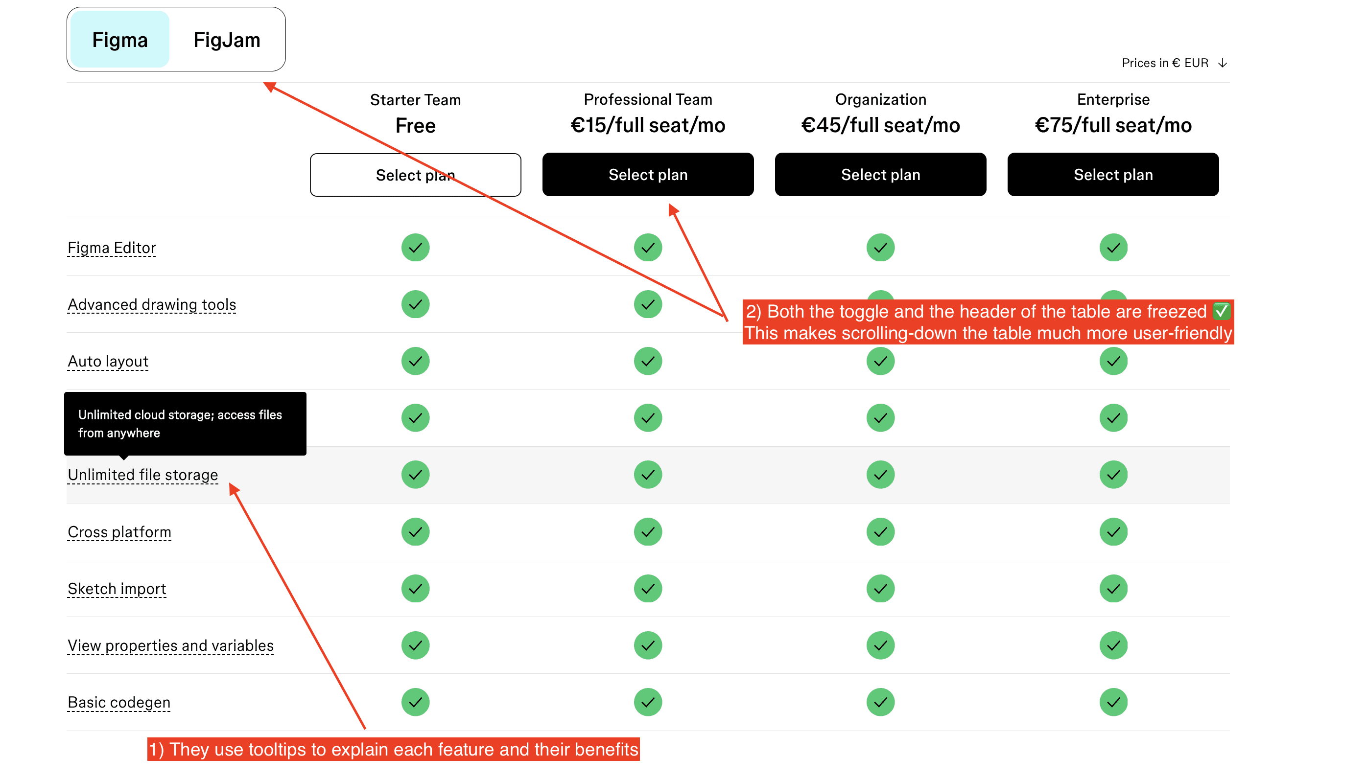
1) They describe each feature by emphasizing its benefits, which is a great practice to keep in mind.
2) If your feature comparison table is long enough to require scrolling, make sure to freeze the headers. Otherwise, users will need to scroll back up to see which features correspond to which plans.
Conclusion
I still believe Figma could benefit from implementing some of these improvements.
Looking at their pricing page in incognito mode, it seems they are not A/B testing it.
In my opinion, they are underestimating the impact a pricing page can have on their business. Especially given their have a clear PLG strategy, where their pricing page has its own role to play.
