How Livestorm changed their pricing page to fit their new Go-to-Market strategy?
Unveiling Livestorm’s Strategic Pricing Page Overhaul: Key Changes, Insights, and Metrics

Aug 9, 2024
Optimizing the conversion rate of your pricing page is essential for any SaaS business with inbound acquisition channels. Customers often visit your site after reading about your product and are likely to check your pricing page if your product can solve their problem. Therefore, a high-converting pricing page is key to turning this traffic into customers.
To achieve this, your pricing page must be updated to reflect changes in your go-to-market strategy. Even if your prices and plans remain unchanged, you may need to highlight specific plans. This adaptation is a normal part of any SaaS business journey.
For example, Livestorm decided to move upmarket in 2024, focusing on profitability by targeting larger customers with long-term contracts. Their pricing page needed adjustments to align with this new strategy.
To understand how a successful company like Livestorm implements such changes, I interviewed Justin Salat, Senior Brand Designer at Livestorm. He provided valuable insights about this project of pricing page overhaul, which I hope will inspire you.
Can you remind me about the strategic reasons behind this pricing page update?
Livestorm is now addressing a new ICP (ideal customer profile). We used to be serving marketing teams from small and medium businesses, like start-ups and scale-ups. As we have reached product-market fit and want to increase average revenue per user, we want to move up market with customers that are bigger like Enterprise customers. This is also because we have developed features likes SAML SSO, API access, and RTMP streaming, catering to complex needs, notably in terms of security.
The strategy is also to reach profitability by pushing yearly contracts. This is aligned with the strategy above, and something that drove us to update our pricing page.
Can you explain the changes on your pricing page relative to Livestorm’s new strategy?
I can list 4 main changes that we made to the pricing page based on the strategy above:
1) Hiding the free plan
We decided to remove the Free plan that was previously featured prominently on the old pricing page.
However, we still wanted to indicate the availability of a free plan by subtly referencing it in the CTA text for the Pro plan.
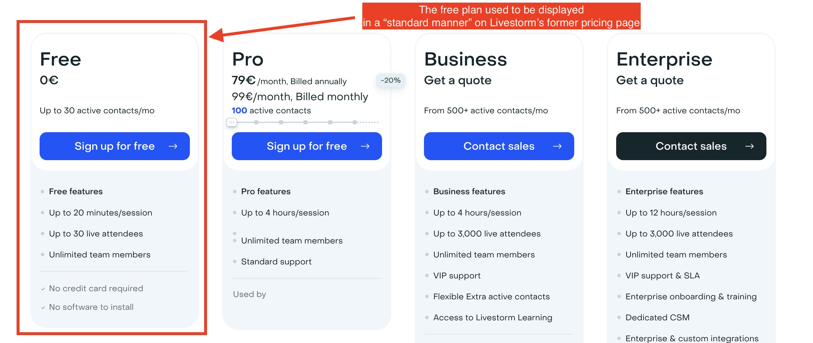
The Free plan on Livestorm’s previous pricing page was presented in a typical format.
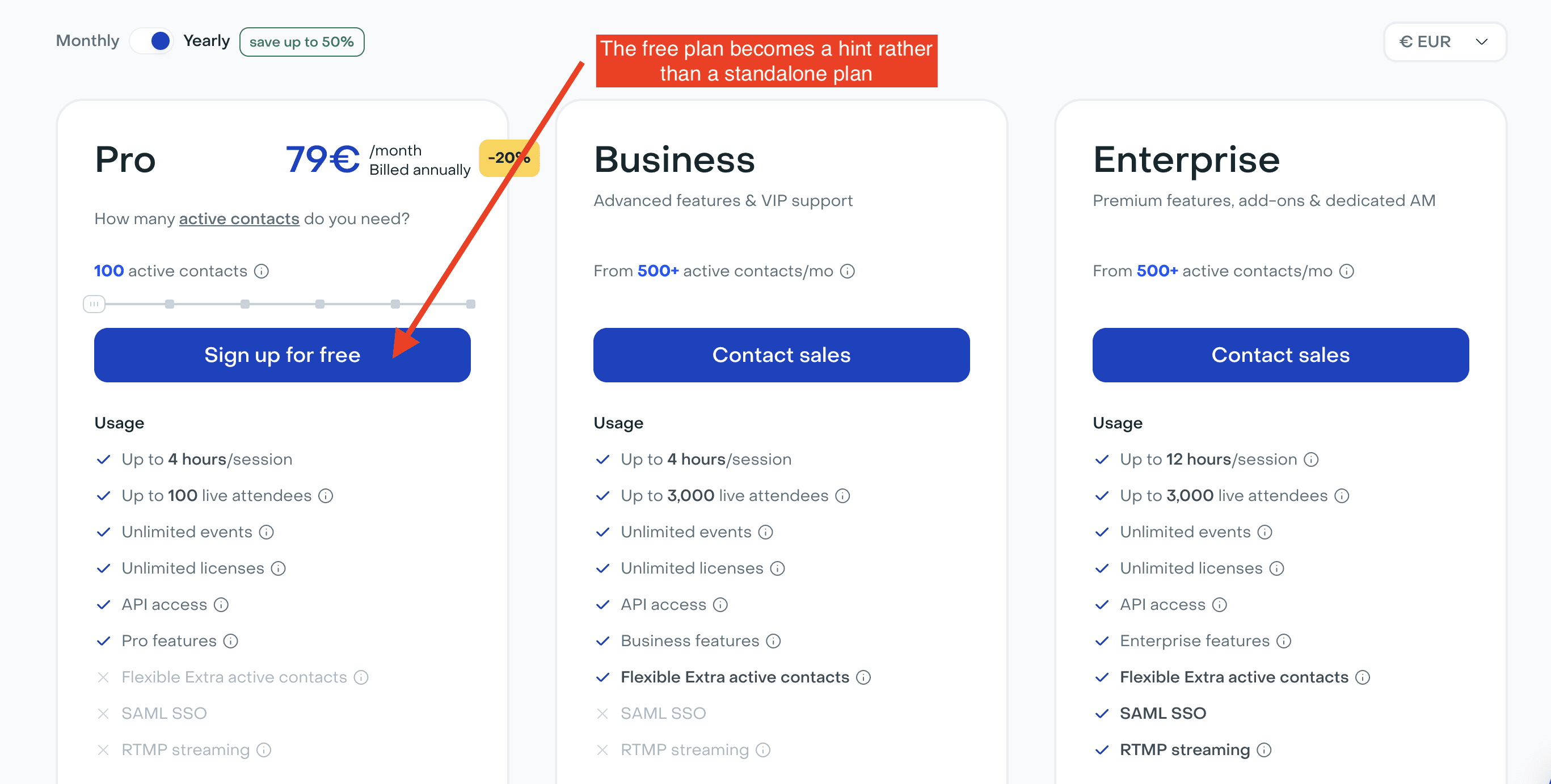
Livestorm’s updated pricing page subtly suggests the existence of a Free plan, but doesn’t provide any further details.
Roast My Pricing Page’s analysis 👇
When your goal is to convert customers on a self-service plan, highlighting the Free plan is essential. It encourages customers to create an account, experience the value of your product, and eventually upgrade to a paid plan.However, when your focus shifts to closing customers on an Enterprise plan, your priority is securing meetings with your sales team. In this case, the presence of a Free plan can divert potential leads, potentially undermining your efforts to drive Enterprise sales. The self-service plans can, in effect, cannibalize the Enterprise plan you're investing in.Livestorm has chosen to subtly reference the Free plan in the CTA copy. This approach allows them to continue closing customers on self-service plans while minimizing the risk of detracting from their Enterprise sales efforts.
2) Displaying the yearly plans by default
Livestorm’s previous pricing page featured both yearly and monthly billing options, catering to a wide range of companies with varying budgets and webinar campaign frequencies. To emphasize the yearly plans, we set them as the default display. A toggle button was also added, allowing SMBs who couldn't commit to a yearly plan to easily switch to monthly billing.
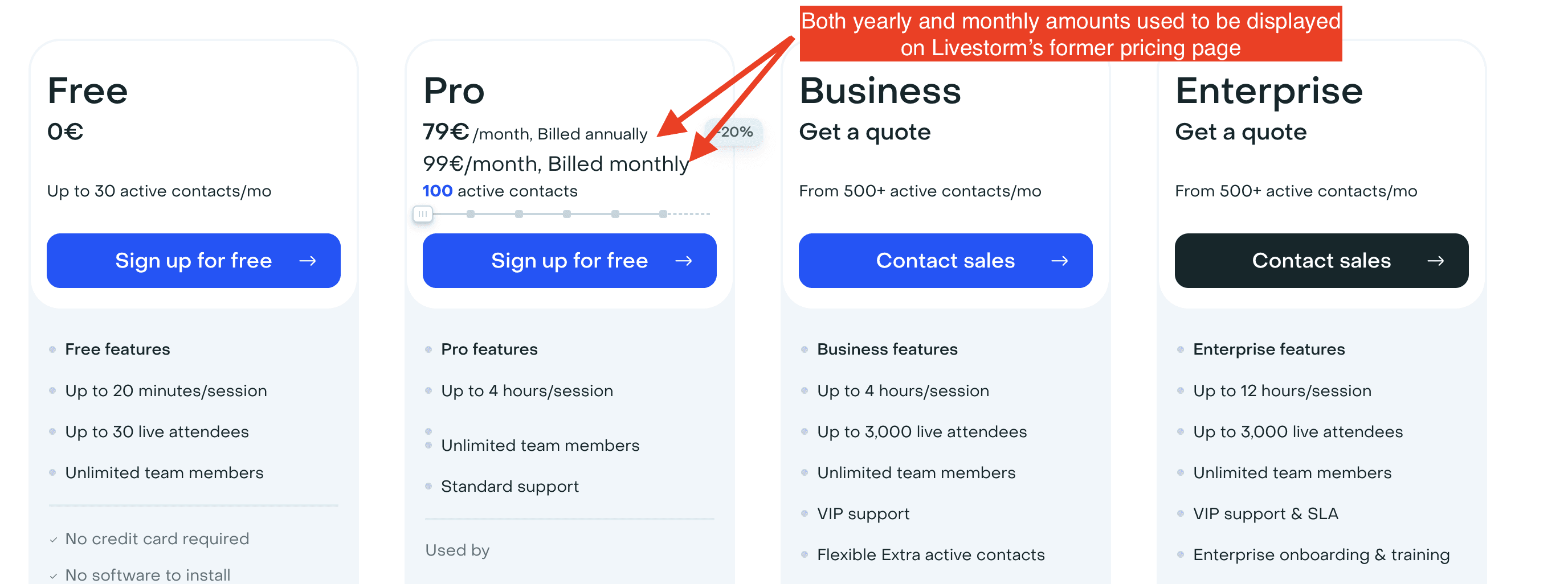
Livestorm’s previous pricing page showcased both monthly and yearly billing options.
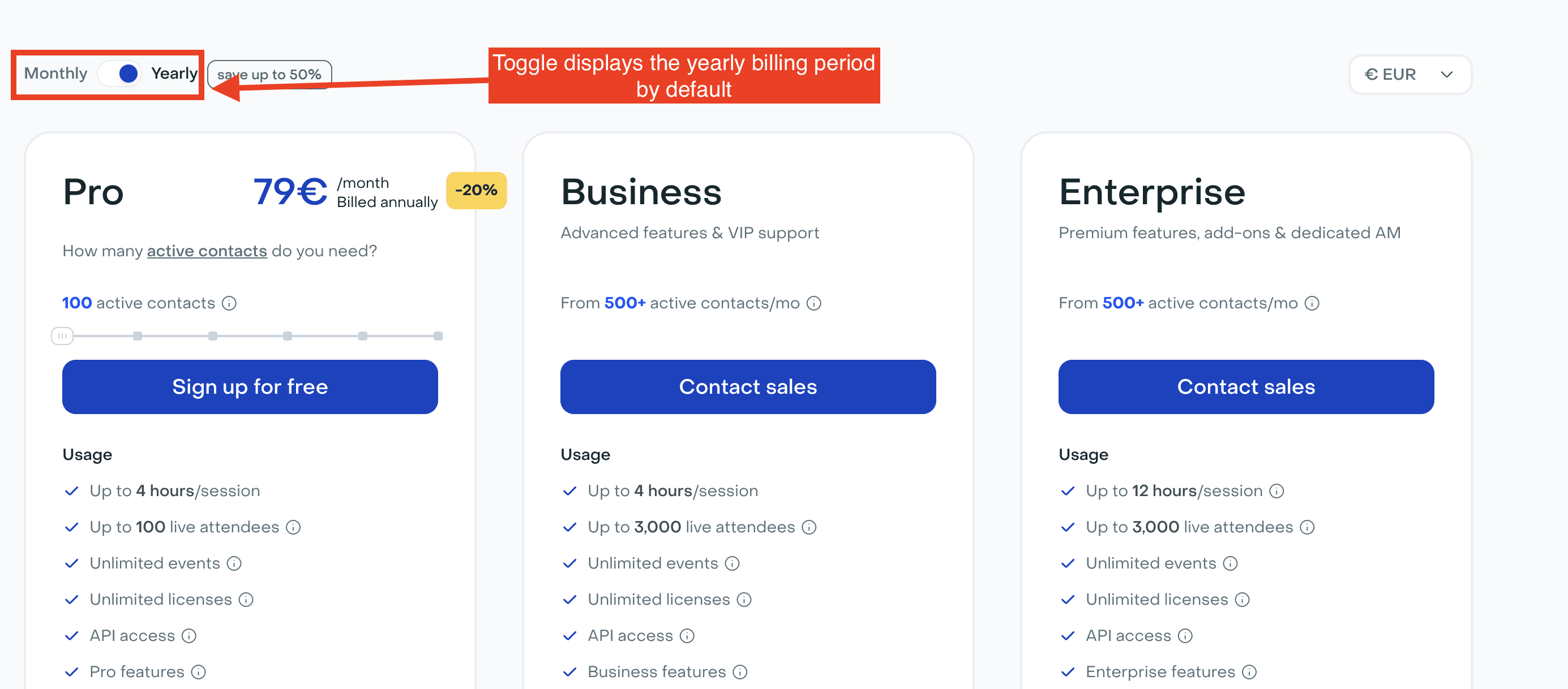
Livestorm’s new pricing page features a toggle button that allows users to switch between monthly and yearly plans, with the yearly value displayed by default.
Roast My Pricing Page’s analysis 👇
It seems like an obvious change for Livestorm to make.Even if your Go-to-Market strategy isn’t focused on Enterprise customers, it’s often a good practice to include a toggle button that switches between monthly and yearly billing periods, with the yearly amount displayed by default:It creates a smoother user experience.It highlights the yearly discount, showing the percentage saved when committing to a yearly plan.It displays smaller price points by default, anchoring a lower psychological price for your prospects.
3) Highlighting better the yearly discount
We aimed to better emphasize the discount offered on yearly plans. To achieve this, we added a tag next to the billing period toggle and retained the previous tag that displayed the yearly discount.
Additionally, we wanted to showcase how the yearly discount grows as the number of active contacts increases. We accomplished this by changing the color of the tag and displaying an increasing curve to visually represent the growing savings.
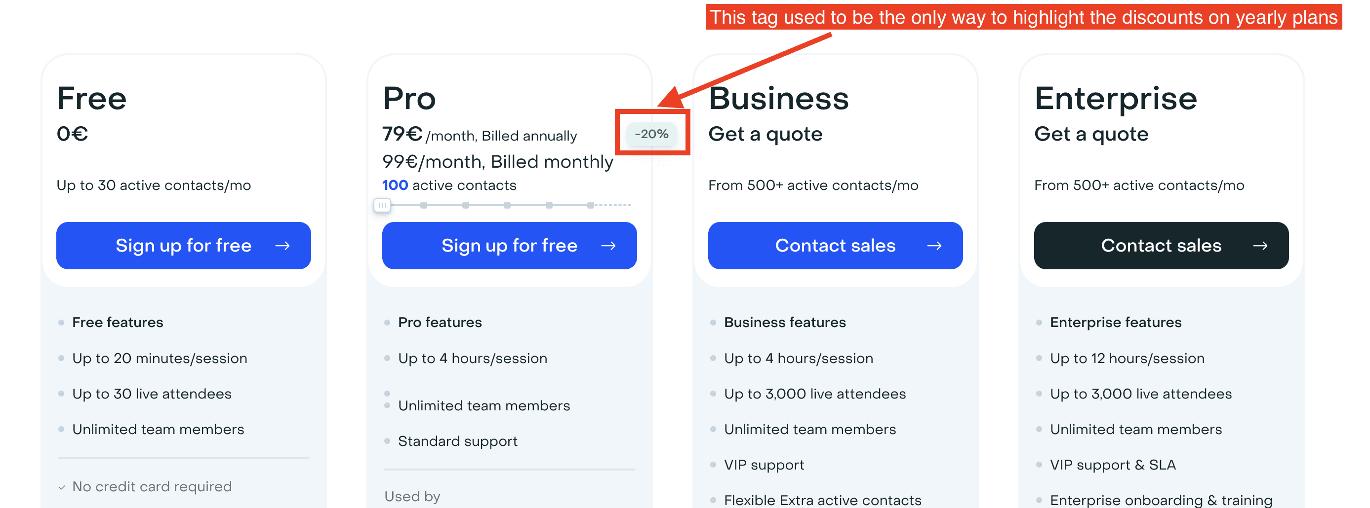
Livestorm’s previous pricing page indicated the yearly discount solely through a tag displayed on the plans.
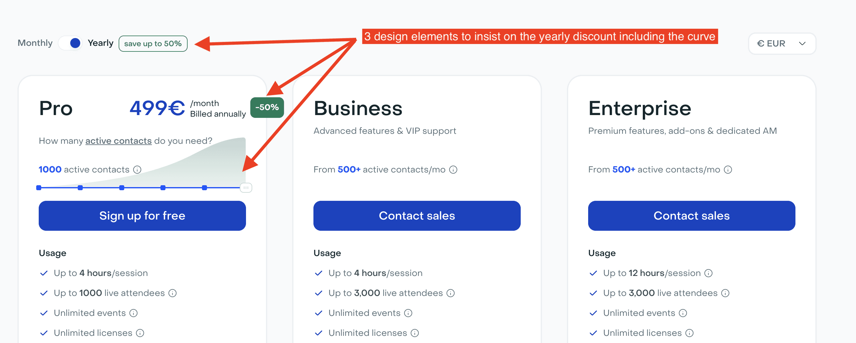
Livestorm’s new pricing page prominently features a growing curve to highlight how the yearly discount increases as the number of active contacts rises.
Roast My Pricing Page’s analysis 👇
This is a truly original approach to highlighting the yearly discount. It's a design trick I haven't seen before, and it definitely catches the eye. By drawing attention to the growing savings, it increases the likelihood that prospects will consider the yearly plan, aligning perfectly with Livestorm’s strategy to promote annual commitments.
4) Adding a pop-up
We implemented a pop-up that outlines the features of the Enterprise plan and includes a CTA to book a sales call. This pop-up is triggered when the number of active contacts reaches 750. While 750 contacts is not the threshold for requiring an Enterprise plan, we wanted to bring attention to it as prospects approached the range where the Enterprise plan might become more relevant to their needs.
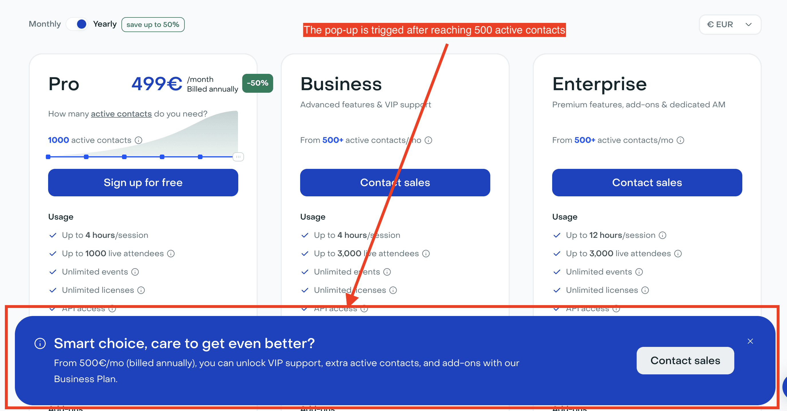
Livestorm’s new pricing page triggers a pop-up when the number of active contacts selected reaches 750.
Roast My Pricing Page’s analysis 👇
Pop-ups are an effective way to nudge users toward a specific action.To design an effective pop-up, you need to define three key elements:
- The Trigger: What action or threshold will cause the pop-up to appear?
- The Content Copy: What message or information do you want to convey?
- The Call-to-Action (CTA): What specific action do you want the user to take?It's crucial to ensure that the pop-up isn't too intrusive and that the content aligns with your overall strategy. The CTA should clearly guide users toward the desired action.In Livestorm’s case, the goal is to encourage users to book a sales call when it appears they will require a number of active contacts that only the Enterprise plan can support.
Can you list other changes to your pricing page?
We put more emphasis on our pricing calculator. Our pricing calculator takes various inputs like the number of events per month you plan to organize, and then computes the approximate number of active contacts you will need.
This pricing calculator was introduced when we rolled-out our new usage-based pricing model. It used to be accessible when you clicked on a button “Estimate your MAC number”.
It is now fully embedded on our pricing page so as to increase its usage.

Livestorm’s pricing calculator used to be accessible inside a modal overlay that you could display when clicking on the button “Estimate your MAC number”
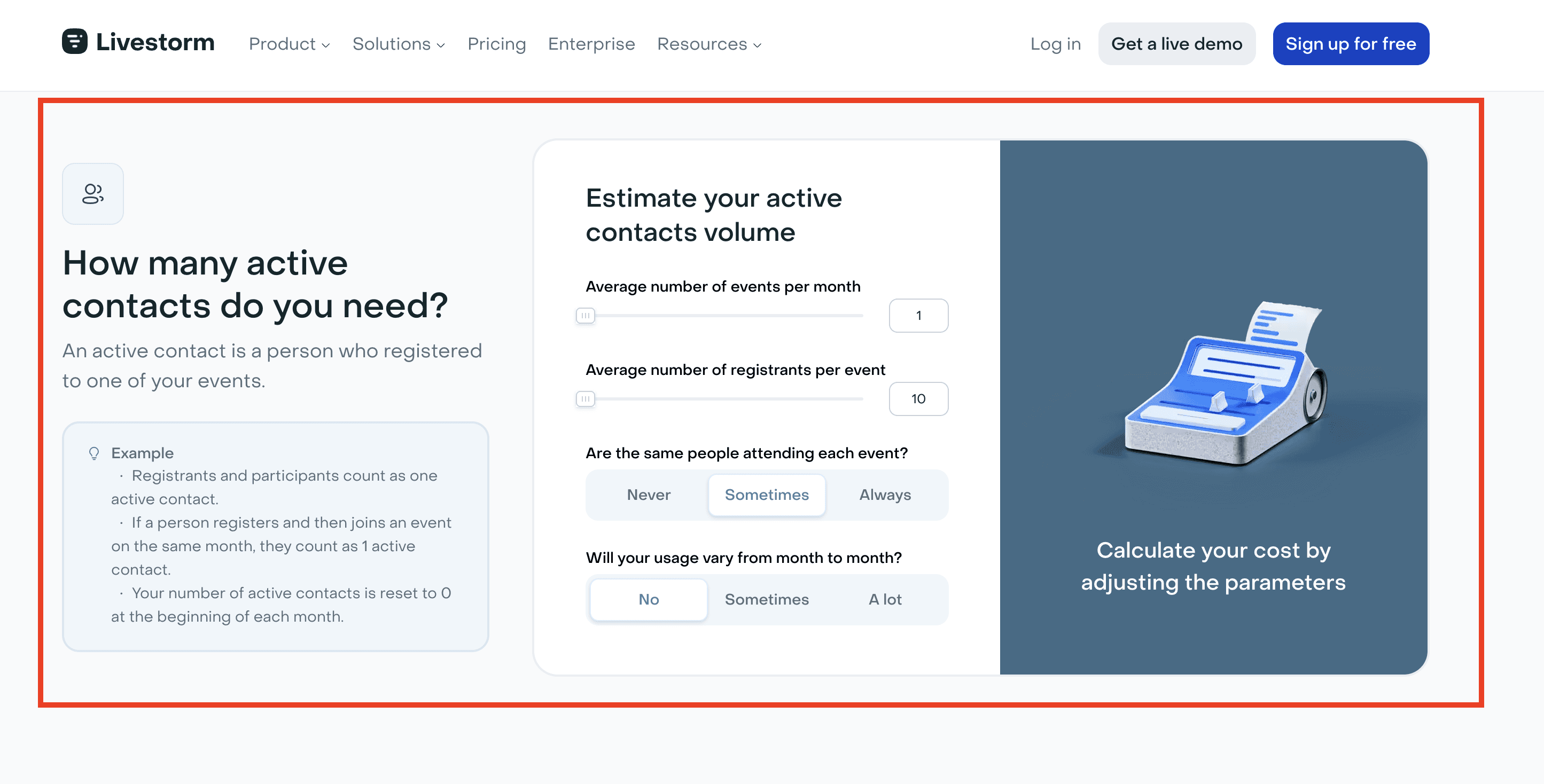
Livestorm’s pricing calculator is now fully embedded inside their pricing page
Roast My Pricing Page’s analysis 👇
Having a pricing calculator is a good practise for SaaS businesses with a usage-based pricing offer along with other key elements to add as described in this article
What were the various steps for this project, and who was involved?
The project spanned four months and involved several key steps. Initially, the Discovery phase focused on data analysis and gathering feedback from the Customer Success Management (CSM) team to inform the direction of the project. Following this, wireframes were developed to outline the structure and layout.
These wireframes, along with subsequent designs, were reviewed by the founders and the VP of Growth, ensuring alignment with the company's vision and growth strategy.
After incorporating their feedback, the final design was completed, leading to the implementation phase, which brought the project to a successful close within the four-month timeframe.
What metrics do you measure on Livestorm’s pricing page?
To assess the success of our new pricing page, we focus on three key metrics:
Number of clicks: This measures user engagement with different elements of the pricing page.
Number of sales demos: This tracks how effectively the new design supports our go-to-market strategy.
Conversion rate: This calculates the percentage of website visits that convert into customers, allowing us to gauge the impact of the website on our growth.
We are currently A/B testing the new pricing page against the previous version to compare these metrics. Given our website traffic, this will provide a precise evaluation of whether the changes are achieving our strategic goals.
What are the upcoming projects for Livestorm’s pricing page?
We aim to provide more personalization on the pricing page, specifically by displaying the most suitable pricing information based on the company’s size and industry.
