[ROAST DEEP DIVE] Zapier’s Pricing Page
Analyzing Zapier's pricing page: comprehensive insights into best practices, compelling copywriting, and design tweaks for increased conversions

Jul 19, 2024
One of my favorite tools out there, and in my top 10 of successful SaaS stories of the last decade: Zapier
Zapier allows you to create workflows using code to connect thousands of different tools seamlessly.
They recently made a switch to a usage-based pricing based on the following unit metric: Tasks. This is a common trend among SaaS that I illustrated in this article where I described how we switched from a licence-based pricing to a usage-based pricing model when I was a Product Manager at Livestorm.
A few information about Zapier before diving into the roast:
Company name: Zapier
Date of creation: 2012
Revenue: Reached 150M$ ARR in 2023
Pricing model: Usage-based
Self-served?: Yes
Start for free?: Free-trial, and Freemium plan
Headline
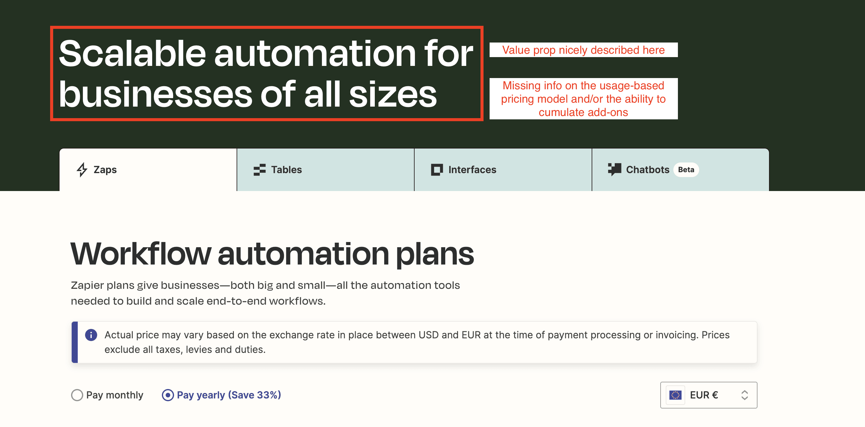
Zapier’s headline on their pricing page
As I explained in this article showing 20 examples of BtoB copywriting on pricing pages, the copy of the headline should convey the value prop and important aspects of the pricing model.
This is well executed for the value proposition with the mention “Scalable automation”. If I want to be really picky, I would add-up a mention showing that automations can be implemented fast or with no coding skills.
However, since their pricing model is complex and new, I would add a subheadline to provide more information about the pricing model at least (and if possible communicate on the existence of add-ons). Bear in mind that a subheadline should be less than 100 characters. That would probably require adding more space above the list of add-ons.
We could start with a copy like this one for the subheadline: “Start automating tasks for free with our pricing based on your usage”
Display of add-ons
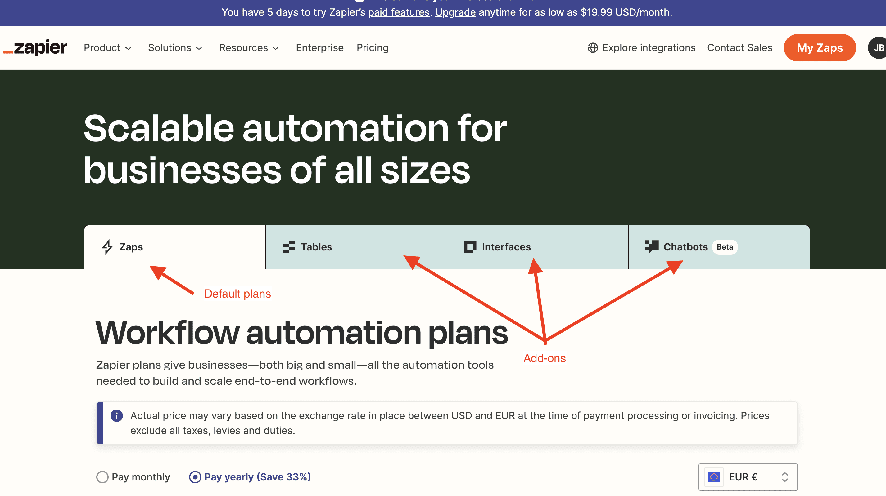
Display of Zapier’s add-ons on their pricing page
Zapier has chosen to display add-ons as "tabs" similar to those in a browser. This approach is user-friendly, making it easy to switch between add-ons.
However, my concern is that it may not be clear that Tables, Interfaces, and Chatbots are add-ons. They appear more like a menu of four products on the same level. Since Zapier's pricing model is based on Zaps, with these three add-ons providing additional features, it’s important to emphasize their status as add-ons right from the tab selection. This is mentioned further down (see screenshot), but it should be highlighted right from these tabs.
Currencies and exchange rate
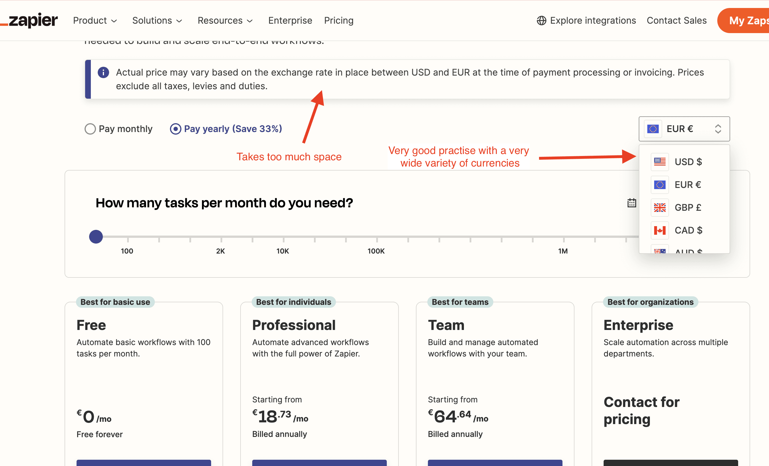
Currencies and exchange rates on Zapier’s pricing page
Zapier have an impressive choice of currency to select from inside their currency selector. This is great to make all those currencies visually accessible with the exact price customer will have to pay.
However, the warning message about the exchange rate takes too much space in my opinion. They may have a lot of questions on that topic, which would explain why they want it to take so much space.
In theory, I would see this message being accessible via a tooltip next to the currency selector for instance.
Monthly vs Yearly billing period
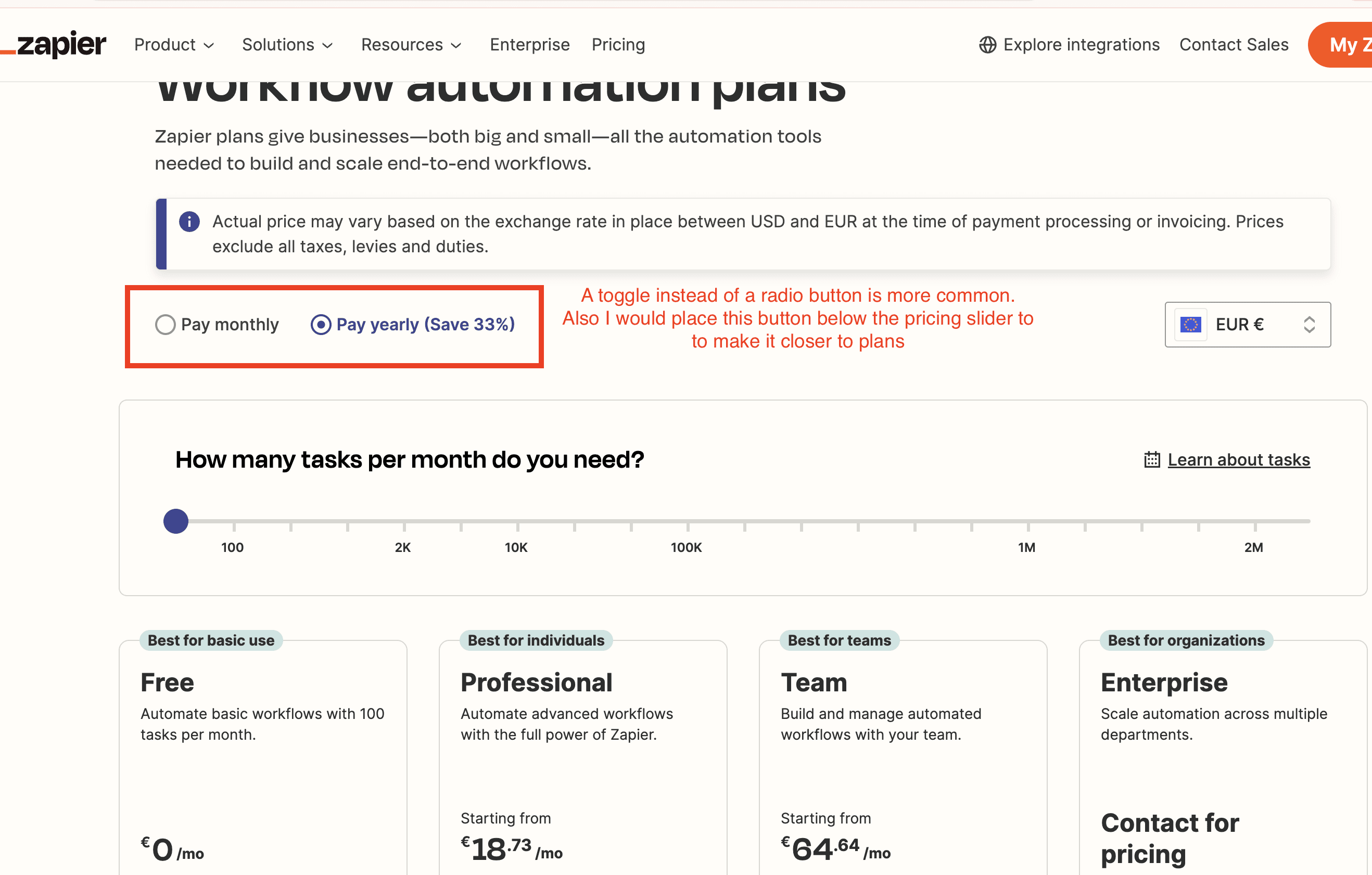
Monthly vs Yearly billing period on Zapier’s pricing page
The radio button for "Monthly" vs "Yearly" is somewhat obscured by the warning message above. Additionally, most SaaS platforms I analyzed prefer using a toggle switch instead of a radio button for selecting between monthly and yearly billing.
A good practice is to show the yearly discount (33%) and to display the yearly price by default.
I recommend placing the toggle switch below the tasks slider, closer to the plans. This placement would make the chosen billing period more visible, as it directly affects the displayed price.
Plan descriptions
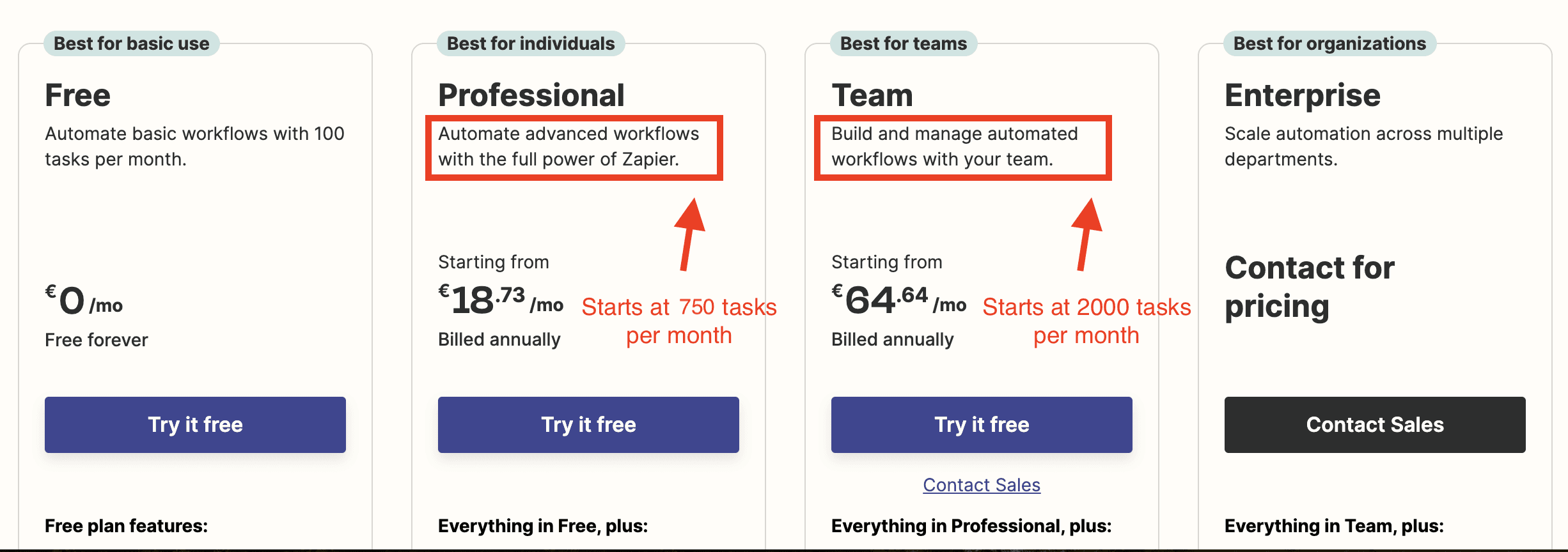
Plan descriptions on Zapier’s pricing page
Zapier uses an unconventional method to describe their plans. They place tags on top of each plan to indicate the most suitable persona for that plan.
Additionally, they use the plan descriptions to detail the use cases. It would be helpful to explicitly state that the Professional plan starts at 750 tasks and the Team plan starts at 2000 tasks. This information could also be included in the feature list below, helping users better understand the use case for each plan.
Free trial and Freemium plan
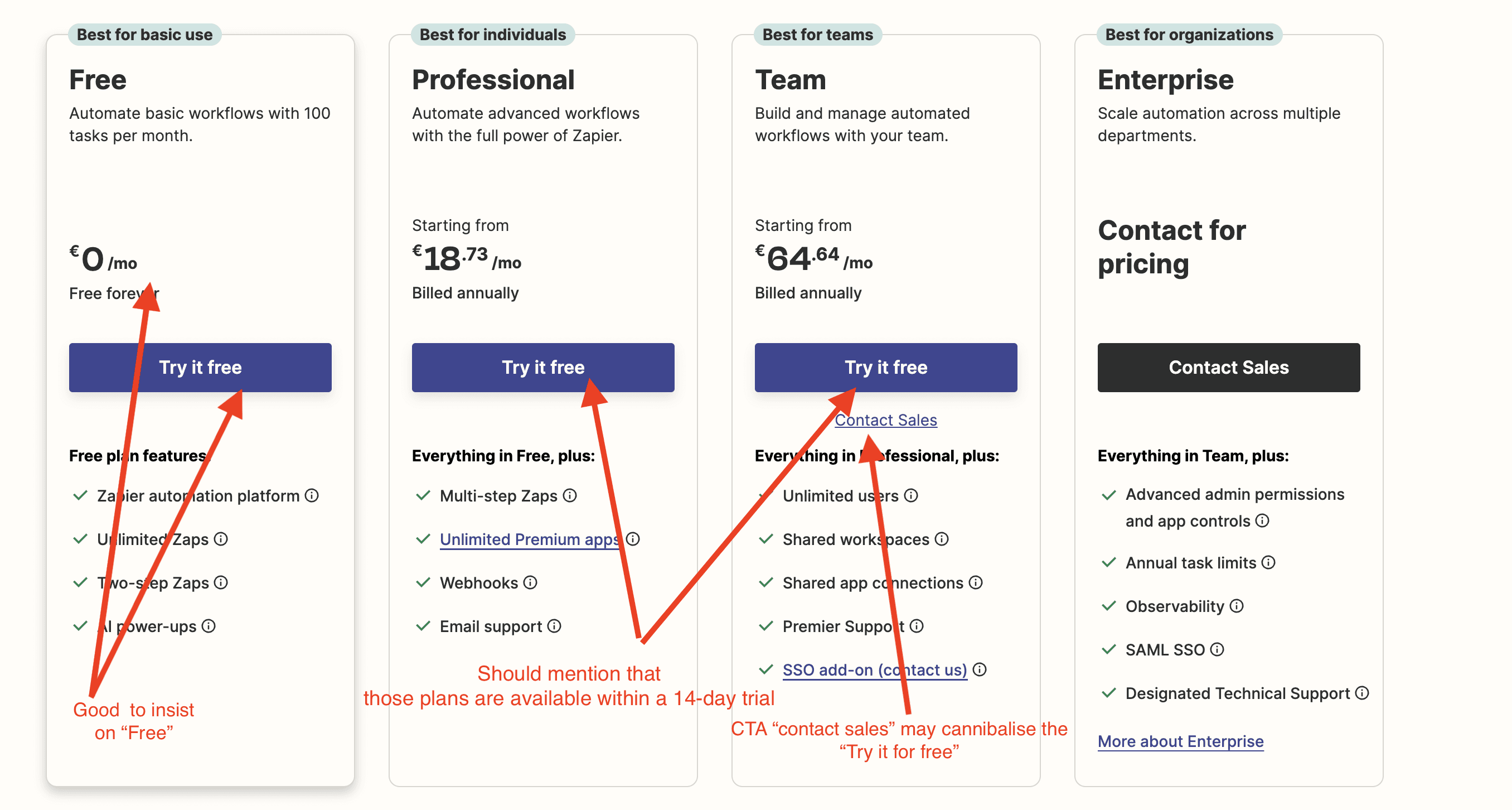
Feature listing on Zapier’s pricing page
There’s sufficient emphasis on the Freemium plan. The phrase “Try it free” is appropriate, even if it seems redundant since the plan is named “Free” and costs 0€.
However, they should highlight the 14-day free trial more. The phrase “Try it free” for the Professional and Team plans sounds like you're starting on a Free plan, not a 14-day trial for the Professional or Team plan, which could be confusing.
Additionally, having both a “Contact sales” CTA and a “Try it free” option may seem contradictory and could undermine the self-service plan. With a self-service plan, the goal is to encourage customers to start using the product on their own, even if they later opt for a sales-assisted plan. It’s more scalable for customers to explore the product independently rather than booking a demo. Therefore, the “Contact sales” button might detract from their product-led growth strategy enabled by the self-service plan.
Feature listings
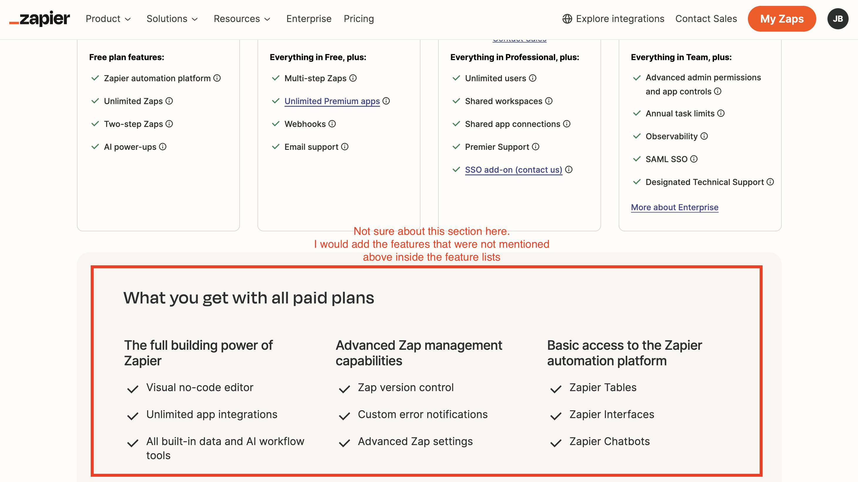
Feature listing on Zapier’s pricing page
I'm not sure about the purpose of this section below the plans' features lists. They manage to avoid overwhelming users with too many features within the plans, instead including additional features in the comparison section below.
They could integrate a few features from this section into the main plans and then eliminate this section entirely. This would make it easier to access the "See all features" link to expand the full comparison table.
Feature comparison table
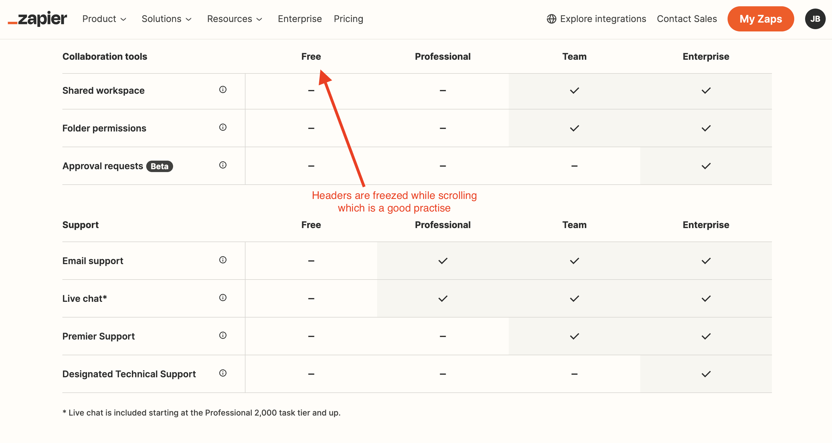
Feature comparison table on Zapier’s pricing page
The headers of this feature comparison table is freezed, while scrolling down the table. It makes the table more readable. This is a good practise to take inspiration from.
The feature comparison is overall well-crafted. But I feel it lacks a bit of colour. I often advise my customers to refrain fro using too much dark colours on their pricing page. Dark is associated with “heaviness”, which means “expensiveness” when considering a pricing page.
Also, they could add a CTA under the name of the plan to nudge the customers into taking action.
Just like Docusign did inside their feature comparison table (See deep dive of Docusign’s pricing page in the following article)
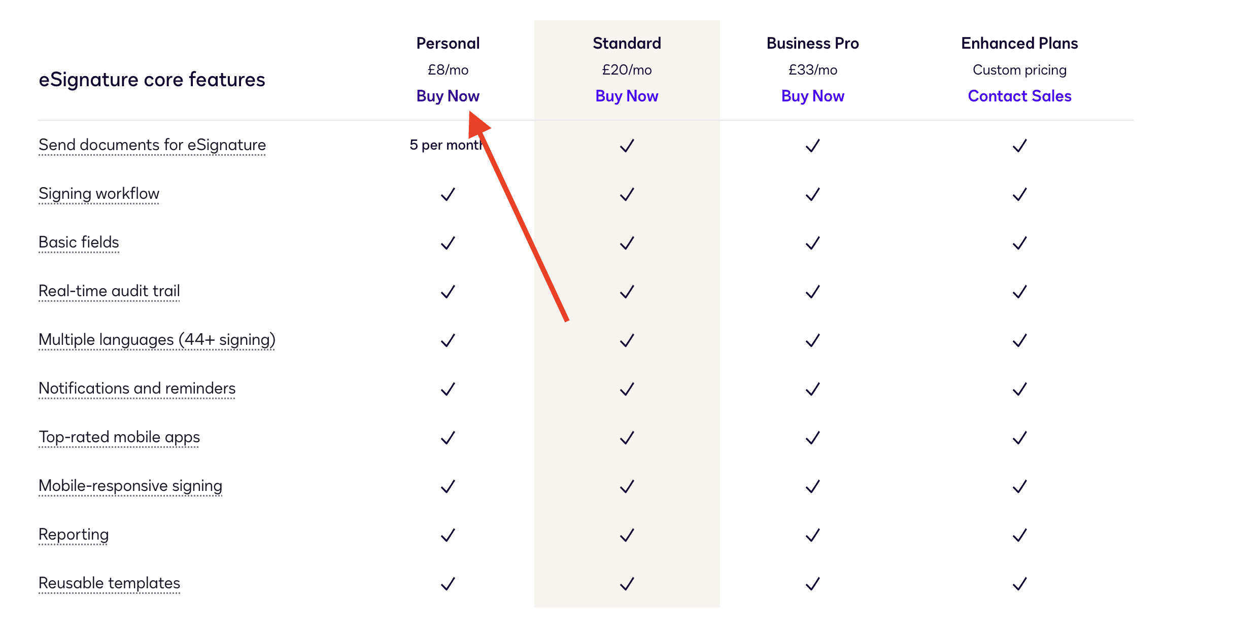
Docusign’s feature comparison table on their pricing page
FAQ
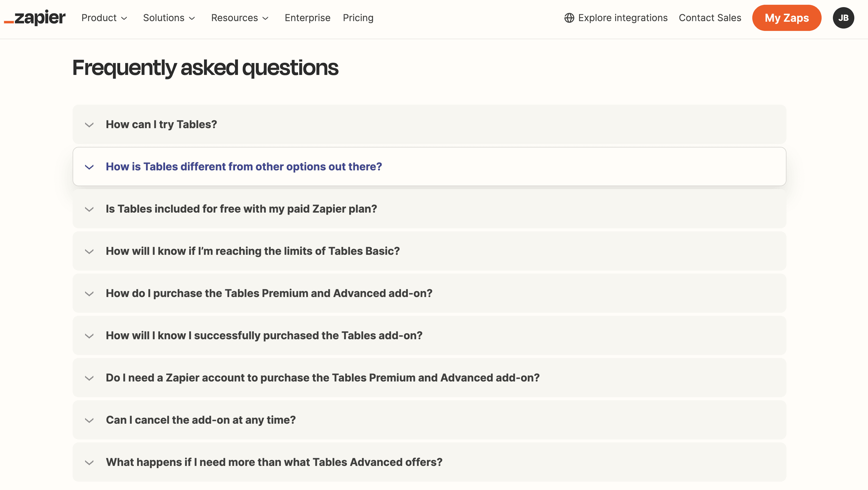
FAQ on Zapier’s pricing page
The FAQ questions change based on the selected add-on. In the screenshot, I selected "Tables," so the FAQ shows questions specific to that add-on.
While this approach is theoretically sound, it may confuse users who have to scroll up to see questions about other add-ons.
I recommend Zapier implement a generic FAQ addressing 6 to 8 common questions about their pricing model, add-ons, freemium plans, and free trials. Additionally, they should include a CTA linking to a dedicated page with a comprehensive list of questions that can be filtered by the selected add-on.
Including all pricing questions for every add-on in one FAQ section would make it too cluttered, even if divided into sections. This approach balances clarity and usability, making it easier for users to find relevant information without overwhelming them.
Want More?
What did you think about this deep dive of Zapier’s pricing page?
Check out other roasts I made on other SaaS products:
